Just for a bit of Friday fun, take a look at these six landscape paintings, and have a guess at who painted them and when, based purely on what you see and how the paintings are painted.
Have a close look at the way that they're painted - the brushstrokes, the colours. Can you see the brushstrokes? Do the paintings look 'real'? Or are the pictures more 'pattern making'? I've put in some ideas to start you off, but look for yourself and make up your own mind.
What order would you put them in for date, starting with the earliest? Answers are at the bottom!
Painting 1
Now, the houses look like quite flat geometric shapes arranged in the landscape here, with the curve of the rainbow adding to the feel of something out of a geometry set....
Painting 2
It's quite similar to what's going on here, except the houses feel a bit more three dimensional....
Painting 3
This seems to be a painting about nothing, or all about texture - it's just a wall. At the top there's a block of plain flat white and plain flat blue. Where's the focal point? It's all quite flat...
Painting 4
Here's those flat blocks of colour again - you're led into the painting, but what's it about? Where's the focus of the painting? There's a sense of depth, but it's just blocks...
Painting 5
Ah, here's something more realistic...but it is also painted loosely, so you can see the brushstrokes, how it is made. There's a high viewpoint, so you're looking down on the girl, almost spying on her, and there are bright dabs of colour as the light catches the leaves, and blue shadows.
Painting 6
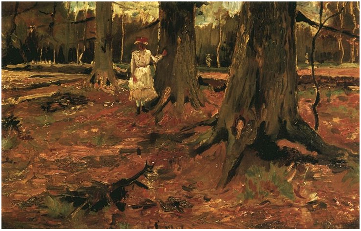
It's almost the same picture, a girl in a wood, but less colourful, more browns, perhaps more 'realistic'?
Right, it's make your mind up time....
Ok, here's the order they should be in, starting with the oldest.
This one is 1782. 1782!!!
(Want to read more about this painting? Look here)
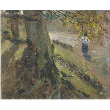
Next are these, 40 years later, from 1821. It's Mr Haywain himself, John Constable, looking more impressionist than the Impressionists (admittedly, they're sketches rather than finished paintings, so the brushstrokes are looser and more fluid, but wow....)
Then 60 years later, it's the father of modern painting, Paul Cezanne.
Yes, the Impressionists get all the credit for painting outdoors on the spot, but others were there before them. There's Constable out and about in the 1820s, and Salvator Rosa was painting outdoors in the mid 1600s, over 200 years before Cezanne strapped an easel to his back.
Then it's Vincent Van Gogh, again 60 years after the Constable painting of a girl in a wood, and strangely looking less 'modern'.
And lastly it's forward 80 years to this painting by Richard Diebenkom, but is it really any more 'modern' in style and subject than Thomas Jones's painting nearly two centuries previously...?
The thing is to learn to just LOOK, really look at a painting, without any preconceptions....


Well, this is very interesting. Thanks for giving us something to do on a Friday night.
ReplyDeleteThe Constable house doesn’t do much for me, the scene has a cold, October feel to it. It also looks unfinished, and I don’t like my paintings unfinished. The Cezanne is very pretty, nice use of colour, the house appears real and nestles comfortably among the rocks and grasses.
The wall is smashing, my favourite of the six. I love the detail, the clothes hanging, the deep shadows on the wall. I found myself looking at this for a long time, almost waiting for someone to open the window. To discover that this was painted in the 18th century is one thing, but what really surprised me was that this obviously Mediterranean scene should be painted and captured so true by a Welshman.
Painting 4 is clearly the most recent, the road and the buildings give that away for me. It doesn’t work for me, it’s like a photo where the photographer has missed the object, it lacks a point. I expect the better painting was done by the person sitting to the left of this artist.
Now this Constable is the real deal. A beautiful painting, which captures a mood, a stillness in the air. I like the way the light is used, the light and the shadows. We’re watching someone who is waiting, there a slight tension. This Constable chap could go far.
This last painting is very smart too. The girl’s clothes make it dated, but the golds and browns make this a delightful painting. Reminds me in part of the feel of your Green Park picture. The trees are real, and the three in a row give a nice perspective to the painting.
I’m trying my hardest to look with my eyes and my head, and trying to keep my preconceptions at bay. They’re still there though, not far away.
Thank you for taking the time to reply! Glad you enjoyed it, especially the Thomas Jones.
ReplyDeleteI've been a graphic artist artist for more than 20 years now. I'm just rather a new comer to operating a blog and stumbled upon your blog post while searching for design blog sites. I want to mention just how impressed I am with all your superbly written articles together with the overall top quality of your website. Hopefully I can startup a website just like yours and will read your articles with great eagerness. Thanks heaps for your motivation friend.
ReplyDeleteFeel free to visit my page :: Australian Landscape Painter
Thank you very much, Mr Anonymous. I very much appreciate your really kind comments.
DeleteI'm a total newcomer to the blogging lark as well, so basically I'm just rambling on to myself. Painting is a very solitary occupation.
Have had a look at your website from the homeland - really interesting. Do you always paint out of a black background (obviously it works for you, as it did for Caravaggio) or have you ever tried a coloured mid-tone? It's just that it's never struck me that the outback has black underneath it.