Saturday 28 September 2013

From my Easel...

Here's a couple of just-completed paintings from the studio.

Blue Sky with Pink Rhododendrons (Oil on linen, 24 x 26)

Purple Rhododendrons against Summer Sky (Oil on linen, 24 x 26)

Both are of rhododendrons at Pollok Park, where they have a fine display in early summer.

Wednesday 25 September 2013

Game of Thrones at Ballintoy Harbour

Last month when I was over in Northern Ireland, one of the locations I went back to to take photographs was Ballintoy Harbour.


You have to go down a very steep, winding single track road to get to the harbour, and this seclusion along with its open views right out over the sea to Scotland and the western isles gives it an oddly other-worldly feel.  

On the way down, there are also some very individual looking houses, none more so than this one.  It's like a mini castle, which I'm told was built by an artist, so it has many windows for many different views.  These arty types!


The harbour also has my favourite name for a boat ever.


Zebra's Fortune.  What on earth could be the story behind that one?

Anyway, obviously the makers of Game of Thrones also thought that Ballintoy Harbour had that other-worldy rather mystical quality, as there is now a sign there, sporting a picture of Alfie Allen (brother of Lily, whom I saw in Equus) (that's Alfie in Equus, not Lily, although I've seen her as well) to tell you that it was the location for Pyke Harbour.


Now, as you all know, Pyke is one of the Iron Islands, an archipelago located on Ironman's Bay, on the western side of Westeros. The island is the site of the castle of the same name, which serves as the seat of House Greyjoy (Alfie Allen is Theon Greyjoy), the ruling house of the Iron Islands, and the town of Lordsport with its harbour. 

Here's how it looked in the series.

Image: Helen McCall

(Zebra's Fortune Didn't make it into the shot, but Faded Rose did.) 


Apparently there are a lot of places along the Causeway Coast that are set locations for Game of Thrones, just as the Welsh coastline provides a lot of the settings for Doctor Who. You can see more locations HERE.

It's just a pity I have no idea what on earth Game of Thrones is all about...

Thursday 19 September 2013

Michael Landy - Saints Alive

Whilst in London, I went along to the National Gallery to see the exhibition Saints Alive by Michael Landy.  Going during the evening on a Friday meant that there were no queues for the Sunley Room, as although the exhibition is free, numbers into the room are limited.

© Glenn Copus, Evening Standard 

Landy (seen above with the kinetic super-sized saints sculptures) is the chap who created Art Bin, inviting people to come and throw their unsuccessful pieces of art into a giant skip.  And then he was also the guy who, back in 2001, sat in the window of C&A in Oxford Street, catalogued all his possessions from his car to his birth certificate, and then systematically destroyed the lot in a performance piece called Break Down.  You do have to wonder how he gets along these days without his bank cards or driving licence.

Anyway, now he has is the eighth Rootstein Hopkins Asociate Artist, which means he gets a studio at the National Gallery and total access to the collection.  The only stipulation is that the resulting exhibition must refer to the collection, and inform and reinvigorate gallery visitors to that collection.

Landy set about drawing and collaging from the paintings that caught his imagination in the collection.  After a while, he was drawn to the many paintings of Saints, with their bizarre stories of self-punishment and denial, strange attributes, and plethora of creatively violent martyrdoms. He then handed over to model-making company MDM, who constructed huge kinetic sculptures of fibreglass and retro mechanical parts, overseen by Landy.

Here's Saint Apollonia, who greets you at the entrance to the exhibition.  

Michael Landy, Saint Apollonia, 2013
Michael Landy, courtesy of the Thomas Dane Gallery, London
© Michael Landy, courtesy of the Thomas Dane Gallery, London / Photo: The National Gallery, London

She's a big girl, and if you stand on a hydraulic footpedal, she smashes a set of pliers into her face with both hands, and wrenches out a tooth with a loud crash.  WHACK...YANK!

Here's Saint Francis of Assissi, famed for his life of poverty and self-denial.

Photo: Allie Suwanrumpha

St Francis is the guy who lived a life free of material objects, although he didn't shred everything in the window of C&A.  Now, I believe that a large grabbing claw, like those machines you get at the funfair, is meant to come along, reach down and grab something out of the neck of St Francis.  But St Francis wasn't working when I visited.  In fact, quite a few saints had broken down.  But in a way that was ok.  Mechanical breakdown.  Mental break down.  Break Down indeed.

Here's one that hadn't broken down - it's  Saint Thomas, whose disembodied finger jab-jab-jabs at the body of Christ, battering holes in the fibreglass. 


The body of Christ flails around violently on its spring, and people jump.  No wonder the gallery staff have earplugs.  It's noisy stuff.  

It's also pretty violent stuff, in a cartoon way.  Saint Jerome repeatedly batters himself with a rock to stop himself from having impure thoughts.  Saint Peter Martyr has an axe in his head.  Saint Lawrence has a large griddle that he was roasted alive on, and Saint Lucy's eyes whirl on a plate.  The flailing, crashing, battering, self-flagellating saints come across as a pretty weird bunch.  What was with all their obsessive self-destruction?  What kind of peculiar mind-set did they have?

Michael Landy, Multi Saint, 2013
© Michael Landy, courtesy of the Thomas Dane Gallery, London / Photo: The National Gallery, London

These are figures are built from many parts.  They are constructed from fragments of a variety of different paintings in the gallery, and are also built out of old defunct mechanical parts.  They are therefore all about Landy's obsession with destruction and fragmentation, about the things that you need, the things you can do without, the things that are defunct and no longer relevant in your life.  

So the question here is - are saints relevant?  Their myths are constructed from different parts, as their physical bodies are here.  Once revered, their stories known by everybody, these saints are literally no longer the figures they once were. Saint Catherine has even been chucked out of the saints calendar for not actually existing.  The minx!  

Landy comes over as a genial kind of guy, but equally he's obviously not the sort of guy who shies away from the big statement or the big gesture.  These are sculptures that are fun and interactive (when they work) but are also ones that pose questions.  

A piece of art is, inevitably, also about the artist who creates it.  So the questions of relevance, self-destruction and, indeed, mental state which Landy is posing about the saints, are also, by extension, ones which Landy is posing about himself. 

You've got to be a bit bonkers to be a saint.  But you've also got to be a bit bonkers to be an artist.

Wednesday 18 September 2013

At the 20 21 British Art Fair

Here's some photos of one of my paintings,  Paths Meeting, Hampstead Heath (that's it up at the top of the photo) on the Duncan Miller Fine Arts stand at the 20 21 British Art Fair, which was held at the Royal College of Art in London this weekend.

As you can see, my painting is keeping good company!  Here it is with contemporary artists Ann Oram and John Kingsley.


Also on the stand were works by, amongst others, Joan Eardley and Scottish Colourist S J Peploe.

On the top left is a Joan Eardley Catterline Landscape and beneath it her 1950s conte drawing Old Woman Peeling Potatoes.  Also seen on the plinth nearby is one of Elisabeth Frink's bird figures.


Here's the very fine Peploe, Still Life with Roses and Fruit of 1928, looking wonderfully contemporary on its black background.

The Fair itself was a feast for the eye.  If I was able to stuff one of the pieces of work into my handbag, I'd either choose a Peter Lanyon Cornish landscape or the Boyle family piece, which was a small square of sand with a single seashell.  I'd never seen such a small piece by them before, and it was very beautiful.

There were also some very lovely figure drawings by Stanley Spencer, so as usual, it was a real treat.

Monday 16 September 2013

A Midsummer Night's Dream at the Noel Coward Theatre

I was in London over the weekend to visit the 20/21st British Art Fair at the Royal College of Art (where I had paintings on exhibition), and took the opportunity to take in a play in the evening.

I've had tickets to see A Midsummer Night's Dream with David Walliams and Sheridan Smith for over a year now, so was really looking forward to it.


I was in the cheap seats right up in the balcony - not for those with vertigo as I found out, but still with a perfectly good view of the stage.

I'm sure you're all familiar with the play - it's all about the anarchic other-worldliness of the forest inverting the up-tight moral order of the court.  It becomes a magical place inhabited by fairies in moonlight, full of beautiful, bewitching imagery, mistaken identity and mischief. 

Sheridan Smith plays Titania, Queen of the Fairies, as a spliff-smoking hippy chick.  David Walliams is David Walliams (as usual) playing Bottom.  Oberon is played by some bloke with an Irish accent that sounds like Sean the voice of my sat nav, and his delivery was so lacking in depth and variation that I kept expecting him to tell the audience to Turn Right.  However, he had obviously been cast for his abdominal physique (which was impressive) rather than his delivery.

Meanwhile, the two pairs of lovers - Lysander, Demetrius, Hermia and Helena - ran about dropping their trousers round their ankles, undoing their dresses and straddling each other with so much six-pack slapstick business that the whole thing resembled a Brian Rix farce.  All it lacked was a Vicar walking in unexpectedly.

It's all very well having a play that's about comedy and fun (because it is a Shakespeare Comedy), but it lacked any emotional depth.  David Walliams was fine - he's been acting Shakespeare for years, after all - but I didn't think he was exactly electrifying.  (I saw David Tennant in Love's Labours Lost simply walk on stage, lie down, and put a hat over his face, and that was just about the most sizzling thing I've ever seen, even from the top row of the theatre.  Goodness knows how he did that.)  But Mr Walliams played Bottom like one of his Little Britain characters. Little Bottom.

Shakespeare's play is full of the most exquisite passages of lyrical poetry, which move through the text like wide glitttering swathes of scattered fairy dust, bejeweling the Dream and giving it form and emotional depth.  But in this production, it just kind of got swallowed up, and you didn't care about any of the lovers and their plight.  It was all just too, too insubstantial. I've seen plenty of productions of Dream, and honestly, you can do both magic and depth. 

For example, there's a difference between taking Puck's line "Lord, what fools these mortals be" as the keystone of the play, and then going further and interpreting the word 'fools' as 'idiots'. Fools are fallable, and you can forgive people for being foolish.  But idiots are just...idiots.  

Given additionally that the line is directed not only at the lovers in the play, but also to the audience in general (meaning that everyone involved in the play, the characters and those watching, are equally capable of being foolish in matters of love) it equates you with the trousers-round-the-ankles brigade on stage.  You're one of this bunch of plain idiots.  And that's just irritating, not illuminating. And it's a play about illumination - la luna, the moon.  Illumination of the human condition.

It's also a political play.  Written around 1590-96, it is an allegory referencing the waning years of the reign of Queen Elizabeth 1st.  Indeed, the huge feminine symbol of the moon dominates the set of this production.   

 The Rainbow Portrait of Elizabeth 1, c1600, Oil on canvas

A Midsummer Night's Dream is exactly contemporary with Edmund Spenser's allegorical (but incomplete) epic poetic masterpiece The Faerie Queene, one of the longest poems in the English language (believe me, I've read it...) which acts, on one level, to praise and glorify Elizabeth.  

Both The Faerie Queene and A Midsummer Night's Dream are also, however, making political points.  Elizabeth was, at this time, in her late 50s/early 60s, and childless, leading to problems regarding succession and a period of economic and political uncertainty. Therefore, in Shakespeare's play, as the virginally white old moon wanes, anarchy breaks out and society breaks down.  

How does Shakespeare get away with it?  By presenting these ideas as a dream.  "If we shadows have offended,/ Think but this, and all is mended," says Puck to the audience, playing the get-out-of-jail-free card, "That you have but slumber'd here / While these visions did appear."  Yes, it's all a dream.  So that's okay then.

So - were any of these themes touched upon in this production?  Any depths, resonances, complexities, universal truths? 

Nope - just drop the trousers.

Now, it wasn't just me being in the wrong mood for the play, or not entirely 'getting' it.  Quite a few people left after the interval - which was a pity, because the second half was stronger than the first.  

To sum up then - for all the energy and invention on the stage, the spliffy hippy analogy actually suited this Dream - because it was actually not nearly as funny or clever as it thought it was.  It was indeed, as insubstantial as a dream.

For more information about the play, cast, characters and tickets, please go to the A MIDSUMMER NIGHT'S DREAM WEBSITE.

Thursday 12 September 2013

A Van Gogh in the Attic

It's a once in a lifetime event - a new full-sized Vincent Van Gogh canvas has been unveiled in the Netherlands.

Sunset at Montmajour was sold in 1901, and went off the radar until it turned up in the collection of a Norwegian industrialist - who had banished it to his attic as it was thought to be a fake.  Which begs the question, what did he pay for it, and under what circumstances was it sold to him as real?  

It all sounds a bit odd, but the Van Gogh Museum in Amsterdam says we're going to get more details of its discovery in the October edition of The Burlington Magazine.

Admittedly, it's not immediately Van Gogh-like.  It's a picture of some twisty little trees on a hillside, and is a bit sludgy looking.

 OLAF KRAAK/AFP/Getty Image

However,  secondary evidence of letters from Vincent to his brother Theo tie the painting down to a specific day (July 4th 1888) during his time at the Yellow House in Arles in the south of France, when he was painting his sunflowers, his bedroom, and other masterpieces.  

Paint analysis and other samples of materials (presumably the jute canvas) also build up a picture of authenticity.  You can imagine how excited the Van Gogh Museum in Amsterdam are about this.


Get up close on the brush strokes and you can think yes, well, that's a Van Gogh brushstroke, even if the effect when you stand back is a bit like a big green duvet.  The technical term (as described by the Van Gogh Museum) is a 'transitional work'.

Here's the actual location,with those wonky trees at Montmajour near Arles.  I guess it kind of does look like a big green duvet anyway.


A rediscovered Van Gogh masterpiece - what do you think?


Tuesday 10 September 2013

Paintings at the 20/21 British Art Fair

I'm going to have some a whole selection of paintings on show down in London this weekend, at the 20/21 British Art Fair.  The Fair opens tomorrow, and goes on until Sunday 15th.

It's held in the Royal College of Art opposite the Royal Albert Hall, and my work is going to be on Stand 11 with Duncan Miller Fine Arts.  

Here's a look at a couple of them!

River in Early Autumn, Betwys y Coed (Oil on linen, 24 x 26)

Green Valley, Brecon Beacons (Oil on linen, 16 x 16)

Both of these paintings are Welsh scenes, one from Snowdonia in the north, and the other from the south of Wales. 

If you're in London, why not drop in?  They have lots of really exciting work from top British artists and sculptors of the 20th century including Henry Moore, Elisabeth Frink, Frances Bacon and Alison Watt.  Find out more information HERE.

If you'd like an invitation for free entry for two to the fair which you can print out yourself, then drop me an email at judith@jibridgland.com


Friday 6 September 2013

Colour at the National Gallery, London

The curators of the National Gallery must have taken note of my list of favourite paintings, because Degas' La Coiffure is going to be appearing in a major new exhibition there next year.


The show is called Colour, and is going to be at the National Gallery in London from 18 June - 7 September 2014 in the Sainsbury Wing.

Here's what the website says about the show - sounds pretty exciting.

‘Colour’ will provide visitors with a unique and exceptional opportunity to journey through the history of colour, by exploring the wide range of materials that are used to create colour in paintings and other works of art. 

Woo-hoo!!  

‘Colour’ is the first exhibition of its kind in Britain.  

Boy, they must have been punching the air in delight when they brain-stormed that one as a USP.  "Think of the fridge magnets!!  It's a marketing goldmine...   

Each room will be dedicated to a particular colour from the spectrum, as well as a room devoted to gold and silver.  

Now, you'll note that they differentiate gold and silver from the actual colours of the spectrum.  This is, of course, as I've pointed out before, because gold is not a colour, it's a metallic element.  Thank you, National Gallery, and take that, Dr James Fox (see my blog HERE for what I'm ranting on about).  Anyway... 

‘Colour’ will draw on the expertise of the  National Gallery's scientific department and the spectacular range of paintings in the Collection.  The exhibition will help visitors to understand the history of the use of colour over a 700 year period – from the early Renaissance  to the Impressionist movement.  

Yum.  

Visitors will explore the origins and developments of the physical materials themselves, from natural and mineral products to manufactured pigments. The exhibition also examines the material problems faced by artists in achieving their painterly aims; the breakthroughs they struggled for and the technical challenges they faced.  

Yum yum.   

Several major national cultural institutions have loaned works for the display – which has painting at its heart but also includes minerals, textiles, ceramics and glass. These form a rich and diverse exhibition which illustrates the importance of colour in the way that creators of works of art experience and represent the world.  

Just my sort of show.  Looking forward to it already!  

Read more HERE.

Wednesday 4 September 2013

New Paintings on Royal Deeside

I was up at Ballater on Saturday, to deliver new paintings to the McEwan Gallery on Royal Deeside in time for the Braemar Gathering this weekend.  It lovely day (if somewhat windy!) with a hint of autumn in the air.

The gallery is situated in the McEwan's lovely and unusual house, built in 1902 by the Swiss artist Rodolphe Christen, and situated on the outskirts of Ballater (near Balmoral and Crathie Church).  The house is packed with paintings, and is a gem to explore.

Here's a quick look at a couple of my new paintings on show there.

 Cottages and Harebells, Northern Ireland (Oil, 10 x 10)

This is of a farm cottage on theTorr  road from Cushendun on the Causeway Coast in Northern Ireland.  The hedgerows were full of delicate little pale blue harebells blowing in the breeze.

 Flowers on the Clifftop, Portnaboe (Oil, 10 x 10)


This is another Northern Ireland painting, this time of the bay of Portnaboe as you go down to the rock formations of the Giant's Causeway itself.  This is looking over to the Camel, a humped shape of rock.  On a clear day you can see the outline of southern Ireland in the distance.


Moonrise, Humber Estuary (Oil, 10 x 10)

This is something a little bit different!

There's plenty more of my work there, so if you're in the area for the Braemar Gathering, then do take a look.  You'll find a sign to the McEwan Gallery on the left hand side of the road from Braemar just before you come into Ballater.


Tuesday 3 September 2013

Top Ten Paintings - Answers

Having been taken to task for my tardiness in supplying the answers (apologies), here are the answers to Fridays paintings.

 
Scottish artist James Cowie, and his enigmatic and mysterious A Portrait Group of 1933/40.  It's in the National Gallery of Scotland in Edinburgh.

The painting originally featured portrait of four pupils from Bellshill Academy, where Cowie taught until 1935.  He then extensively repainted the figures in 1940.  With portraits, he started with the eyes, as the artist felt that these were the most important aspect of the figure, giving an insight into the character.  

I like this painting because of its ambiguity - you can't tell what the relationship is between the sitters, or where they are exactly, or what is going on.  It's everyday, but mythical - a bird flies in, steam or smoke rises from behind the hedge as if a train has passed by,m and is that washing or drapery fluttering down from the top of the painting?  Meanwhilre, a rider on a horse gallops past on the right, like a figure from a fairy tale.  

The sitters are in a shallow space as if on a stage, and yet beyond the hedge, the very Scottish landscape stretches far off into the distance.  The sitters are all crammed together, like a shuffled pack of cards, and yet beyond the hedge, there seems to be excitement and adventure and possibility - so near and yet so far.  There's a real sense of yearning, of magic realism about the painting.


This is Andy Warhol's huge screenprint Orange Car Crash Fourteen Times.  It was made in 1963 and is in the Museum of Modern Art in New York.  Fifty years old, but fresh as a daisy.

I love it because the repeat of the screenprint fades and becomes indistinct, meaning it is hard to make out the horror of the image of the car crash that has been taken from the newspaper photograph.  On the second panel, it is just a blank, as if time has eroded the scene and made everything calm.  I find it a really powerful piece.  

However, before getting too carried away with reading things into it, one should bear in mind what Warhol said of the two canvasses.  

Andy was quizzed as to how the work should be displayed.   What was the correct way to hang the printed half and the blank half? 

"The two are designed to hang together however the owner wants." shrugged Andy.   

And why create a piece using a printed part and a blank part?  Warhol replied drily "It just makes them bigger and mainly makes them cost more."  

Because Warhol was a smart guy who was self-aware enough to realise that his paintings about consumerism would ironically become the ultimate consumer objects themselves.  Consumerism would consume them.  

Andy, I love your style.

Now, this piece wasn't in the Guggenheim in New York last time I was there, but somewhere in its collection (because I've seen it there before) is Robert Rauschenberg's Untitled (Red Painting) of 1953.

Obviously, it's a little difficult for this little image to convey the impact of the piece, which is why you really always need to see real art in situ.  

It's got a lot of surface texture going on with layers and layers of collaged materials of different textures and thicknesses, such as newspaper and fabric, and layers of differently applied types of paint and varnishes.  Two pieces of wood lie at the top and bottom of the paint surface.  These echo the more subtle brown shades in the painting, and are organic beginning and end-points for the piece, which have been machine-cut to fit.  So they are organic and natural, but tailored by machine. 

Although it is one colour - red - there are lots of subtle colours - oranges and vermillions and ochres, and shadows cast by the layers, and then really deep parts where you can physically look right into the dark heart of the picture, and then bright reflected light on the varnished surface.   

The paint, which could be oil or household, is in parts dribbled or splattered or brushed, so there are different forms of action used to apply the parts, some carefully, some energetically, some thoughtfully, some accidentally.  Instead of mark-making with a brush or charcoal, it is huge gestural mark-making with scraps of two dimensional materials which are then wrinkled and layered to make animated three-dimensional form, in a method of art-making that is right in the point between a sculpture and a painting.   

When he was a child, because they were poor, Rauschenberg's mother resourcefully made clothes from scraps of materials in order to make do and mend, even, apparently, making a skirt for herself out of a suit which her brother had died in. Nothing was wasted.  The house was always full of these scraps of material being transformed and pieced together into a new shape and a new life, although Rauschenberg longed for something new and shop-bought.   

His art, then,  consists of taking the found and treasuring it, transforming it into something new that is labelled as and revered as 'art'.  He would also later make a series of work called the 'Glut' series, a comment on the throw-away consumerism of middle-class America.  He travelled round the roads of the US, stopping to pick up car wreckage and other discarded objects, and taking them back to the studio to make into assemblages. 

Untitled (Red Painting) is both beautiful and raw, formed and unformed, organic and man-made.  It's very, very exciting and full of a powerful energy.  I couldn't take my eyes off it.


When I was studying Fine Art at university, a lot of the famous paintings that we needed to study either had no images available, or were in black and white (which was useless).  That's because they were in The Barnes Collection, and Dr Barnes had rules about access to his paintings.

However, now you can go and see the Barnes Colection in Philadelphia.  And I did.  And this is in it.

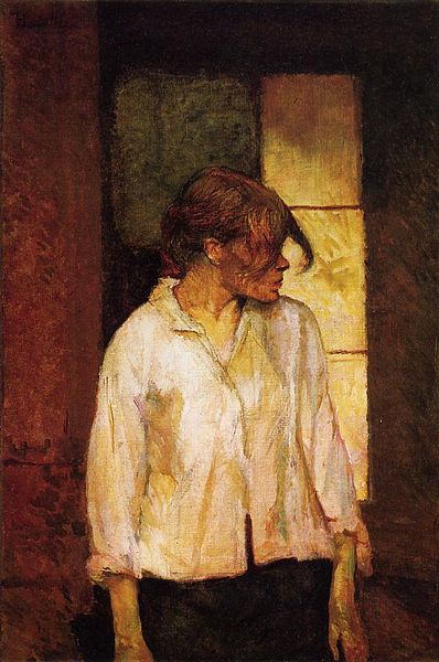
It's "A Montrouge" - Rosa la Rouge by Henri de Toulouse-Lautrec, painted in 1886/7.  Again, it's a very enigmatic painting, and it just really struck me.  There it was, upstairs in the Barnes collection, displayed amongst a whole lot of ceramics and with ironmongery stuck to the walls amongst the paintings.

Dr Barnes made his fortune through a chemical formula for an eye ointment for infants. Deciding he wanted to collect art, he set about finding the formula for beauty, and for the perfect work of art.  He wrote to (and fell out with) various artists and thinkers, trying to get the 'formula' from them.

When you see the collection, you are struck by the amount of ironmonergy - metal escutcheons, door-knockers, hinges and so on - that are hung on the walls in between the paintings.  The collection - and the metalwork - is hung according to the way that Dr Barnes displayed the work.  Apparently this was the formula for beauty and aesthetic perfection.  Because, of course, that's how every great collection hangs works of art, and as an artist, I know that my own work would not be complete without a large keyhole beside it.  Because that will 'unlock' the mystery of art.  Or something. 

Albert C Barnes was a man who bulldozed his way through the art establishment, hated the discipline of art history, and said that he created his Barnes Foundation for not for the benefit of art historians, but for the students.  Students of what, I've no idea.  Obviously not Art History.  Certainly when I was a student (of Art History - tut tut), I was determined that one day, I would see what this Barnes person had hidden away, and it aggrieved me eatly that one person could hide such treasures of art history from the rest of the world in such a way.

Dr Barnes was a prickly man who, from what I've read of his letters, seems to have felt that everyone was a potential enemy out to get him.  Matisse (who was commissioned to do a freize for him) was so nervous of Barnes's intimidating personality that he had a minor heart attack on the spot.  

Barnes was not a man to take advice from anyone, nor from inanimate objects.  He died when his car was hit by a truck after he failed to stop at a stop sign (no road sign was going to tell him what to do).  His little dog Fidel was thrown from the car, and had to be shot by a police officer who arrived on the scene.  

Ah, poor Fidel.  Fidel's name contains the ideas of faithfulness and loyalty which you feel Barnes felt were lacking in those around him.  Fidel was lavished with all a dog could wish for and more, including a fancy bed (which is on display). I think Barnes felt that it was only Fidel that he could trust...you certainly couldn't trust those pesky Art Historians.


Back to the Top Ten.  Of course there's got to be a Cezanne.  So I've chosen this one, Still Life with Basket of Apples 1890-94.  I haven't seen it in Chicago, but I've seen it at a Cezanne exhibition some years ago in London, and I've made several copies of it over the years.

I love it because it plays a lot of games.  It looks like an ordinary everyday scene.  It's not.  Look closer and things don't quite add up.  Look at the lines of the table.  Or are there two tables under the cloth?  They don't form a line.  The tablecloth is like a little Mont St Victoire landscape in miniature, and the apples in the basket couldn't quite really all be sitting in there (although Cezanne wasn't averse to using wax fruit in his still-life set-ups).  Nor could the little pile of biscuits at the back actually tip up like that, or the bottle actually sit at that angle.  Everything is a little drunk, a little out of equilibrium. 

I love the colour of it, the harmonies and the subtleties, and the rather sexual undercurrent.  It has a real tension to it.

It's a saucy still-life by the master of modernism.
   
 
This is Degas' La Coiffure of 1896 from the National Gallery in London.  I've written about it before HERE and HERE.   So take a look!

This is Van Gogh's vulnerable little Crab on its Back painted in 1889, in the Van Gogh Museum in Amsterdam.  It's not big, but it is very beautiful.  Read more about it in my blog HERE.

This is Rembrandt's The Jewish Bride of 1666 in the Rijksmuseum in Amsterdam.  It made a huge impression on me when I was studying in Europe as part of my Fine Art course, and was one of my must-see paintings then.  It didn't disappoint.

I've written more about it HERE.

Also see for the first time on that trip to Europe was this, Michelangelo's Libyan Sibyl from the Sistine Chapel in the Vatican, which was painted during 1508-12. 

Of course, the first time I saw it, it was before the restoration.  I saw it during and then after, when it became just the most lustrous, breathtaking jewel of a thing, far above your head, to be glimpsed only for a few moments during your short time in the Chapel.  What a truly stunning thing.

I wrote about the restoration HERE and the Libyan Sibyl fresco HERE.

And top of the list, it's the painting that I would most like to have.

It is of course Caravaggio's The Deposition of 1600-04, which is in the Pinocoteca of the Vatican Museum (be careful when you go - check it isn't closed).  I've written about it HERE , and there's lots more on the blog if you type Caravaggio into the Search.

It's a huge painting.  It thrusts out at you, it includes you in the drama. You're in the grave looking up.  You are dead, but you are alive, looking up at the great tumble of figures falling inevitably towards the grave.  And yet the composition rises up and up as you look up.  Because Caravaggio is saying that the miracle of the resurrection is there, implicit, in the painting, if you look. 

I love the detail of Christ's dead index finger just catching the top of the stone of the tomb. and bending back.  It's a tiny gesture that says so much.  There's a beautiful movement to it, and a weight, and a truth, and a realness, yet it's all just paint.

It's just breath-taking genius, and it gives you that real goose-bumpy feeling that Caravaggio actually touched  it.  How amazing is that?

Okay.  That's all.  Everyone happy?