Friday 31 August 2012

Seduced by Art: Photography Past and Present

This looks like an interesting exhibition coming up at the National Gallery in London.

Called  "Seduced by Art: Photography Past and Present", the exhibition is going to be a mix of photography and paintings, in order to compare and contrast, showing the fine art traditions that photographers draw upon.  

It's going to include work by Victorian photographer Julia Margaret Cameron...


Julia Margaret Cameron

Julia Margaret Cameron: Portrait of an Italian Man

and contemporary Richard Learoyd

Richard Learoyd, Man with Octopus Tattoo, Unique Ilfochrome Photograph, 58.5x49.5", 2011

Richard Learoyd, Tatiana in White Chair, Unique Ilfochrome Photograph, 58x48", 2011

Both of these two photographers have very painterly qualities about their work, and underlying similiartites despite being a century and a half apart.

Cameron was a highly gifted amateur who only turned to photography as a means of personal outlet and expression when given the gift of a camera when she was 48.  Her aim became to master the difficult processes of the new medium and to turn photography into a high art, imbuing the images with an inner spirituality based on Old Master paintings.  Her extraordinary images provide very powerful connections with people who are long since dead, but whose images still have the capacity to have a hold over us.  These are real people with inner lives and thoughts.

Read more about Cameron here.

Learoyd creates potent, intimate images which have a Vermeer-like glow and timelessness about them.  Like Cameron, models are posed deliberately in the studio, rather than snapped by chance in the street, for example.  The images are contemplatory, where we become intimate with the subjects, observing small details, going into their personal world of their bodies and their thoughts.  

You can't see the face of the man with the octopus tattoo, but you think; who would have a tattoo like that?  It's a huge commitment of a tattoo, obviously something of great meaning which dominates his body.  The man sits on the stool in quite a submissive pose, with his hand resting on the body of the octopus, his fingers mimicking the spread of the tentacles.

Read more about Learoyd here.

The whole exhibition sounds intriguing, so hopefully I'll be able to get down to see the show.  If any of you do see it, then please drop me a line and let me know what you think!

The exhibition opens on 31 October and runs until 2013.
 
Read more about it here.

Thursday 30 August 2012

Cyril Gerber

Sad news to hear that Cyril Gerber has died.


A major figure on the Scottish art scene, he founded the New Charing Cross Gallery in Glasgow in 1963 with Bet Low and John Taylor.  Just to put that in context, Glasgow wasn't exactly known for its artistic side in the 1960s - it was all grey fog, shipyards, razor gangs and murders (in fact, our next door neighbour was leading the Bible John investigation). 

In 1969 the Compass Gallery was opened, which was a starting point for the careers of young Scottish artists in a city which had very few outlets for their work.  

Cyril Gerber Fine Art was opened in 1983, showing British art and sculpture such as the Glasgow School, the Scottish Colourists,  the St Ives School such as Peter Lanyon, and Modern British artists, including William McCance, Anne Redpath, Matthew Smith and Keith Vaughan.  

Going down to the small, intimate space of the gallery in West Regent Street and browsing around was really special, as you could see a Ferguson, or pick out a Henri Gaudier Brzeska drawing, or handle a Joan Eardley pastel from a pile on the floor.  

Magical.

Wednesday 29 August 2012

More Damien Hirst Spinning

Back in the news again, it's Damien Hirst and his spin paintings.   They've sold for more than £1m and have helped make him one of the world's most celebrated and wealthy artists.


"I never thought it was real art," he says of spin painting. "I remember thinking, 'That's fun, whereas art is something more serious'.  Ah, you echo our thoughts.

Now a piece by the BBC claims that Hirst was actually inspired by the legendary John Noakes on Blue Peter, who showed plucky 70s youngsters how to construct their own motorised spinning art machines.


The piece contains a short video not only of John Noakes in action, but also interviews Damien Hirst.  

Despite the headline of "Damien Hirst Reveals Blue Peter Inspiration", what Hirst actually says is the rather less enthusiastic, "Yeah, I did used to watch Blue Peter when I was a lot younger, and you just showed me a clip there of making a spin in 1975.  So I must have seen that."

Never mind.  It was enough to base a career on.  Thanks, John!

Tuesday 28 August 2012

Harebells Galore!

The sun came out and the harebells were in bloom at the side of the road between Cushendun and Torr Head.


I think this is going to be a really big painting.....

Monday 27 August 2012

August on the Causeway Coast

I'm just back from my annual trip to the Causeway Coast in County Antrim, Northern Ireland (weather - variable) where I'm pleased to report that I did in fact visit the new visitor's centre at the Giant's Causeway.

As parking can be an issue, I took the opportunity to book my timed ticket online at the National Trust website, where it costs £7.50 instead of the usual £8.50 (gone are the days of it costing £5 per car, no matter how many people were in the car - and we thought THAT was extortionate!!).

However, there were a few problems.  Firstly, once I'd successfully completed the transaction online, I waited for my ticket to be emailed.  Nothing happened.  I printed off the final screen with the barcode and reference number, and good thing I did.  When the e-ticket still hadn't arrived the next day, I contacted the National Trust only to be told that they 'couldn't resend the ticket'.....

Anyway, I rolled up on Friday at the appointed time, but the ticket doesn't guarantee a parking place.  So if you pay for a ticket and there's no spaces left, then you have to go back to Bushmills, park the car there (if there's space) and get back to the Causeway on a park and ride shuttle bus.  By which time you may have missed your ticket time-slot.

However, there I was bright and early in a near-empty visitor's centre, which I have to say was a very pleasant surprise.  With its grassy roof, it isn't nearly as intrusive as you'd think.


Inside, there's a big open-plan cafe, gift shop, 'experience' space with some quite nice displays, especially the one which is a model of the coastline.


The ticket price includes a rather loud hand-held audio guide, which everyone then wanders about with, so you hear this endless stream of other peoples audio guides.  It's very myth-centric, and goes on heavily about Finn the giant (to the alarm of small children) and his camel.  Just to clarify, that's not a real camel - it's one of the rocks...


There's also a number of new walking trails, so the geocache which was unearthed by treasure seekers as I sat on the cliff-path last year is now no longer there.  Judging by the plants as I walked around, it's obviously been a hard summer in Northern Ireland, as it has been in Scotland.

Another new innovation at the Causeway is the installation of an artwork, 'FLAGS' by Hans Peter Kuhn.  


This consists of 140 boards on poles planted in the hillside, which are red on one side and yellow on the other, and can swivel round in the wind.   Part of the London 2012 Festival, it cost £150,000 to install.  

Apparently the flags "generate a strange form of binary code transmitting nature’s message," and "different thoughts and feelings will be evoked depending on how the flags are sitting, light levels and weather".  

Here they are...

Kathryn Thomson, Northern Ireland Tourist Board chief operating officer, German artist Hans Peter Kuhn 
and Hugh Mulholland curator for the MAC with a yellow flag (Belfast Telegraph)


I have to say, I've only been able to find negative comments about the flags by those who who have visited the Causeway - people find that they either look like like warning markers or are just eyesores, interfering with the natural beauty.

My reaction was "I've travelled all this way to take photos of the Giant's Causeway for my own artwork - and there's a bunch of stuff right in the way that's been put there by some other artist.  I can get 'nature's message' without a whole load of big red and yellow flags flapping about, thank you!"  

It's a very male thing, to plant a flag on a mountain, marking your territory, and it just annoyed and upset me.  It was really distracting, not enhancing.  It spoilt the Causeway, and made it in to a landscape of ego, as it even seemed to claim all the negative space in between the flags.  It must be like climbing Everest, only to find it's actually all covered in litter.

After a day getting thoroughly soaked, it was nice to go to the cafe, where I must sing the praises of the food.  I'd happily marry the lemon and blackcurant cake and have its babies.


So that's the new improved Giant's Causeway.  Although I have to admit, as nice as the new centre is, I'm actually rather nostalgic for the old rough-round-the-edges centre, where everything wasn't so slick and packaged, where you weren't told where to walk, or what to think about the landscape...

Wednesday 22 August 2012

Spanish fresco restoration botched by amateur

You couldn't really make this up...

Apparently an elderly Spanish lady in her 80s recently decided to take it upon herself to restore the damaged fresco of Christ which is housed in her local church in Zaragoza.

I'll let you decide which is the 'before' and which is the 'after restoration' photo.


BBC Europe correspondent Christian Fraser says 

"the delicate brush strokes of (artist) Elias Garcia Martinez have been buried under a haphazard splattering of paint.  The once-dignified portrait now resembles a crayon sketch of a very hairy monkey in an ill-fitting tunic."

To make matters worse, the local centre that works to preserve artworks had just received a donation from the painter's granddaughter which they had planned to use to restore the original fresco.

Guess they reckoned without a feisty granny armed with a ladder, a pot of paint and a large brush.   Step away from the fresco, lady....

Read the full article on the BBC website.

Sunday 19 August 2012

Off to Northern Ireland

I'm off on my annual trip to the Causeway Coast this week.


I'm hoping for good weather at the Giant's Causeway again this year!  It can be very very changeable, but I haven't been let down yet, and always get a blink or two of sun between the rain showers....

It will be interesting to see the newly opened Visitors Centre at the Giant's Causeway, whose vast excavations were ongoing when I visited last year.  

I've been going to Northern Ireland for a few years now, and have seen a lot of changes.  You used to be able to pop along to the Causeway, park your car on the verge and walk down to see the stones.  Here's the stones...


And here's the new Visitor's Centre....


 The Giant's Causeway is being turned into a huge 'Experience' by the National Trust, with a vast multi-lingual interactive interpretation centre, and a park and ride facility at Bushmills (certainly no parking on the verge any more - there are fancy car parks paved with little hexagonal blocks now, but you've got to get there early).  

It's all meant to 'enhance your visiting experience', but I think it makes the whole thing more crowded and more processed, and actually takes away from the experience of exploring something natural for yourself.  

Anyhow, I'll see it for myself this week.

Wednesday 15 August 2012

Paintings at the 20/21 British Art Fair

I'm going to have a selection of new paintings at the 20/21 British Art Fair at the Royal College of Art in London at the beginning of next month. 
 
Here's a couple of them...

Bluebells at Camusdarach (Oil on linen, 32 x 48)

Gorse in Evening Light, Traigh (Oil on linen, 32 x 48)

These beautiful big canvasses are of the pink and white sands at Morar, on the west coast of Scotland, looking out towards the islands of the Hebrides.  

The sands were empty, and stretched out in beautiful big sweeps, with gorgeous turquoise-coloured sea.  There was the most amazing light, but it was pretty chilly though!

Celebrating its 25th anniversary, the fair champions Modern British art, and runs from 12 - 16 September, with my paintings being exhibited with Duncan R Miller Fine Arts.  

The Royal College of Art, next to the Royal Albert Hall, is arguably 'the spiritual home of British art', and an ideal setting to see work by the great names of the 20th century, many of whom are former students: Bacon, Freud, Frink, Frost, Hepworth, Hockney, Hodgson, Lanyon, Lowry, Moore, Nash, Piper, Riley, Scott, Spencer and Sutherland.  It's well worth a visit.

To find out more about the 20/21British Art Fair, click here.

Tuesday 14 August 2012

Damien Hirst's Olympic Spin Painting

Now, despite its size, you may be forgiven for having actually missed the gi-normous Damien Hirst painting at the centre of the closing cermony for the Olympic Games.  

Here it is...


Yes, that's it there, that Union Jack red white and blue smudgy thing in the middle...


Images AP and Reuters

The work, lengthily entitled ‘Beautiful Union Jack Celebratory Patriotic Olympic Explosion in an Electric Storm Painting’ (2012), was described by the Olympic committee as epitomising, “the dynamic, anarchic energy of British Pop Art.”  Of course.

It's a huge version of one of his spin paintings, based on the retro children's toy you may have played with in your childhood.  Here's the man himself with one of his spin pictures.


Now, if you did ever make something at home with your Magic Spin Art in about 1972 that looked uncannily exactly like this, there are several give-away criteria that would easily distiguish your poor effort from that of Damien's masterpiece.

1.  it would have been less than 130 metres wide
2.  you would have been aged about 8, and 
3.  you would have actually made it yourself.
But I'm being peevish.

'Art is what you can get away with,' said Andy Warhol.  It's a philosophy embroidered on the seat of Damien Hirst's pants. 

But to be fair, what else could he have done for such a massively patriotic event but produce a humungously big, smudgy Union Jack?  And at least there was a bit of British art right there, at the heart of the Olympics.  Art was, of course, formerly part of the Olympics, with medals awarded for architecture, literature, music, painting and sculpture from 1912-1952. 

However, you just wonder what an Olympic ceremony designed by a fantasy British art team might look like..... 

I'd have Roger Dean for the giant inflatables, Barbara Hepworth for some huge iconic abstract structures, giant Edouardo Paolozzi robots stomping about, dazzling Chris Ofili scenery; and then I'd throw in Paul Nash, Francis Bacon, Stanley Spencer, Peter Lanyon, Bridget Riley, all of the Bloomsbury Group....

Who would you pick...?

Monday 13 August 2012

Art, Disability, and the Dignity of Risk

I'm sure you'll have seen Oscar Pistorius, the 'Blade Runer',  racing at the Olympics.

South Africa’s Oscar Pistorius competes in the 400-meter semifinals heat, Sunday, August 5, 2012. 
(AP Photo/Matt Slocum)

Pistorius had his legs amputated as a baby, so fitting his prosthetic legs was as normal for him as putting on a pair of shoes.  His disability wasn't made an issue of by his parents.  With this mind-set, he never saw a problem about pursuing his natural athletic ability, and the sight of him running in the semi-final was both compelling and beautiful, with his sculptural, tip-toe form tearing down the track.

His biggest problem in getting to that stage at the Olympics was with the governing body of the IOC, who complained that his prosthetic legs gave him an advantage.  Obviously none of the IOC members had had their legs amputated, and had then attempted to run a race out of starting blocks balanced on pieces of narrow bent metal.  It's hardly an advantage.  However, eventually he was allowed to take part alongside everyone else. 

In fact he came last (not his fault in the relay), and in fact, instead of suspicion and complaints from fellow competitors, he won the utmost admiration and respect.  The winner, Kirani James of Grenada, didn’t rejoice in his own victory in the immediate aftermath but made straight for Pistorius, unpinning his racing number from the front of his vest and swapping it with him. It was a great moment.

Getty Images/Phil Walter

Getty Images/Alex Livesey

Pistorius was making the point that he didn't want to make a point.  He was saying, "I want to take part just the same as everyone else - because I can run."  He wanted to be allowed to be equal, without concessions - the dignity of risk.

Read more in an article here.

Australian Priscilla Sutton is also an amputee.  For her, a prosthetic limb is also something normal, not something to hide or disguise, but a piece of body art.


She has curated a show 'Spare Parts' which opens next week in funky Brick Lane, London, where artists have been asked to decorate and transform prosthetic body parts.  

It came about when Priscilla found one of her old prosthetic legs in a cupboard, and found that she didn't know what to do with it - it's a hard thing to dispose of, and is something that is very personal and intimate.  The problem of what to do with it turned into the idea of something celebratory, and so the exhibition took shape.  

An art exhibition about fake body parts might not be everyone's cup of tea.  It's a bit 'edgy'.  A false leg can be something frightening or squeamish, and a prosthesis an object of apology or shame. You don't know, as a non-wearer, whether to look at it or not.  

But for the wearer, they can be transformed to become an extension of the self.  The exhibition is about taking something sculptural and personal, something normally hidden or disguised, and making them beautiful, something of acknowledgement and acceptance.

Here's Priscilla's 'going out' leg, complete with artwork by Mark Ryden.


Now, that's a party leg!  It's not hidden.  It's not trying to be the same as the other leg.  It's saying exactly what it is, but in a way that makes it a real part of the owner.

Oscar Pistorius's legs say - you know what, I'm fast.  I can run.  I'm able. I'm about speed and fitness.   Priscilla's leg speaks of her personality and youth, vibrancy and tenacity. 

Both people have had bad stuff happen to them - well, ok, but that's not the issue any more.  Now it's about what they can do, not what they can't.  Their disablities have thus become conduits for their creative energies and talent.  It's ok to look.

Spare Parts will be at The Rag Factory, Brick Lane, in London from 25 August to 9 September 2012.

Read more about the exhibition in the article here.


Thursday 2 August 2012

A History of Art in Three Colours: Blue

I was very much looking forward to this new BBC4 series, which explores how, in the hands of artists, the colours gold, blue and white have stirred our emotions, changed the way we behave and even altered the course of history.

I missed the first episode, which was 'Gold' - rather irritating as gold is a precious metal rather than a colour, so somewhat went against the premise of the title.

However, last night was 'Blue' 


It started with Dr James Fox bobbing about on the Venetian lagoon with a big lump of lapis lazuli, the exotic blue stone like a piece of the sky itself, that changed how art looked.  

Previously, blue didn't feature much in art or language.  Colours were made from earth pigments, so art was rather brown.  There was an interesting segment where Dr Fox watched a piece of lapis being made into pigment, and the huge effort and time (up to 2 weeks)  that goes into grinding the very hard stone and processing the colour.  Perhaps the most striking image of the whole programme was when he then held up a small bottle of the finished product, a mesmerising ultramarine - intense, bright, pure and strong.

Then is was off to Padua, to see the Giotto frescoes in the Scrovegni Chapel, one of the most important rooms in the whole of Western art, and a hymn to the colour blue.


Giotto, Scrovegni Chapel, Padua (Fresco, 1305)


I've visited the chapel in the 80s, when you could just walk in off the street, and take as much time as you liked to look at the paintings, while the sun beat down outside and you could hear the sound of the swifts.  I revisited in 2004, having driven to Italy in my mini, and this time, you had to book in advance for a timed ticket.  The chapel has been restored, and is all climate controlled, so you have to wait in a sealed room before proceeding into the chapel for your allotted 15 minutes with the frescoes.  It doesn't make for relaxed viewing.

Giotto used lapis lazuli blue on the ceiling vault (and what a fortune that must have cost) to depict Heaven itself.  Thus you are standing up and looking right into another world, with the Virgin Mary, Jesus and saints.  The colour thus becomes emblematic of the divine.

Giotto, Vault of Scrovegni Chapel, Padua (Fresco, 1305)

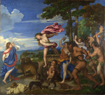
Blue became the colour of Mary, and began to be controlled by the Church, who maintained its high price and coralled its use.  Two hundred year later, however, Titian defied the convention, and Dr Fox looked at the restored Bacchus and Ariadne in the National Gallery in London.

Titian, Bacchus and Ariadne (Oil, 1520)
If you take a diagonal from top right to bottom left, half the painting is blue - costing a fortune to make.  It's not a biblical subject, and Ariadne is wearing the Virgin's colour of blue robes.  How exactly Titian got away with incurring the wrath of the church wasn't really explained.

Then it was on to Picasso, via a rather strange and unclear bit about Romantics and flowers.  In any programme about art history and the colour blue, you have to talk about Picasso and his Blue Period.  

"What was the event that triggered Picasso's Blue Period?" mused Dr Fox.  Well, it was the death of Picasso's friend Casagemus, wasn't it?  Woah, not so fast!

And this is what began to annoy me about the programme.  Dr Fox takes a very, very long time to make an obvious point, when a bit of judicious editing would make the whole programme more to the point and less about the presenter.  

And so we had the mean and moody monochromatic Dr Fox, in crisp white shirt, black tie and jacket and black hipster jeans, slouching about a train in a recreation of his Inter-railing youth on a trip to Paris.  Then he was wandering about Paris with some arty camera work.  Then he was in a bar.  All this to get across the point that Picasso and his best pal Casagemas went to Paris, where Casagemas killed himself.  It took an age.  I understand that not everyone might be familiar with Picasso and his story, but it still took an eternity.

Finally, we got to see a few paintings.  


And then we also had the opinion of a Jungian psychoanalyst thrown in, that Picasso was schizophrenic.  Which didn't sound much like Picasso at all.

Next it was Yves Klein, who actually invented his own colour (International Klein Blue) with the help of pigment specialist Edouard Adam.  The way you do.  Here is one of his textural all-blue paintings in his very own colour.

Yves Klein, IKB 191, 1962

There was a lot about Mr Klein (such as his love of judo), which would again have benefitted from editing, as it didn't really add anything to the main thrust of the programme, which was meant to be an exploration of the colour.  

Thus we got a baffling segment about a photo of Klein throwing himself out of a first floor window and taking a photo of the act (with Dr Fox climbing up a concrete pillar on the spot where the incident took place in order to make some sort of point - mostly that he's rather fit and flexible).  It wasn't made entirely clear what the outcome of the incident was or why it got such a prominent mention in the programme.  Again it was almost as if it was included in order to inject some drama and some sort of action sequence for the presenter.

Anyway, I think what he was getting across was that the point of Yves Klein was to do with blue being a liberating colour (it was the 60s after all), a colour that opened the windows to freedom and the great blue beyond where you could leave your earthly existence behind.  Except the photo was faked.  And wasn't blue.  It was all a bit muddling.

Yves Klein, Le Saut dans la Vide (Photomontage, 1960)


Which took us to the Most Annoying Bit of the whole programme.  A trip to Austin, Texas, to talk to a Saturn 5 astronaut.

Because Dr Fox had travelled all the way to Austin, Texas, and had sought out a real, live Saturn 5 astronaut, there was a long segment where we heard about the mission, where the astronaut repeated himself about the Cold War space race and described the rocket engines shaking him about, and how he nodded off at one point.  All very well, but detail we didn't really need to know about in the context of an art programme, because you could see with crystal clarity where we were being taken, and the whole narrative story arc that was about to clunkingly be made.

At the start we had Giotto with his other worldly blue of heaven.  This astronaut guy was the one who took the photo of Earth as a blue planet.  So blue is actually also the colour of home, and of Earth.  Get it?  Except, it wasn't an artist that was being interviewed, it was an astronaut, and it was a scientific photograph taken as part of his work, not a creative artwork.  The title of the series is "A History of Art", and this final conclusion didn't actually involve an image from the history of art at all.  Ok, so it was a very influential image.  But it isn't art, because it wasn't made by an artist.


So that really, really annoyed me.  

I really can't engage with Dr James Fox at all, and his presenting style.  I really want to, but I just can't.  I want someone who really speaks to me, not tells me how clever they think they are.  Just in the way that his whole outfit and persona should add up to him being one groovy, fit guy, it just kind of doesn't.  Similarly, the programme involves lots of exotic places, and hip camera work and on-the-spot re-enactments, but it somehow doesn't hit the mark.  It's not 'come with me on this journey' it's 'look at me'.  It's just not as insightful or as instructive or intelligent as it could be, and good art programmes are so rare that I really wanted this to be insightful and instructive and intelligent.

For a series that's meant to be about the emotion of colour and the passion of art history, it's all rather cold.  You can see the end point of the arguments way before they happen, and they take a maddeningly long time to finally arrive, via a whole load of extraneous whoffle that really should have hit the cutting room floor. It's frustratingly less than the colourful sum of its parts.

If we had time for astronauts, why didn't we have time to look at the science of the colour blue?  Why is it so intense?  How does it work on our eyes optically?  How does it act on our brains?  Why are Georgian libraries and reading rooms painted blue?  (Blue makes it easier to see printed word.)  Why are motorway signs blue with white lettering? (Ditto.)  Why do painters go to St Ives? (It's the intense blue light, which makes everything clearer and more beautiful, due to the reflection of light and the sky and the curve of the bays with the sea.  And they have good fish and chips.)

In short, it's a series that needs to be a whole lot less Foxy and more carefully thought out in order to actually be "A History of Art in Three Colours".   

Colour?  It just doesn't quite do what it says on the tin.

Next week it's "White".  I'm not sure if I'll be tuning in.

View the episode on BBC i-player here.

Wednesday 1 August 2012

WIGGOLD!

Yes, thanks to the Sun, and a mass wearing of cut-out-and-stick-on sideburns, Bradley Wiggins has got Olympic gold.

The Sun

(Print and cut out your own here - you know you want to.)

Unfortunately, I didn't see him set off on the time trial (nor did I see Sanchez unfortunately fall over the start line).  That's because I had a ticket to see Egypt play Belarus at Hampden.  In fact, I'd stupidly paid to see the game.  Nobody else in the stadium had paid for a ticket...

Anyway, this time, there were enough no queues, and enough pies to go round.  Looking round the stadium, it didn't take long to work out why....

Anyone there...?

Tumbleweed

The match was more hopeless than a game of Korean badminton, so I left at half time to go home to watch the cycling time trial.  (Apparently it all ignited at Hampden as soon as I left, to become a scintillating tussle with Egypt beating Belarus 3.1.)

Back at the cycling, Sir Bradley of Wiggins triumphed, and immediately ascended a golden throne outside Hampton Court where his first act was to decree that the National Anthem should be replaced by Paul Weller's You Do Something To Me.  Fair enough.


Bradley Wiggins sits on a throne after his victory in the time trial. Photograph: John Giles/PA

And with Chris Froome in bronze, that's a pretty good  past 10 days for British cycling.