Wednesday 29 February 2012

My Cameras - Canon PowerShot G12

As well as using my Nikon as my main 'serious' camera, I also find it useful to have something a bit more handbag-sized and portable but which still has all the features I need and takes a great picture.

To this purpose, I have a Canon PowerShot G12 more information here.


It wasn't the camera that I went out to buy - after reading all the reviews, I had an Olympus I mind. But when I got to the shop and tried out all the cameras, this was the one which was most comfortable to use in my hand, even though it is quite heavy and a little bulky.

It's built like a tank, so it's great when clambering over rocks and rough ground, or using it on the beach.  It has a really good 5x zoom, and has a high-sensitivity sensor which means it is really good at shooting in low light conditions - ideal for the Thames at night!  It also has an image stabilizer, which is an anti-shoogle feature that means you can take a picture really quickly and spontaneously out of a car window if you see a scene (as a passenger, I hasten to add, not driving), and you don't have a complete blur.

The best feature, though, is the big screen.  You can flip it out, turn it round and tilt it up and really move it around - you can use it screen-side out,  or store it screen-side in (clever) and just use the viewfinder.  It also allows you to see exactly the shot you are taking at any angle, so you can hold the camera down low (and get lots of nice foreground vegetation in the shot without lying on the ground or randomly pointing the camera at foliage) or right up high so you can get overhead shots.  This allows for great versatility and control of composition, so it functions equally well as a work camera or for getting a really nice sharp shot of Steve Hackett at a concert without the rest of the audience in the way!

It's pretty expensive on the company website, but if you shop around, you really can find some great bargains.

Tuesday 28 February 2012

David Hockney: The Art of Seeing

As a landscape painter, it's a big thrill to see a huge landscape exhibition taking pride of place at the Royal Academy, and one which is such a talking point.  

David Hockney's A Bigger Picture really is that - a vast exhibition of big, big paintings, in a big big space (all 13 rooms of the RA), which is ironically filled with huge amounts of sharp-elbowed folk in a marked contrast to the empty people-free calm of the pictures.

Sometimes as a painter of landscape, you feel that you might be considered to be at the edge of things, painting in some sort of old-fashioned sub-genre whilst the real artists get on with cutting sharks in half and embedding skulls with diamonds.  

"Landscape finished?" snorts the eloquently plain-speaking Yorkshireman Hockney in his BBC Culture Show Special film, "Only our way of looking at landscape is finished - so find a new way".  

And here is that new way, with i-Pad print-outs and multiple viewpoint films and great pulsating canvases of colour, all expanding on the sense that landscape is something to be experienced and lived and moved through like life itself.

If you've got any interest in the exhibition, or in landscape, painting, or just the way that paintings make us look at the world afresh and feel alive, then take a look at  David Hockney: The Art of Seeing on BBC i-Player.  It's a treat.

David Hockney painting on location in Yorkshire

Monday 27 February 2012

Thank you!

Now that I'm back from London, I'd like to take the opportunity to say a very big thank you to everyone who kindly came along to the preview of my show on Thursday night and who were so enthusiastic and supportive of my work.  

Thank you!


It really was lovely to meet everyone, and I appreciate that a lot of people had made a real effort to get to the gallery for the private view.


Hope you all enjoyed the show - and since two thirds of it has sold already, I guess it must have struck a chord!  But if you missed the preview, don't worry.  You can drop by at the gallery over the next 3 weeks - the show finishes on March 16th.


The gallery is very handy for the Royal Academy, so I took the opportunity whilst in London to drop in for the big Hockney exhibition (more later!).  I'd booked in advance, but it was still sardine city - not for the faint-hearted!  I also went to the theatre for One Man, Two Guv'nors ('hottest ticket in town') with James Corden, which was a lot of fun too, even from high up in the cheap seats.

I've also been taking a lot of new photos along the Thames, so hopefully there's more London paintings in the pipeline!

Wednesday 22 February 2012

Off to London for 'Between Tides'

It's off to London now for the preview of my solo show!  Very exciting....

 Heather by the Sand, Morar (Oil on linen, 32 x 48)

If you're planning to come along to the preview on Thursday between 6 and 8.30pm, then I look forward very much to seeing you there - everyone is welcome.  It's going to be a lot of fun!  Previews in London are always a big buzz. 

For more details on the gallery and the show, go to the Duncan R Miller Fine Arts website.

And if you've a particular painting in mind, then don't be late - there have been quite a few sales already!

The Sculpture Show, part 2

You can't have a show about 20th century sculpture without having work by Barbara Hepworth - which is fortunate, because she's one of my favourite artists.  I've been to see her work at the new Hepworth Gallery in Wakefield, at the Yorkshire Sculpture Park,  and several times to her inspiring studio in St Ives.

Her work is very feminine, very nurturing - not surprising, because she had four children, including triplets with fellow artist Ben Nicholson - and very rooted in the landscape, referring not only to her native Yorkshire but also to her adopted Cornwall.  

Don't mistake feminine for namby pamby - this is work of sensuous strength and vitality, and forms a complete contrast to the rooms later in the exhibition of hard-edged male militaristic or machine aesthetic art.

This is Curved Form (Oracle) 1960.


Made of carved guarea wood, the tactile fluid form is smooth and natural on the outside and more textured and painted on the inside.  It is sensuous and mysterious, suggesting perhaps a seed-pod, nurture, reproduction and ripeness.  

This is Wave of 1943.


Again carved in wood and painted, is contains strings, and so suggests a musical instrument or aeolian harp.  This gives a sound dimension to it, almost as if you listen very closely, you can hear it, like putting your ear to a seashell.  The sculpture is meant to be a view of the sea, encapsulating many viewpoints of a landscape in one (rather like a Peter Lanyon painting).  'The horizon of the sea is enfolded by the arms of the land to the left and right' (wrote Hepworth), with a great sweeping gesture held by the tension of the strings.

(Not all of her sculptures are of wood, nor are they small - there are many epicly-sized public sculptures and Wakefiled has the most amazing plasters.)

The next room contained Epstein and Gill, not their best examples.  It included a great clunky ugly alabaster by Epstein. 

However, the 'Geometry of Fear - 1950s Britain' was a very interesting room.  Elizabeth Frink's small bronze birds from 1959 aren't pretty, delicate things.

 
These are disjointed, fractured forms, menacing and militaristic, like something out of Star Wars.  They are the bronze version of Ted Hughes' poem Hawk Roosting (published around the same time these sculptures were made).  Both creative forms, poem and sculpture, are born out of a post-war Britain that has itself been taken apart and brutalised, and is trying to find itself again.

Similarly, Kenneth Armitage's 1957 figure on its side, with its stick-like legs, has literally been knocked sideways and can't stand on its own two feet.
In the room also are Eduardo Paolozzi's assemblages - large forms created out of make-do-and-mend recycled scraps and objects.  

 Eduardo Paolozzi St Sebastian 1957 bronze

It's as if they are self-made figures, trying to piece themselves back together and find themselves again, and to create a new world order out of the chaos in which they find themselves.  They are rather touching in their rag-bag appearance, and almost heroic, as these are figures that are, indeed, putting themselves back on their feet.

Overall the exhibition is a very deft piece of curating, the Geometry of Fear room especially (although it would be wrong to think that all post-WW2 sculpture consisted of the fractured forms suggested displayed in that room - just look at what Hepworth was doing in the same era).  

However, it is a difficult thing to make sense of such a big subject, but by making good use of the layout of the gallery, it manages to tell a cohesively thought-provoking, if not exhaustive, story.

Tuesday 21 February 2012

The Sculpture Show, Scottish National Gallery of Modern Art

During half term, I managed to get through to Edinburgh and take in a few shows, including a trip to the Gallery of Modern Art.  I was especially keen to take in the sculpture show, and to see how it compared with the very disappointing British Sculpture exhibition at the Royal Academy a couple of years ago - having a theme of 'sculpture' for a show is, after all,  ludicrously wide ranging.  How to curate and make sense of such a large subject?

The answer here was to narrow the range between 1900 and 2012, and to arrange the rooms each with a theme.  The first room that I entered was all about the human form, and contained Ron Mueck's super-sized A Girl (2006).

Born in 1958 in Melbourne (Paula Rego is his mother-in-law, which I didn't know), Mueck's hyper-real sculptures are meant to give a disconcerting sense as you are able to look at something normally quite small in super-close-up, including individually applied hairs on the baby's head.  However, I found that the skin was just too shiny and unreal to carry off the illusion and trigger that disconcerting feeling.  Or maybe I've watched too many episodes of One Born Every Minute to feel any sense of shock.  Or maybe it's having had a baby - of course they feel that big!

In the next room were less literal represenations of figures, with works by Man Ray, Marcel Duchamp, Sarah Lucas (with her stuffed tights) and Henry Moore.

Henry Moore, The Helmet 1939

Moore's piece is at once something militaristic, and also a mysterious abstract object relating to the human form, being one thing inside another.  It can also be read as a mother and child, with the 'helmet' as the protective mother.

Further rooms contained works by Nick Evans - 'Oceania' is a giant checker board with huge coral-like figures, and a dull Damien Hirst retake on Degas' 14 year old ballet dancer.   Then I discovered Room 1 where I perhaps should have started...

Now we're talking!  This contains a piece by Medardo Rosso - 'Ecce Puer' (Behold the Boy) of 1906.

 
This plaster sculpture was inspired by seeing a small boy push his face against a net curtain, revealing the form in a ghostly, partially hidden, mysterious shape.  The result is a textural, organic form.  

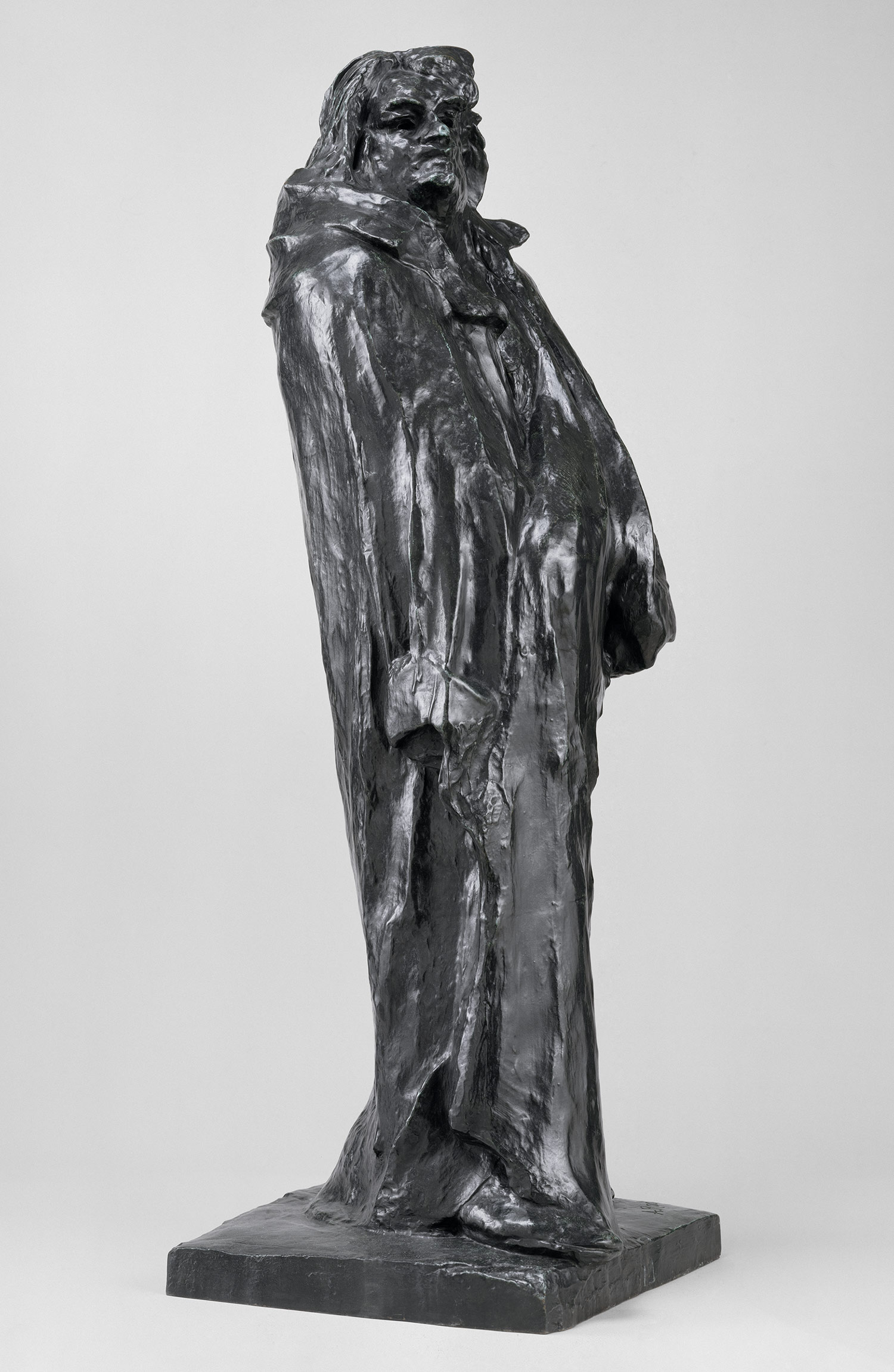
Then there are Degas' bronzes, where you can feel the fingers of the artist in the work.  Hurrah, there is Rodin, and his study of Balzac, with the figure and the dressing gown all merging into one expressive gesture, like a wave, with an organic synthesis of foam and hair forming the head at the top.


Rodin leaves the marks of the manufacture clear to see.  You get a sense of precisely what it was like over a century ago to take a piece of wax and work it into a shape with your fingers.  Nothing says that more clearly than the back of his Flying Figure 1900, which originally had a second figure as part of the sculpture.  Rodin then decided to remove it by slicing it off with a large knife.  You can see the sawing action through the wax as he carved it off, like a Sunday joint.  Instead of smoothing off the site of the butchery, he decided that this was all part of the genesis of the piece, and so it is preserved as the final bronze.

This Impressionist sculpture, where you can see the process behind the finished object, of course reflects what was happening in painting in the last part of the 19th century.  Painting was changing from highly-finished, studio-created  Salon paintings, where brush marks couldn't be detected, to en plein air Impressionism, where expressive gestural brushwork was the order of the day.

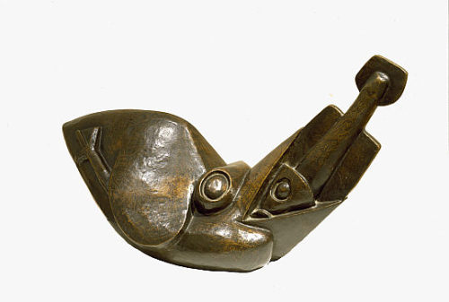
Then it was on to a room of Cubist sculpture, of which there's nothing much good to say except I was heartened by again meeting Henri Gaudier Brzeska's Bird Swallowing a Fish.

It's a beautiful thing, a beautiful shape and a lovely patina.  It was made in 1914 a few months before the start of WW1 (in which Gaudier Brzeska was killed in 1915 at the age of 23).  This was created by someone who was just 21!  How many students coming out of art school could make something like this?  It's a fusion between machine aesthetic and the organic, with a torpedo like fish being rammed into the beak of a tank-like bird.  

It's a resonant precursor of Isaac Rosenberg's WW1 poetry, where he also combines striking imagery of the fusion between the destroying machine and the lyrically organic; as in the poem Dead Man's Dump where 'the swift iron burning bee/ Drained the wild honey of their youth', or in August 1914, 'Iron are our lives / Molten right through our youth. / A burnt space through ripe fields / A fair mouth's broken tooth.' 

More tomorrow!

Monday 20 February 2012

At the Scottish Contemporary Art Auction preview

I took the opportunity today to drop into McTears in Glasgow to have a look at my Life Study which is coming up for sale in the auction tomorrow.  I couldn't remember what sort of a frame it was in, and I thought it would be good to see it again.  

Despite being 21 years old, it still looks fresh as a daisy!  Here it is...


As you can see, it's in a plain wood (obeche) frame with a gold slip and a plain double mount. The moulding of the frame is about 4" wide, and the outer measurement of the frame is about 32" wide by 42" high.

It's a good big picture, so it will be very interesting to see how much it sells for tomorrow night.  It's not often you see my work in an auction, so there's usually quite a bit of interest - but I'm sure someone's going to get themselves a bargain!

Friday 17 February 2012

All is Calm, North Berwick

This is currently on show at the Royal College of Art until Sunday. 


It's All is Calm, North Berwick, and it's a biggie - 32" x 48",  oil on linen.

It was painted in May, and was a lovely warm, bright and sunny, if changeable day.  The seaside town of North Berwick, just south of Edinburgh, is behind and to the left.  The scene looks out over the Firth of Forth towards Fife (the land just on the horizon).  The long low island is Craigleith.  If you swung round to the right you would see the famous Bass Rock.

I've painted the Bass Rock many times, but for this painting I chose the more unusual scene of these rocks on the beach and their reflection in the calm water.  I liked the contrast of the dramatic shapes of the dark rocks in the middle ground with the gentle shape of Craigleith in the background, echoing the calm of the sea.  I also wanted to bring out the blue of the sea and sky by notching up the orange tone of the sand.

I also liked the dark tide-line of the seaweed, which carries your eye round out of the painting on a continued sweep of the bay.  I turned the paintbrush round and drew into the paint to get the texture of the fronds.

Look out for the painting if you're at the 20/21 International Art Fair today or this weekend!

Thursday 16 February 2012

20/21st International Art Fair, RCA London

The big 20/21st International Art Fair opens today at the Royal College of Art in London.  I've got new work on show there with Duncan Miller as a little taster for my solo show which starts next week.

Small Dog, Green Park (Oil on linen, 24 x 26)

Running from 16 - 19 February 2012, the fair features modern and contemporary art from the UK but has a significant number of dealers who specialise in work from China, India, Japan, Russia, Poland, Serbia and the Ukraine.

However, art from a whole host of other countries will also be on show including many European countries, and, this year a special exhibit from Australia. International names include Braque, Chagall, Matisse, Miro and Picasso, plus British favourites such as Peter Blake, Damien Hirst, David Hockney and Henry Moore.  And me!!

If you're thinking of going, then you can get a free pair of complimentary tickets by going here to the  Wren Gallery website.  Click on the link and print them out. 

Enjoy!

Wednesday 15 February 2012

William Gillies - Landscapes and Still Lifes

As it's the half term break, I took a trip through to Edinburgh to catch up on a few shows.  Top of the list was the William Gillies exhibition at the Scottish Gallery.

Gillies was born in Haddington in 1898, was one of the Scottish Gallery's major artists, but remains rather under-rated.  His work is quiet and subtle, with reflective interiors, views from windows, or locally Scottish landscape scenes done from the side of the road where he could park his car.  He was a well-loved teacher, and taught Elizabeth Blackadder.

This is a sepia ink drawing of Trees near Temple (Temple being Gillies's home from 1939 until his death in 1973).


It's dense, because you are glimpsing houses through tree trunks and branches, but there is a lovely calmness to it. There's also a mischevious sense there, as you're given a playful little glimpse of the buildings.  The trunks of the trees are left blank, giving a lovely vertical airiness to the piece, balancing the complexly busy horizontal band.

On the Meldons Road, painted in 1953, is a lovely subtle pastel-coloured watercolour.


It's not a painting that shouts; it doesn't depict a dramatic mountain or an extraorinary moment.  The hillside rolls up towards the sky with great familiarity, like a comfortable bedspread, and the wall at the bottom tells you that everything is very safe and enclosed and ordered.  It's a very truthful and contented piece of painting, both a recognisably real Scottish place and also about pattern-making on a 2-dimensional surface.

I also loved this little watercolour of Rockcliffe.


It's just such a happy painting, with the shape of the boats mimicing both the clouds and the waves, as if everything is just right together.  The warm yellows and earthy oranges of the hillside complement the strong blues of the sea and sky, but the blue tones are also carried through the hillside, so that everything is harmonised.  The line of the land meeting the sea is squint, making it feel natural and organic, otherwise there would be a harsh line chopping the composition in half.

Also on show was this lithograph, Cottage Window, of 1946, produced for the Arts Council.


I was very interested in this, because I have one!  I got mine many years ago at the Barras.  The example in the Scottish Gallery has faded somewhat, with rather sludgy colours.  The one I have has much brighter pinks and oranges.  I asked what the edition size was of the lithograph, but unfortunately they were unable to tell me.

I love Gillies's paintings and drawings, especially the landscapes.  They're just very, very Scottish.  I think he's really under-rated, and I'd love to own one - apparently the Scottish Gallery used to have a bargain bin of his watercolours which you could pick up for 20 guineas - sadly, no longer!

The show continues at the Scottish Gallery until 3rd March. For more information, and to see all the work in the exhibition, go to the Scottish Gallery website.


Monday 13 February 2012

Scottish Contemporary Art Auction - one of my drawings up for sale

One of my life studies is coming up for sale in a Glasgow auction shortly.  

It's Lot 301 in the McTears Scottish Contemporary Art Auction on Tuesday 21 February.

It's of a model called Lynn and was done at Glasgow School of Art quite a long time ago now, so it's really strange to see it again after all these years!  It's funny that it still looks like something very familiar.

It's a big piece, and is described in the catalogue as 'ink on paper' - in fact, it's painted in Payne's Grey gouache and Indian Red watercolour on a cream coloured paper.  (Indian Red's a really useful colour for life drawing, I'm very fond of it.)

It was originally sold through Art Exposure Gallery in Glasgow in 1991, and has now come up on the secondary market.

It was the first life study I ever sold - in fact, I've sold very few, so it's a rare piece.


You can take a look at it in the catalogue here on the  McTears website .  

It's quite exciting because you can listen live to the auction as it happens on your computer, and even join in the bidding.  (Fortunately, I'll be out at Art School, so I won't be able to follow it live myself and get tempted to bid...!!)

Headland, Causeway Coast

Here's another little painting from my London show with an interesting story behind it.  This is 'Headland, Causeway Coast', painted at the Giant's Causeway.


I went very early in the morning, when there was still a lot of early mist, and spent a long time walking along the paths by the shore, and then back along the cliff path, which forms part of the Ulster Way, to get a different angle.

I sat for a long time in a very secluded spot looking down over the bay and watching the light change, taking a series of photographs.  It was very quiet and completely undisturbed, and away from the normal tourist trail.  There were lots of harbells and wild frlowers, and it was very peaceful.

Or so I thought - because who should come around the corner but two Dutch geocachers (hullo Wim and Marianne!).  Geocachers are an online community who follow clues given on the web to real physical places where small caches of treasure are hidden in the ground.  And it turned out I was sitting right on one of them.  What were the chances of that?

Anyway, Wim and Marianne were lovely, although it probably gave them a bit of a shock.   I don't think 'red-head with camera' was in any of their clues....

Over the years that I've been visiting the Giant's Causeway, it's become much busier and more difficult to park.  Now they have a park and ride at Bushmills, which you have to use unless you go really early and can get into the car parks beside the old visitors centre.  They're building a huge new visitor's centre, which, according to the artist's impression, looks obtrusively massive, and houses all sorts of 'interpretation centres'.  How much interpreting do rocks need?

I plan to go back this August as usual, so we'll see what changes there have been....

Friday 10 February 2012

Harebells by the Sea, Cushendun

Here's a cute little painting from my new show...


It's a little oil 10" x 10", called 'Harebells by the Sea, Cushedun'.  As usual, I was over in Northern Ireland last August, and travelled along the Causeway Coast which this year was covered in delicate little harebells.

I stopped on a steep hill, where the fields run down to the seacliffs, and you can see Rathlin Island in the distance.  It was very sunny and breezy, and there were high verges at the side of the road, so I could get right down low to take the photo and make the flowers a real foreground feature. Here's the photo...


It was a really uplifting scene.

Someone else obviously likes it as well, as the painting has sold from the catalogue with still nearly 2 weeks to go until the show opens!


Thursday 9 February 2012

Favourite paintings - Caravaggio

If I was to be give one painting in the world to own, then I think it would probably be this one.


It's The Deposition from the Cross by Caravaggio, painted in around 1600-1604, and it's in the Pinacoteca in the Vatican in Rome.  It's just beautiful.  You look at the real thing close up and you think 'how did he do that??'

It shows Christ being taken down from the cross to be laid in his tomb.  It's a huge painting, and when you're standing in front of it and looking up at it, the figures seem to tumble down onto you in an almost inevitable movement towards the grave, in which you seem to be standing.

It's a fine example of the dramatic lighting that Caravaggio was famous for 'chiaroscuro' or 'light dark'.  It's almost like looking at a still from a film where the characters are bathed in a spotlight.  

Caravaggio was pretty clever in his use of light - often the paintings were commissioned for specific places within chapels (such as in S Maria del Popolo in Rome), so he used real light sources in the chapels which hit the figures in the paintings in the same direction as the painted light source.  In The Calling of St Matthew, this is divine light, following the gesture of the hand of Christ as he calls Matthew.  

But it is also real light from a window to the right in the chapel where the painting is hung.  Caravaggio is playing a complicated game on lots of different levels.  His paintings communicate with and refer to their surroundings as well as with us.  He's extending the 'world' of the painting into our personal space, which is a pretty conceptual, sculptural idea.  

He filled his work with plain ordinary people in contemporary clothes in the scenes of biblical events.  Sometimes he even included a portrait of himself in the scene, to say 'I'm right here - you are too.'  The figures in the deposition have dirty fingernails and bare feet and struggle awkwardly with their task, something which outraged patrons and shocked polite society when they saw Caravaggio's paintings.   I doubt he cared much.  His message was that religion isn't about saints and heaven, as so much of Baroque art was, it's about ordinary people right here and right now (and that included women - he was an amazing painter of women as real women).  It was totally inclusive.  He didn't compromise.

To get the drama of the light and dark in the paintings, Caravaggio painted quickly out of a dark ground, moving towards the light colours.  There weren't any preparatory sketches, he just got right on with it.  

He painted from life, posing a group of models, and then scratching the main thrust of the composition and main lines into the ground with the end of a brush.  If you stand to the side of a lot of the paintings, you can see this when the light catches the marks.  (You can see it especially clearly on The Sacrifice of Isaac.)  

He painted fast.  He had to, as there's only so long models can hold poses like that, plus he was usually on the run.  He had quite a temper, and was always getting into trouble.  This was a man who matched his work.  He was dressed in black, dark eyes, dark hair, dark beard, slept in this clothes because he was always ready for a quick getaway.  He picked a fight with a waiter about a plate of artichokes (the old butter/olive oil debate).  He killed someone during a game of tennis.  His paintings were all light and dark and simple and complex, and so was his life, all contradictions.  What a guy.

I could go on for ages.  Luckily, the world's hottest fine art historian has recently published the definitive biography of Caravaggio, so if you're interested, read Andrew Graham Dixon's 'Caravaggio; A Life Sacred and Profane'.   

Agree?  Disagree? (Not with Andrew Graham Dixon being hot - no-one disagrees with that on my blog).  Got a favourite painting of your own you'd care to share?  Then let me know, either below or at judith@jibridgland.com


Wednesday 8 February 2012

Mark making with a palette knife

Here's some pictures of palette knife action!  Hopefully it will give you a few ideas about mark making.

This is the scene in the studio.  I've got my new canvas ready with a coloured ground, the image that I want to paint ready.  The idea of how I want to do the painting is in my head (the general tone and feeling of what it was like being there - stormy, sunny etc), with the photograph blown up and taped to my easel, and my palette all laid out.  Time to go!

I usually work from the top down, so it's sky first.  I know what sort of mark I want to make - something big and expressive - lots of big blustery clouds and airy volume.  So, picking up the mixed paint from the palette with the narrow edge of the knife...


That's the amount of paint that I want to put on the canvas in one big mark, and it's all ready to go on the edge of the knife there, so the mark is going to be the width of the end of the blade.

Here goes...

On goes the paint in a nice big expressive smooth mark.  You keep moving the knife in a controlled directional sweep as long as you have paint on the knife, so I suppose it's a gesture that lasts about two seconds to complete.  Varying the pressure gives a different mark.


The orange mid-tone of the background is the complimentary colour to the blue of the sky - as you can see, the paint applied by the palette knife doesn't go on in a completely smooth lump.  It has texture to it, especially round the edges on the tooth or roughness of the canvas, so that the background shows through a little bit.  That means you have the blue and the orange working together, making each colour extra zingy - the blue looks bluer because of the orange.  (Old trick I picked up from Delacroix.) 

I don't know exactly how the mark is going to look until I've finished making it.  It might not be the right one, but you look at it and think 'is that saying what I want it to say?'.  If it isn't, I change it, by modifying it, or by making a different mark.  

But unless you're making marks, and making mistakes, and making corrections, you're not actually painting.


This part is the sea, which I roughly sketched in with a small watercolour brush and thinned prussian blue, just to get a sense of the shoreline and where I wanted the main movement of water and waves and tide to be.  

You can see that the palette knife has created some nice large rounded texture and lumps in the sweeps on the right.  I have now put a little paint on the knife and dipped it into my dish of turps so that it carries a film of turps on the blade.  I'm then drawing the edge over the canvas with a scraping action, so that the paint is both thinned and scraped off, giving a very flat, thinly painted area.  This is the part where the water is coming into the beach, so there's not so much in the way of waves.  I therefore wanted a calmer, flatter area of paint to form a contrast.  

There has to be contrasts, otherwise the paint surface would look too busy and unreadable, like an action movie that's nothing but explosions.

As I said before, there's no right way or wrong way of doing things, it's just a case of trying things out and seeing what works for you.  I use my palette knife in a variety of different ways, and use it to apply a lot of different marks.  You can even use the tip to incise very very fine marks right into the paint, so it can be a very delicate tool, not merely for trowelling the paint on.

Give it a try.  See if it works for you.

Tuesday 7 February 2012

My palette

Just before I go out and do battle with the Grim Reaper (that's the statue, hopefully not the real thing), I thought I'd answer a question I've been asked by posting something about my palette and the colours that I use.

I use Daler Rowney Georgian oil paints.  I buy them in 225ml tubes, and buy white in 5 litre tubs.   

Here's my palette, which is the top of an old school desk.

It's not set out in the order that a text book will probably tell you, but it works for me. 

I try to use 2 types of each colour, so 2 yellows, 2 blues etc, one being cold and one being hot, but over the years that's expanded slightly.  What you can see here in the massive lumps is (starting at bottom left and moving clockwise) 

two browns - raw umber, burnt sienna
two greens - viridian,  sap green 
three blues - prussian blue, coeruleum (the turquoise at the back), cobalt blue (in front of it) 
reds - rose madder (the pink to the right of it), crimson alizarin (to the right of the pink), cobalt violet (at the back), vermilion (the scarlet colour)

You can also see here a small ceramic pot which I put over the liquin to keep it from drying out overnight, and a dish of turps.

Then down the left hand side there is 

yellows - cadmium yellow deep, cadmium yellow, yellow ochre, naples yellow 
whites - mixing white (from the 5 litre tub), titanium white from a 225ml tube  (which has a nicer more creamy consistency)

You can also see in amongst that yellow/white section there's a pool of liquin.I mix the colours in the centre, and there's also various scapers for cleaning the board in there, and bradals for signing with.

There's no black - to get the darkest dark, I mix the prussian and raw umber together, and you can add the violet and/or sap green to it, depending on what kind of a dark you want.

Lots of heavy metals going on there, cadmium, titanium, lead - colour comes from the centre of the periodic table with all those metallic elements - so you definately don't want to eat the stuff!  However, it does get everywhere....

Monday 6 February 2012

Sculpture!

I thought you might like to have a quick look at some of the work I'm doing in my sculpture class.  This is the stuff I do for fun!

I do evenings at Glasgow School of Art, and this is the piece that I'm working on at the moment.


It's constructed from hessian material covered in the world's supply of plaster, and placed over a metal and wooden armature to support it.

It's an old trick I picked up from Rodin, who used a real dressing gown dipped in plaster as a study for his finished bronze sculpture of Balzac...


However, with all our struggles so far in the studio with giant sheets of monumentally heavy plaster-coated hessian slopping all over the place, I think I'm on a pretty steep learning curve....


Friday 3 February 2012

Brushes and palette knives

I've been asked a question about what sort of brushes I use to paint with, so I thought I'd do a quick blog about the type of tools I use.

I like to get a variety of marks down on the canvas, so pretty much anything can be used as a mark-making object.  I use a variety of brushes and palette knives as you can see, but also basically anything to hand that can be used to make a mark - the edge of a piece of card, a roller, a stick.  It depends what mark you have in mind, then you look round to see something which you can use to apply the paint with. 

Here's a selection of the types of brushes that I use.


As you can see, there's everything from (R-L)

a cheap wide flat bristle brushe, good for making large gestural strokes; 
an eye-wateringly expensive large soft cats tongue, again for large soft marks; 
chinese calligraphy brush for long thin-wash marks; 
a lovely goats hair chinese brush ('capra') which I picked up in a market in Milan and which caused a problem at airport security, again good for loose marks with thin paint; 
narrower cheap flat bristle brush, for finer background passages; 
a 1" flat; 
smaller calligraphy brush;
long natural hair watercolour brush for picking up paint and doing expressive flicky loose marks such as grasses;
short round natural fibre watercolour brush for doing detail;
brush handle sharpened at the end for drawing into the paint.

I also use palette knives of different sorts.


The plastic ones are very flexible, almost like the sort that you use to get cake mixture out of mixing bowls.  If they're too rigid, then they break at the handle.  Again, the metal knives are very flexible.  The large one in the middle is my favourite, very versatile, good for skies and sea.  You can get lovely waves and clouds with it.  The plastic ones on the left I use all the time for getting the paint on so I can start working the finer detail.

It's just about finding the right tool to make the marks that express what you want to say.  All you're doing is mark-making.  

I tried out lots of knives in the shop to see what sat best in my hand and what I could do with it, how I could move it about, how I could bend it and flex it to move the paint where I wanted. The sides of the knives are just as useful as the flat surface, so it can be used to incise or cut the paint, as well as make very large flat marks ands sweep the paint, and off course they're a great quick way of mixing colours.

If you dip the large knife into a small dab of oil, then into your dish of turps, then you can do very thin large washes of paint, or scrape paint off.  Never be afraid to scrape oils off again.  Show it who's boss!

Thursday 2 February 2012

Solo show now online!

You can now see the images online of all the 36 paintings in my solo show.

View the show here

If there's anything you'd like to ask about any of the paintings, then just get in touch and I'll be happy to answer - drop me a line at judith@jibridgland.com

Seems like it's not long to go now until the show opens!   All very exciting, and I'm really looking forward to it.
 
Rosebay Willowherb, Morar (Oil on linen, 24 x 26)

This is another of the paintings in the exhibition.  It shows a beautiful array of rosebay willowherb at the side of the old 'Road to the Isles' by the white sands of Morar.  

It was a lovely clear early summer day, which meant that you could easily see the mountains of Skye and the distinctive shapes of the islands of Rhum and Eigg in the distance.  There was a little yacht with a white sail making good speed in the distance. 

It was a scene which seemed to capture everything you imagine about the beautiful west coast of Scotland, with its free open spaces, wonderful scenery and amazing light.

If you've got any thoughts you'd like to share on this painting, or of any others on the blog, do leave me a comment and let me know what you think.

Wednesday 1 February 2012

Catalogues arriving soon!

The catalogues for my solo show will be arriving any day now - very exciting!

Montbretia in August, Rinagree (Oil on linen, 32 x 48)

If you'd like one, or an invitation to the preview on Thursday 23rd February, let me know.  Send your postal address to judith@jibridgland.com

This is one of the paintings that will be in it - it's a big juicy oil of the Causeway Coast in Northern Ireland, looking out over the cliffs and the stormy sea towards the western isles of Scotland.

For more details on the show, please go to Duncan R Miller Fine Arts