Tuesday 30 June 2015

What This Hand Has Done Today...

So what's this chubby hand been sculpting today?

Opinions range from seed pods...

to animal bones...
...to two figures...

...depending on which angel you look at it from.

I'm a great believer in letting the object become itself, and not being too prescriptive. It will tell you what it wants to be.

It's just I'm not sure even it knows what it wants to be yet.

Meanwhile, in a corner of the workshop far, far away, the Death Star is being constructed.

Monday 29 June 2015

Sculpture Workshop Day One

It's day one of my sculpture workshop, and I thought you'd like to see how far you can get in a day.

I started off with the idea of several pieces that I've seen that all had elements that interested me.

I liked the simplicity and surface texture of this very feminine piece, with its painted plaster surface

Barbara Hepworth, Single Form

I liked the exciting pitted surface marks of this huge Henry Moore piece, which looks like a whale bone, although I didn't like the clumsiness of the shape.

 
Henry Moore, Three Way Piece No.1: Points 1964-65 (plaster with surface colour, hessian on wood support)  Photo: Jennifer Hicks 

I liked the organic, coral-like sway of this marble, one of the final pieces by Michelangelo in Milan. It's quite abstract, especially as it has the remains of another sculpture still visible as part of it (an arm on the left hand side).  On the back, it has a variety of exciting mark-making.


I decided that for my week-long workshop, I wanted to do a plaster piece, with lots of surface markings, contrasted with smooth painted surfaces.  I wanted to do something fairly abstract, with an organic feel.  Other than that, I'd let the object become itself, and rely on found objects and odd lengths of welding rod in the studio, so I wasn't going to be too prescriptive.

I started by using a found piece of steel for the base plate, and welding together an armature of found and cut rods to make a roughly bicuspid shape, like a seed pod.


I placed the structure on a wheeled trolley, so I can easily move it around to work on, and cut long lengths of scrim which I draped on the armature.  I then prepared buckets of casting plaster, dipped the scrim in, applied it to the armature, and then applied handfuls of plaster to the form to create the volume.


I think you'll agree that so far, it looks absolutely nothing like anything!!

Thursday 25 June 2015

In The Studio

Latest paintings on the go...

...some more California poppies and honesty from my garden...
...poppies at the North Berwick with the Bass Rock in the background...
...and an atmospheric landscape.


Wednesday 24 June 2015

The Silver Ticket - Barbara Hepworth

My invitation has arrived for the special private view of the major Barbara Hepworth retrospective at Tate Britain.

It's the first major retrospective in London of the sculptor's work in 50 years.  And I'm going!!

I was at the Hepworth Wakefield the other week to see complementary exhibitions about her work, as a scene-setter for the Tate show.


The first was Hepworth in Yorkshire, about her early years in Wakefield, which sets the scene for her later working life.  It's interesting that Hepworth's very RP accent which you can hear in later documentaries and films doesn't betray anything of her Yorkshire roots - all part of her careful self-image and projection of herself as an international artist.

Here she is on holiday at Robin Hood's Bay in 1925 - as ever, her pose shows that she is very conscious of her artistic image, even early on.
Barbara Hepworth on holiday at Robin Hood's bay, 1925 Photo: BROWNES, HEPWORTH ESTATE

This is a recently discovered early portrait of Hepworth by Ethel Walker.

 
The second exhibition was A Greater Freedom, focussing on her prolific final decade (because artists don't retire), in which she explored new materials such as marble and bronze.  I have to say, I find that the more expensive and precious her materials became, the less connection I have with the work, finding it too sterile and uninteresting.  It looks coldly over-finished, over-processed, lacking in that warm, tactile, sensual quality.

Three Forms (Bronze, 1971)

However, this decade also saw her purchasing the Palais de Danse in St Ives in 1961, the large space opposite her studio (which has, excitingly, just been purchased by Tate St Ives).  This large space allowed her to take on such monumental commission such as Single Form for the United Nations.

Here's the photo I took of Single Form last time I was in New York (amidst construction work at the UN).
 

There was also a great display of her printmaking, which showed that she was very interested in the simple, textural marks that you can get on the zinc lithography plate, and of gestural, fluid water-like marks that are possible in the print process.  This mark making has everything thing to do with an artist's interest in a print as means to an end, and as a source material for exploring mark-making possibilities, rather than a print-makers obsession with process.

As ever, it was a joy to look at her plasters, with their wonderful, warm surface textures and painted patinas (which in their watery, gestural sweeping brushmarks, are reminiscent of her prints).  They demanded to be touched.


Which sadly, you can't.  Here's the much much smaller plaster for the UN piece, in the main room of the Hepworth Wakefield.  It has an incised circle instead of the cut-through hole of the UN piece, a pitted surface texture like a natural stone or marble, and a lovely sweep of coloured washes in burnt sienna and Paynes grey, with a beautiful pink tinge of rose quinacridone at the bottom...

...and a beautiful tactile groove running up the back that you just want to run your finger down.  Which again, sadly, you can't.

There's also a wonderful display of how her plasters are created, with the armature


and the finished piece in plaster
 

which would then go on to be cast in bronze.  Here it is in Hepworth's garden at her studio in St Ives.  The bronzes in the garden are meant to be viewed in the context of the shapes of the plants and the sunlight and shadows of the garden.  You can often see how the shapes of the sculptures make reference to and play against, for example, the organic shapes of the cheeseplant or cacti in her greenhouse.
 

The Wakefield gallery is first rate at showing the tools of the trade, and explaining the processes.  Inspiring stuff.

Next week I'm off on a week long sculpture course, and as well as looking forward to the Tate show, I'll be taking a lot of what I saw in Wakefield to my sculpture class.

BARBARA HEPWORTH; SCULPTURE FOR THE MODERN WORLD OPENS TODAY AT TATE BRITAIN, LONDON.  Until 25 October 2015.

Monday 22 June 2015

Why Has No-one Thought Of This Before?

Mirrored beach hut, Worthing beach, by ECE Architecture

Of course it will look beautiful until...

it gets attacked by seagulls
birds fly into it
it gets covered in guano
dogs pee on it
it gets smeared with ice-cream
the mirrors gets broken with stones
etc etc.

But it is beautiful.  I don't know why, but it is.  

It has a sort of simple joy.

Holland Park

I've also recently completed some paintings of Holland Park in London.  It's a great little park that I hadn't visited before - it has lots of different areas to explore, formal and informal - even a field for grazing cattle!


This is a wild area around the pond, which was just bursting with the beautiful colours of the azaleas...


Here's my finished oil painting of the pond.  Somehow it doesn't seem nearly as beautiful as the real thing...


Sunday 21 June 2015

Some New Paintings from the Studio...

Thought you might like to see some new work from the studio.  I'm trying to pull a few things together before the summer break, and so the paintings reflect a few of the ideas I've been looking at and exploring over the last weeks.

There's a couple of Tower Bridge from Bermondsey (you can see the original photos and read the blog HERE) ...

Setting Sun, Tower Bridge from Bermondsey (Oil on linen, 16 x 16)


Tower Bridge at Dusk from Bermondsey (Oil on linen 12 x 12)

Then there is some work from my trip earlier in the year to Yorkshire, where I travelled up the coast from Spurn Point to Whitby.  Flamborough Head is sort of the half-way point!

Gorse at Flamborough Head (Oil on linen, 20 x 30)

Sandsend (Oil on linen, 16 x 16)

Finally, there are paintings exploring the seasonal theme of the flowers in my garden, which is always a rich source of material.

Bluebells (Oil on linen, 16 x 16)

Honesty and Yellow Poppies (Oil on linen, 12 x 12)

Sunday 14 June 2015

Sargy Mann: How a Blind Painter Sees

There's a really fascinating essay HERE about the painter Sargy Mann, who unfortunately died two months ago.  

Mann was a painter despite having limited vision, and for the last 25 years of his life was registered blind.


I won't use the word 'inspirational', which perhaps has certain patronising overtones.  But as an artist I am acutely aware of my eyesight and the need to see and observe clearly.  His essay therefore gives a very powerful and moving account of what it is to 'look' as a painter, and of the different ways of looking and perceiving a world which you have a innate burning desire to create and record visually, but cannot see. 

Painting, like life,  is a constant problem solving process, and there are many ways of seeing - such as through touch, sound, verbal description and memory.

Sargy Mann, Two Bathers

Sargy Mann, Frances in Hammock by the River No2

Read his essay and feel humble.


Look at the full essay and the catalogue for his final show (which opens at the Cadogan Contermporary Art Gallery on July 7th) HERE .

Monday 8 June 2015

Marie Curie Exhibition at Glasgow Art Club

Here's two of my paintings (at far end of room on the end wall - see if you can spot them!) at the recent Marie Curie Exhibition at the famous Glasgow Art Club.


Above the paintings,  you can see the newly uncovered and restored frieze by Charles Rennie Mackintosh.  

It was stencilled onto the wall in 1893 when the artist was 25.  It was subsequently covered up, and has taken 3 years and £1.2 million to restore.


Thursday 4 June 2015

Affordable Art Fair Hampstead

Just to let you know that if you're in north London next week, I've got paintings on exhibition at the Affordable Art Fair in the tents on Hampstead Heath.

 Bluebells in Woodland (Oil on linen, 16 x 16)

There's over 100 galleries with art from £100-£5000, and my paintings are the Duncan R Miller stand.  If you do go, have a look out for them!

The Fair runs from 11-14th June.

Wednesday 3 June 2015

Richard Diebenkorn's Search for Rightness

The other week I went to the Richard Diebenkorn exhibition at the Royal Academy.  Diebenkorn (1922-93) was an American landscape artist closely associated with the West Coast, who, very unusually,  journeyed from abstraction to representation and back again.

I was only familiar with two of his works, but I was eager to see more.  

The first room contained his drawings and works on paper.  Interestingly, Diebekorn saw these works as central to his practice, and worked on them simultaneously with the oils, seeing them as works in their own right.  However, unfortunately, I was not in any way excited or captivated by them. I really couldn't connect with the mark-making.

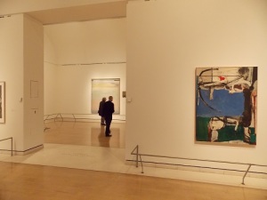
But the main bulk of the show was Diebenkorn's various phases of painting, from early abstracts of the 1950s with soft, rounded organic forms, through to the 1960s with their more linear, geometric, pale pastel colours and chalky surface.  Here's some of the rooms so you can see what I mean.

Again, I just couldn't quite connect with what he was doing.  They're big paintings, and I really wanted to like them, but....

Perhaps it was the flatness, the lack of mark-making...?


This one below reminded me of Cornish artist Peter Lanyon


Glider pilot Lanyon often painted landscape from an aerial perspective, which gave it an abstract, pattern-making feel.  This was combined by also tipping up the landscape so you are also viewing it from multiple perspectives.  A vertigo sufferer, Lanyon also put this sense of out-of-kilter uneasiness in his work.  I felt that this kind of sense was also in these Diebenkorns.

More pattern-making abstracts...


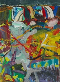
Later works go back to a more figurative style, this time with actual figures in them.  I really didn't like these either - sorry.  The clumsiness of the figures irritated me, and I just couldn't understand what the figures were doing in the landscape.  There seemed to be no connection between the elements.  The catalogue called them 'meditative'. I call them annoying.


These are his life drawings.  Guess what?  They annoyed me too. They channeled Matisse in some places, Munch, Klimt, and sometimes Schiele, with their unpleasantly doll-like poses.  But give him his due, he was good at contextualising the figures.


This reminded me of a Duncan Shanks painting, all tumbling abstraction based on direct observation of nature.

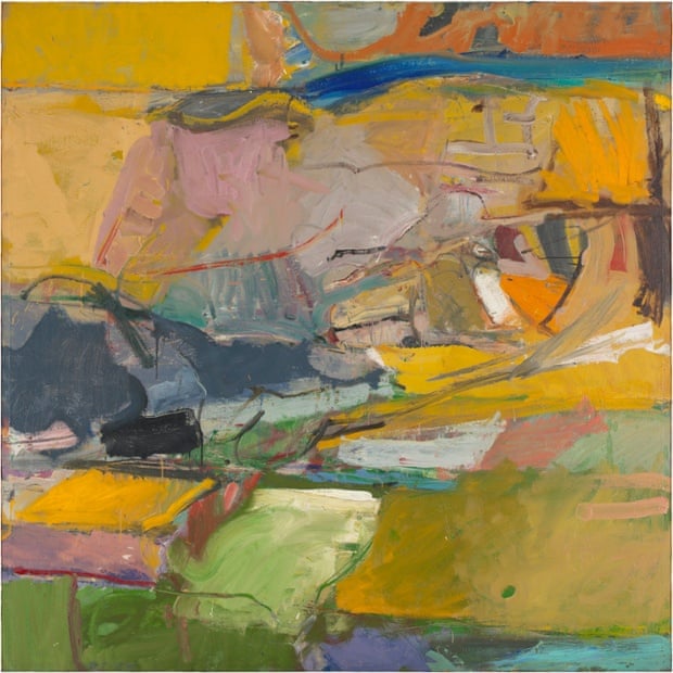
Berkeley #57, 1955. Photograph: San Francisco Museum of Modern Art © 2015 The Richard Diebenkorn Foundation 

Duncan Shanks, After Flood (1997)

See what I mean?

Then, hurrah!!  This was my favourite.  I guess it's a cross between his abstract and representational styles.

Richard Diebenkorn, Cityscape 1 (Oil on canvas, 1963)

I was sorely disappointed that he hadn't painted roomfuls like this.

I think you can tell that I didn't warm to the guy.  He seemed to be a painter who was wobbling around all over American Abstract Expressionism, even a bit of Hopper, but with one eye on European art such as Cezanne (well, who isn't influenced by Cezanne, eh?), the flatness and pattern-making and saturated colours of Matisse, the chalkiness and textile-type surface pattern of Bonnard.  Which should mean I really liked his work.  But I didn't.  I just couldn't connect with it, either emotionally on a personal level, or in any of the mark-making as an artist.  

Diebenkorn described his practise as a 'search for rightness', but it just came across as a hotch-potch of spot-the-influences, like he was some sort of absorbant, spongy shape-shifting sea-creature, changing his surface every so often as a result of some sort of colourful external stimulus in his surroundings, camouflaging his real self.

It's not a bad show.  In fact, it's a great show - well laid out, well curated, telling Deibenkorn's story well, so top marks to the Royal Academy for all that.  It wasn't the RA, it was me.

Obviously I have a real downer on Mr Deibenkorn, so I will leave you instead with his Top Ten Tips on how to start a painting.  Read and learn.

NOTES TO MYSELF ON BEGINNING A PAINTING

1. Attempt what is not certain. Certainty may or may not come later. It may then be a valuable delusion.

2. The pretty, initial position which falls short of completeness is not to be valued – except as a stimulus for further moves.

3. DO search.

4. Use and respond to the initial fresh qualities but consider them absolutely expendable.

5. Don’t “discover” a subject – of any kind.

6. Somehow don’t be bored but if you must, use it in action. Use its destructive potential.

7. Mistakes can’t be erased but they move you from your present position.

8. Keep thinking about Pollyanna.

9. Tolerate chaos.

10. Be careful only in a perverse way.