Monday 31 December 2012

Happy New Year

Here's a photo which I took at Portencross on the Ayrshire coast during the Christmas holidays.  

I thought it was a fitting image for the last blog of the year.

It was bitterly cold, but there was a beautiful, soft sunset, all apricots and lilacs.  

The Isle of Arran is in the distance on the right across the Firth of Clyde, and the colours of the sky are reflected in the rockpools.


Wishing everyone a very happy and peaceful 2013.

Sunday 30 December 2012

Strangely Similar...

It just struck me today how two of my favourite paintings that I've mentioned previously in my blog are in fact strangely similar, and yet so completely different.

Take a look and you'll see what I mean.

Here's Caravaggio from this article

Caravaggio Judith Beheading Holofernes, (Oil on canvas, 1598)

..and three hundred years later here's Degas from this article.

 Edgar Degas, La Coiffure (Oil on canvas, 1896)

Now I'd never have thought of Degas and Caravaggio as being in any way similar before, but see what I mean...?

I know they're two completely different subjects - one is a violent beheading with three figures and startling chiaroscuro, the other is a calm domestic scene mostly in red tones with only two figures -  but just take a look at the composition.

In each, one figure lies submissively on the left, and a standing figure carries out the action of the piece on the right.

In the Caravaggio, Judith holds Holofernes' hair and cuts the throat with a red surge of blood.  In the Degas, the maidservant holds the hair and wields a comb through the red swathe of hair, in an act that seems to be producing a certain amount of pain as well as pleasure.

In both, the loops of the circles of the arms of the two main protagonists form a rhythmical figure of eight across the painting. 

But the oddest thing of all linking the two pictures is the loop of red curtain hanging from the top of both paintings.  In both it signals an enclosed, shallow, intimate space, like a theatre set, something almost womb-like. 


It's an oddly disconnected piece of drapery in both - in the Caravaggio it writhes in an agitated convulsion, echoing the blood and pain of the brutal act.  In the Degas, it hangs in sensuously suggestive folds.

Did Degas have the Caravaggio at the back of his mind when he painted his blood-red painting?  I have no idea.  

All I can say that it strikes me that there are strange resonances between them both, and now that I've noticed it, it gives a whole new sub-text to Degas' painting for me! 


Friday 28 December 2012

Arise, Sir Bradley of Wiggins (part 2)

So Bradley Wiggins is to be made a Sir!  Britain's first Olympic gold-medal winner in cycling is to receive a Knighthood in the New Years Honours list.

Well, you heard it here first five months ago!!

July blog  Arise Sir Bradley of Wiggins

and also in August.

Photograph: John Giles/PA

Sir Wiggo speaks.

(And if you want to print out your own cut-out-and-stick-on sideburns - and you know you do - you still can by clicking here.)

No Sirship for Andy Murray though - he's an OBE.  That's Andy Murray who this year sensationally won both an Olympic Gold and was the first British man to win a Grand Slam Title for 76 years with the US Open, on his own, and without the tennis equivalent of Team Sky behind him.  Just pointing that out.

Pic courtesy: Getty Images

But good news - Tracey Emin is to become a CBE.  After all, she did produce this poster for the Olympics.


Tracey Emin, Birds 2012 Photograph: London 2012

Doodletastic!  That's right up there with an Olympic Gold and a Grand Slam title, obviously.


Read the New Years Honours List here.

Sunday 23 December 2012

HAPPY CHRISTMAS


Wishing everyone   

A VERY HAPPY CHRISTMAS

wherever you are.

Thank you everyone for your kind support, good wishes and feedback throughout 2012.

Hope to see some of you at forthcoming shows and exhibitions, and to hearing from you in 2013.

Friday 21 December 2012

One of My Paintings Coming Up For Auction

It's always interesting to see some of my paintings which I sold years ago popping up again, so it was nice to find out that there's one for sale in a local auction next month.

Coming up for sale as Lot 1643 is "Headland at the Giant's Causeway", a little acrylic painting of Northern Ireland which I last saw 10 years ago. 


Headland at the Giant's Causeway (Acrylic on paper, 5 x 7)  


The scene is of the bay as you walk down the path from the Visitor's Centre towards the Giant's Causeway in County Antrim, Northern Ireland.  

I go there every year, and here's a recent photo I took of the same scene.  Only the foreground has changed!  The painting was sold at Macmillan's Cancer Charity Exhibition in Glasgow back in 2003, and was at that time in a cream wooden frame. 


The auction is on Sunday 13th January 2013 at 2pm, so if any of you are interested in bidding then you can leave a bid or due it live and interactively online, which is quite exciting - DETAILS HERE..  (Just remember there's commission plus VAT to pay on the hammer price.)  

If there's anything you'd like to ask me about the painting, then please do get in touch.

Preparing a Solo Show

Now that my consignment of work has arrived safely in London ready for the start of the 2013 art fairs and my February solo show, it's time to wind things down in the studio.

It's been another very busy year, and although I don't show with many galleries, there's a constant demand for work and a yearly programme of events to enter submissions for.  This means that there is also a constant programme of work at different stages.  Organising each consignment of paintings is like doing a giant jigsaw puzzle, and you have to keep your eye on all of the pieces. 

For example, for my London solo show in February 2013, I started doing the preparatory work in spring 2012, pencilling in site visits to locations that I wanted to work in throughout the year.  These included Morar in May, the Peak District and Northern Ireland in summer, and London at the beginning of winter.  I wanted a mixture of different landscapes to play off each other, different seasons, different moods,  some familiar scenes, but also some rather different.  

The preparatory work involved taking thousands of photographs.  I then review these on the computer, selecting those that jump out at me as really capturing the feeling of what it was like to be in the landscape on that particular day.  


I then compile a short list of images, and print them out.  I draw up a plan of the number and range of sizes of paintings for the show, and looking at the shortlist of photographs, think about which image is best expressed on which sized canvas.

When you're dealing with oil paintings which take a long time to cure, you have to plan well in advance, and keep your eye on the whole.  The canvasses were ordered over the summer, and the bespoke frames ordered in August. It's also really important to keep good records of everything, as un-bohemian as that sounds.  All the paintings needs to have photographic records, and all the frames at the frame workshop need to match up with the paintings in the studio.

Then it's just a matter of painting the pictures!  

Whilst I'm painting the show, all of the work is set around the studio, so that I can keep in mind the 'tone' of the exhibition, and relate the work to each other.  Just as there are contrasts within each painting which make them work, so there are contrasts between the paintings in the show which (hopefully) makes the impact of the exhibition greater than the sum of its parts.  

It's something that I think very carefully about, even though as soon as the show finishes, those paintings will never be seen together again as a collection.  Each solo show is therefore a very unique moment, so it's a huge event in the year to aim for. 

I'm really looking forward to seeing the catalogue for the solo show and the paintings finally in the gallery, as they always look quite different to how they were when I last saw them in the studio.  When you see them beautifully finished in their frames hanging on the walls in the gallery, after having lived with them for months in the studio, you have to give up your emotional attachment to them as you know they're going off somewhere else and you won't see them again.  It's quite a moment.


The show opens on 14th February at Duncan R Miller Fine Arts, so if you'd like to come along, drop me a line and I'll send you an invite!

Thursday 20 December 2012

The Plot Thickens...

Last month, I blogged about the Henry Moore statue which is being sold off by Tower Hamlets Council to raise funds.

Draped Seated Woman, currently in Yorkshire Sculpture Park, was sold by Moore at a knock-down price to City of London County Council in the 1960s so that it could be put on display for the people of the East End of London.


The news that it is to be auctioned by Tower Hamlets as soon as possible at Christie's has caused a right old stink.  Bromley Council has now disputed the ownership of the sculpture, and in a debate about the matter this week in Parliament, Culture Minister Ed Vaisey has stepped in to say that any auction by Christie's cannot go ahead until that dispute is settled. 

So the gloves are off.  Suddenly a piece of art that lay in a field for fifteen years is the centre of hot political debate!


Read more here and here.

Wednesday 19 December 2012

Skyfall Paintings in the National Gallery - Can You Be Bond and Q?

Since I've been blogging recently about the paintings in Skyfall, and as I was in London over the weekend, I decided to pop into Room 34 of the National Gallery and visit the scene of the Bond art history action.

"Is it possible to sit on the same bench as Daniel Craig and Ben Whishaw and pretend to be Bond and Q?", I wondered.

So on your behalf, I went in to check it out.

(If you haven't read the blogs, here they are, talking about Bond meeting Q In the National Gallery,  the stolen Modigliani painting and the key painting in M's office.)

Here's Bond in the National Gallery in London meeting Q for the first time, in Room 34 which holds iconic British paintings by the likes of Turner, Gainsborough, Stubbs and Constable.

View the scene in a video clip here.

Clearly in the film, the seating arrangements consist of a long black wooden bench.

 
Indiewire.com

The first thing I found was that if you go to the real Room 34, there is instead a long leather couch in the centre of the space to sit on, which has a padded back to it.   Here's Room 34.

Bugbog.com
(Bond and Q would have been sitting at the far end, facing the left hand wall with their backs to the right hand wall.)

However, in the film, this couch has been replaced by a simple bench.  Obviously a couch didn't suit the scene as well.  

Having a bench means that both Bond and Q are clearly framed by each of the paintings behind them without the interference of the back of the couch being in shot.  

It isolates each of them within the frame of a painting, with the subject of the particular painting behind them acting as a shorthand for their characters. 


MGM 

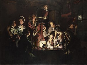
Q is backed by Joseph Wright of Derby's cutting-edge scientific piece Experiment on a Bird in the Air Pump of 1768...

...and Bond is framed by Thomas Gainsborough's The Morning Walk of 1785.  
 
This is described in the note beside the painting as a marriage piece.  The two figures are dressed in their wedding clothes.  A dog is a traditional attribute for such paintings (as in Van Eyck's The Arnolfini Marriage) and is a symbol of fidelity. Make your own speculations here - Bond as the dog, looking at its mother-figure mistress?  New M and old M? Bond's fidelity to Queen and country?  His marriage to his work?

Additionally,  the shot of the two characters framed within frames in similar poses 
is also a device which links them together, both visually and psychologically  (mirroring being a term in psychology referring to individuals unconsciously copying each other).  Although they don't know each other at that point, it shows - literally - that there is a bond.

Of course, the painting that Bond and Q are actually looking at and contemplating as a metaphor for Bond himself is Turner's The "Fighting Temeraire" Tugged to Her Last Berth to be Broken Up of 1839.


This is in fact a relatively small painting to contemplate from the distance of the bench, it has to be said.

If you go to Room 34 expecting to see this scene, you'll be somewhat disappointed.  The room does not have the same arrangement of paintings, and as I've said, there's no bench.

Bugbog.com

It's a long room, with The Fighting Temeraire beside the central door in a long row of three other Turner paintings (in the above picture, it's the first painting on the left beside the black arched door).  The couch is not opposite the painting so you can't sit and look at it like Bond.  

On the right wall, The Morning Walk is there (it's two to the left of the big horse painting), but not positioned so you can line it up with The Fighting Temeraire in front of you.  

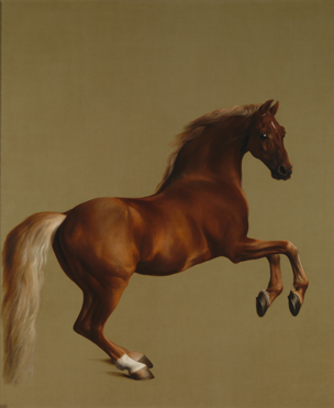
There is no Experiment on a Bird in the Air Pump (which I couldn't find on display at all).  Instead there are works by Reynolds and Hogarth, and then further along the very large and distinctive 1762 equestrian masterpiece Whistlejacket by George Stubbs (the big horse painting), which noticeably isn't there in the film clip.


So, disappointingly,  you may not be able to recreate the famous scene from Skyfall at the National Gallery, but don't let that stop you from visiting!  It's an iconic collection, and well worth taking every opportunity you can to see.

Tuesday 18 December 2012

Conquest Art

Earlier in the year I was contacted by Conquest Art, which is an organisation that encourages people with physical disabilities to take active participation is visual arts.  

Through painting and drawing, these artists discover new abilities and gain self-confidence.  

The artists enjoy copying paintings, and had found it useful to copy, amongst others,  some of my paintings from old catalogues of my solo shows.  So I was happy to be able to help out in a very small way by sending some larger reproductions, which would be easier for them to work with.

A few months later on, here are a couple of the finished pieces based on my paintings, by Conquest Art member Chris Roberson.


In a lovely letter, I was told that Chris gets a lot of pleasure out of copying the work because of the bright bold colours.  And it's great for me to hear that someone is able to get such enjoyment in this way.

Brilliant!

Monday 17 December 2012

Constable, Gainsborough, Turner and the Making of Landscape

I was at the Royal Academy in London at the weekend to see their landscape exhibition of Constable, Gainsborough and Turner.

It's quite a small exhibition, very academic, but strangely lacking in paintings.  

There is Constable's The Leaping Horse, all pre-Impressionist sparkly white blobs of paint imitating the passage of light (his famous 'Constable snow')
 
 
John Constable, The Leaping Horse (Oil on canvas, 1825)

Constable's subject is ordinary contemporary life, rather than a landscape inhabited by gods and goddesses or the backdrop for historical events.  Landscape itself becomes the subject of the painting.  Constable paves the way for the Impressionists to stride out into the countryside they knew and were familiar with, on the cusp of industrial change, and to record what they saw for its own sake - but this isn't really a point that is made extant.  (Perhaps if Constable had had portable collapsible tin tubes of paint and had lived in a better climate, he would have been an Impressionist 50 years before the Impressionists.)

There is Gainsborough's large dark and dreary romantic landscape with its spotlit sheep, like a more sedate Salvator Rosa landscape but without the bandits or exciting sense of brooding menace.


Thomas Gainsborough, Romantic Landscape (Oil on canvas 1783)

Then there is Turner's rather dull Dolbadern Castle - not exactly the exciting swirl of colour and light that is The Fighting Temeraire.

JMW Turner, ‘Dolbadern Castle’, 1800. Oil on canvas

And then there is a whole load of black and white prints.  

The thrust of the show is that before 1814 and the opening of Britain's first public art gallery (Dulwich), there was no way of seeing grand paintings apart from at auctions or in stately homes.  Prints were an affordable way for the ordinary person (and other artists) to access works of art and put them in their homes. Controlling the output of good-quality prints was also the way for artists the disseminate images of their work, controlling and furthering their careers and making another stream of income.

Which is all well and good, but unless you're into rows and rows of black and white prints, it makes for a very dull show.

The only time I got really excited about any of the exhibits, was when I spied a case containing Turner's brushes.  Why, they were very long, ideal for loose expressive brushstrokes, just like Whistler's long brushes which are on show in the Hunterian Art Gallery in Glasgow!  How thrilling! 

However, it was brought to my attention that actually, this was in fact Turner's fishing rod.  

For more information about the exhibition, which continues until February 17th 2013, click here.

Friday 14 December 2012

And the answer is....

...Michelangelo's lovely Study for the Libyan Sibyl of 1508, which is in the Metropolitan Museum in New York (although I looked for it last time I was there, and couldn't find it).


Only the size of a sheet of A4 paper, the Met themselves call this "the most magnificent drawing by Michelangelo in the United States". Apparently a male studio assistant posed for the anatomical study (hence the masculinity of the female figure, although all Michelangelo's women appear as if they could look after themselves in a scrap).  All I can say is that that studio assistant certainly had a pretty hot set of muscles from grinding all those paints...

The drawing is of course a preparatory study for the Libyan Sibyl, one of the female seers frescoed on the ceiling of the Sistine Chapel (Vatican Palace) in 1508–12. 

Here it is, after cleaning, so the colours just sing.  When you see it in real life, you can't take your eyes off it.


I've explained the complications of fresco painting before here.  Can you imagine your day's work being to balance on top of shaky scaffolding in poor light and paint the complexities and subtleties of this figure, all in one go?  

It's an astonishing thought....


Thursday 13 December 2012

Another Beautiful Drawing

Right, here's an easy one.

Name the artist, the date, and the place where you can see the finished work that this is the study for.


I'm sure you'll know it (no checking on Google!!).

I did lots of copies of this when I was at University (because we were encouraged to draw and keep notebooks).  It looks simple, but it's fiendishly difficult to get the nuances of the gesture just right.  

Done in red chalk, there's lot of implied movement, and a lovely gentle expression on the face.  It's a very physical, sculptural  drawing, but one that has a calm emotional feel as well.  It's all about contrasts;  between the tension in the body, and the relaxation in the face, and between the masculinity of the musculature of the back and the femininity of the face.

And your answer is...?

And the answer is...

Ok, well done everyone, it's Rembrandt!

Rembrandt van Rijn, Young Woman Sleeping (Ink and gouache, 1654) 


It you want to see the drawing, or find out more about it, it's in the British Museum in London.

Wednesday 12 December 2012

A Gem of a Drawing

Here's a beautiful little drawing which I've always found captivating.  Can you guess who it's by?


It's done with a soft, fairly long-haired brush (squirrel hair?), one which can spread to do broad fluid strokes, but also be brought to a fine point to draw more precise lines.  

It uses brown ink with a little white body colour (it's there on the sitter's arm and her face, just making the dark ink a little less intense so that it isn't the same value as the arm of the couch, thus avoiding the image jumping around too many marks of the same colour).  There's a mixture of marks, in that some are wet and fluid (around the eyes and under the chest, the arm of the couch), but some are dry and scumbled.

In the background the ink has been thinned to make it paler so that it can be moved over the paper in a wash.  Some body colour has also been applied on top of the wash to knock the background right into the back, make the darkness of the figure punchier.

It's quickly done with confident, loose, expressive, almost calligraphic strokes.  It's almost impressionistic, as there isn't a lot of detail, and yet there's all the detail that you need.

It's very intimate.  The figure is obviously someone the artist knows well, not just a model. There's an air of concern about the figure - not only as if she's got something on her mind, but also as if the artist has concern for her.  The background hangs over her head like a dark cloud.  So it has an emotional punch, something very human about it.

What has always fascinated me about this little piece is that so few strokes can be used and yet it says everything it needs to about volume, the weight and the different textures, but also goes beyond mere representation.  All that in a few licks of ink.

So who's the modern impressionistic genius?  Answer tomorrow!

Tuesday 11 December 2012

..And Finally....

Today is the last big push for the consignment of paintings for London.

The right canvasses have to go in the right frames, and all checked over, and then the right labels with the right titles have to go on the right paintings and be parcelled up with the right address labels and the right paperwork.  

Once everything is double triple checked and accounted for,  it's off in the van to London.

Of course, as usual, it's the iciest, most wintry day of the year...


Monday 10 December 2012

Patrick Moore v Damien Hirst

Look up into the sky tonight, and you'll probably see a new constellation, one which forms a rather grumpy looking but familiar face with a monacle.  Because Patrick Moore died yesterday.

(c) BBC


The irreplaceably eccentric astronomer, who presented The Sky at Night for 55 years (it would have been 60 years, but he spoke very fast), always had a sharp sentence on pretty much any topic.

Back in May 2003 for example, Damien Hirst had one of his spot artworks jettisoned into space on the Mars lander craft Beagle 2 (which went on to stray off into the cosmos - bad dog).  

Here it is.

(c) BBC

"If they've got eyes, they'll love it!", said Hirst of the Martians, confident that they'd be absolutely  thrilled by the sight of 16 coloured spots representing the pinnacle of another civilisation's cultural achievement.

"It won't interest the Martians," snapped an unimpressed Moore.

The Martians have yet to comment.

Thursday 6 December 2012

"To the Sea" Solo Show Preview Date

The date for my 2013 solo Show has been confirmed.

"TO THE SEA" will open on Thursday 14th February at Duncan R Miller Fine Arts, St James's, London.

Montbretia in Sea Breeze, Portrush (Oil on linen, 32 x 48)

This is the year's major collection of work, and only solo show, with the chance to see brand new paintings from a variety of locations both familiar and new. 

The exhibition will include paintings of Morar, Fife, Northern Ireland, Derbyshire, Lancashire, Yorkshire, Wales, and scenes of Hampstead Heath and the Thames. 

There will be full colour catalogues available in the New Year, so if you'd like one sent out to you, or an invite to the show, then just drop me a line with your postal address.

If the preview is anything like last year's sell-out, then it promises to be quite an event!

Wednesday 5 December 2012

Christmas Doesn't Get Much More Traditional Than This...

Thought you might like to see our Christmas Advent Calendar.


Yup, gets you in the mood, doesn't it?

Name That Painting...

Here's Naomie Harris as Miss Moneypenny in Skyfall.

You'll notice that there's a rather nice landscape painting on the wall behind her.


There seems to be a great deal of significance to the paintings in this film, so has anyone got any ideas what it is and who it's by?  

Here's a rather blurry close-up...


This is only half of it, unfortunately, as the delightful Miss M inconveniently has her head over the right hand part.  (However,  I had a look at another still in a book of Skyfall in a bookshop yesterday, and the right hand side just shows a dark, round tree and a bit more of the river.)

So - calling all you Art History buffs - any ideas?  Or has anyone got any better stills of this?

Those look like rather Italianate cypress trees and a little temple.  It's a very flat 19th century-looking landscape with nice Constable-like clouds, but it doesn't look very English. What place has a flat meandering river like that?  It is a foreign scene, or an English country estate in the Italian style?

Constable has been suggested to me, so have a look for comparison at this view of Weymouth by Constable in the Louvre.  This is the nearest I could find in terms of the clouds and the colouring (though not the subject) by Constable to Miss M's painting - I was looking especially at that peachy-orangey section. However, you'll see Constable has a more rugged, impressionistic handling of the paint.


So, any ideas?

I look forward to your suggestions!

UPDATE:  Thanks to an alert reader, here's the ANSWER.

Tuesday 4 December 2012

To Glaze or Not to Glaze...

I am often asked why my paintings are framed using glass.

If you own one of my pictures, you'll see that I have glass over the top of the painting, with a spacer in between (called a slip) so that the paint does not touch the glass. The reverse has a backing board covering the canvas, so that the painting is presented as a 'sealed unit'.  

Now, I have a friend who is a painting conservator, and he says that most of his work comes from paintings which have been ripped or damaged by the edges of chairs or tables.  Hence a backing board on a painting is a no-brainer.

However, the argument I often hear is that 'oils shouldn't be covered by glass', as you can't see the texture of the paint.  I would say that if you go into any major art gallery or museum, you'll see that all the paintings have glass over them.

The reason for this is conservation.  Glass provides the best environment for the long-term preservation of the painting, and protection of both the canvas and paint surfaces.

Pigments can be faded and the paint made brittle by the action of UV light upon the painting. Ordinary glass cuts down UV light by around 40%.  The more expensive museum quality glass is 2-3mm thick glass with a UV coating, sandwiched between two layers of  anti-glare optical coating, and cuts down 98-99% of harmful UV light.


Glass also protects the textured paint surface from dust and dirt.  Oil paint never fully 'cures' or dries.  If it did, it would come away from the canvas.  

I was told a story about a conservator who, many years ago (before Van Gogh was so famous) took a Van Gogh into his lecture to show his students.  Although the painting was at that point about 70 years old, when he stuck a pin into a textured part of the paint, it came out with wet paint residue on it.  (You wouldn't be allowed to do that nowadays with a priceless masterpiece, but obviously art lectures in the 60s were much more relaxed, cavalier affairs...)

I take a huge amount of care and put a great deal of thought into all my work, and I want it to leave my studio and go out into the world in absolutely the best condition that it can.  Painters are always aware that their work will outlive them as their legacy, so my paintings are quality products made with quality materials, to the best of my ability.  Therefore I choose the best bespoke Belgian linen canvasses, and bespoke hand-crafted, hand-gessoed and gilded frames, with glazing and backing. 

However, I am also aware that the trend is now for people to enjoy my work without the barrier of glass between themselves and the texture of the paint.  And that's fine - the paintings won't fade in my lifetime or yours, so please choose to enjoy them and live with them as you wish now. Homes are not museums.

(Top tip for getting rid of dust on the impasto - use a hairdryer on a cool setting to gently blow the dust away.)

Hopefully, my paintings will last for hundreds of years, give a lot of pleasure over generations, and still look as good as the day I painted them.

Wednesday 21 November 2012

Latest paintings...

Here's some more from the studio.

This one is of the Peak District, near Castleton in Derbyshire.


Farmland, the Peak District (Oil on linen, 24 x 26)


The second is of the white sands at Morar.   

If you park the car at this car-park here, you can walk down to the right to the sands following a burn, which flows past sand dunes out to the sea.  

This is the point where you come out of the dunes onto the beach, and the riverwater meets the seawater.


Burn Meets the Sea, Morar (Oil on linen, 24 x 26)

Friday 16 November 2012

The Last Leg...

I'm now (hopefully) on the last leg of work for the big consignment to London.

Here's a couple of new paintings.

The first is a night scene along the Thames of Tower Bridge - it was freezing, but the water was glittering and there was a moon shining.

Barges by Tower Bridge at Night (Oil, 10 x 10)

The next is a big contrast,  a big, bright,  expansive view out to the Hebrides from the beaches at Morar.  Quite a contrast to urban London.  However, I want my solo show to have lots of contrasts and surprises, as well as the familiar.

Heather on Rocks, Morar (Oil on linen, 20 x 20)

 All the paintings are fuelled by this.  Well, you've got to have some motivation.


Because there's nothing quite like a Tunnocks teacake.  

People of the world, if you've never had one, you're missing out.  I'm sure many artistic tragedies and mishaps would have been avoided if temperamental artists throughout history had just sat down with a cup of tea, cracked open a nice box of teacakes, and had a bit of a sugar rush in the afternoon.