I have an interview about my painting techniques in the April 2019 edition of the Artists and Illustrators magazine.

For those of you who are interested, or who can't get hold of a copy of the magazine itself, here's the full interview.

I gather you paint on both linen canvases and wooden panels.
What determines which support you use?
I
enjoy working on both, as they each give something special to the
painting.
I
use Belgian linen, as it is better in conservation terms and also preferable
when using impasto paint. Linen is made
from the long fibres of the flax plant, which have a lovely natural oil within them. This gives a really nice flexibility and
strength, which means the support doesn’t sag when loaded with thick
paint. When you apply a loaded brush to
the surface of a linen canvas, there is a lovely responsiveness to it, like a
tensioned dance floor.
However,
it’s also rewarding to work on a panel, for different reasons. There is a beautiful tooth to the surface,
yet a smoothness that means the paint slides across it in a different way. It’s
nice to have that resistance. A panel gives a feeling that there is a great
robustness underpinning the work.
It’s
a bit like making a construction or a sculpture – the support is very much a
part of the whole, not merely the bit underneath. What you’re painting upon has a subtle dialogue
with the paint on top of it, and can add a certain hardness or softness to the
overall sense of the piece.
Do you prepare the supports in any special way before you
begin to apply the paint?
I
give the supports a coloured ground, usually a warm grey or cobalt, but
sometimes lilac, magenta or a deep cadmium yellow.
It’s
good to work out of a medium tone, as this not only helps to unite the
composition and set the mood of the painting, but is less daunting than working
from a huge stark white surface. You can
work up to your lightest tones, and down to your darkest from the midtone.
Are
there any rules you follow when building up impasto paintings – fat over lean,
for example, or dark colours first? If so, why do you work in that way?
When I am
painting, I try to do so freely and instinctively, without thinking of
formulas, rules or theories. I’ve had
years of studying and practice, so it’s about the confidence of using all that mass
of knowledge subconsciously in order to make an informed but intuitive mark.
For me, a
painting isn’t a formula, it’s an expressive communication. I paint ‘alla
prima’, so I make the mark and try not to overwork it. This keeps the paint surface lively and full
of energy. So the marks aren’t conforming to specific constraints, the
important thing is that they are right for the painting, and express what I
want them to express.
When I am
painting, I want to be able to reach out for a colour on my palette and know
that it will mix and perform in a particular way, and that certain colours will
combine to make the exact shade that I want to put down on the canvas, and that
particular brushes or knives will sit comfortably in my hand and perform in a
particular way. When you are comfortable
with that, when you can own your workspace and materials, and be confident of
your knowledge and ability, and park all the noise of the technical stuff at
the back of your mind; then you can really focus down on solving the important
issues in front of you – that of the painting itself, and of putting feeling
and emotion into the painting.
Could
you describe how you apply the paint? Do you use knives, brushes or a
combination? And if so, which types and for what sorts of strokes?
I guess I
would describe the way that I apply paint as ‘expressive’ or ‘gestural’. The marks you make speak very much of you,
like handwriting.
Oil paint
is beautiful – glossy and textural, great lumps of pure colour. It doesn’t matter what you use to apply it,
it’s the mark on the canvas that matters, and I use many tools to apply paint
with. I use both oil and watercolour
brushes and also palette knives in all shapes and sizes I also use the sharpened handles of old
brushes to draw into the paint, and various other bits and pieces to apply the
paint and make marks. Anything goes!


Broadly,
the painting moves from the general to the particular – large, thinly painted,
flat, open areas to small, complicated, impasto details.
Sometimes
I will thin the paint with turps and use a large scenery painting brush to
sweep in the background, other times a large palette knife or the edge of a
sheet of card.
I use one of my favourite palette knives for waves
in the sea, or for the volume of clouds in the sky. I mix the paint on my palette, pick up the
amount I need, and make a purposeful mark firmly. I blend the edges of these
big volumes of impasto with a small watercolour brush or stipple it in with a
small flat, firm-bristled brush.
I
use a smaller plastic spatula for the leaves or trees and foreground foliage,
and draw into them with the sharpened end of an old brush handle. I use a long-bristled soft watercolour brush
for stems and grasses.
The
key is choosing the right tool for the right mark. It’s just what works for you, to create your
own language of marks.
Do
you have to be very considered with each mark you make? And how easy is it to
correct a mistake when working with such thick quantities of pigment?
Every
stroke is completely considered and purposeful.
Art is a language, and choosing the right mark to make is like choosing
the right word for a poem.
A long planning
process takes place before I get to the studio stage. There will have been months of going to visit
locations, collating source material, and thinking through the problem of the
painting beforehand.
So whilst
the idea of what I want to have at the end is broadly sorted in my head before
I start, I certainly don’t have a visual picture in my mind of what the
painting will look like when finished. That would be too prescriptive, and you
can’t be too prescriptive when you paint.
Applying
the painting to the canvas is, ultimately, a dialogue between yourself and your
materials. You bring the idea of what
you want to paint to the canvas, and can control things up to a point, but then
the materials themselves bring a certain unpredictable quality to the process,
which is good.
If you
are making big marks with large amounts of paint, or thin runny paint, or
painting with very pliable brushes or implements, then although knowledge and experience
gives you a very good idea of how your materials will behave, there will be a
certain amount of mark-making that is outwith your control, or surprises
you. You don’t know exactly what is
going to happen, how the paint will stick or dribble, or how the marks and
colours are going to work together to make up the whole.
So as you
progress with the painting, you are reacting to the marks you make and the way
the materials and colours behave and relate to each other, incorporating the
good parts of the accidental and the unpredictable, and building upon and
correcting others. The painting becomes all about this balance.
There is
an interplay of tension between the controlled, exact representation of the
scene and the serendipitous accidental out-of-control. Being too controlling kills the liveliness of
the painting, but not giving the materials enough guidance leaves it looking
messy and incomplete.
You have
to have an empathy with your materials, be a good listener, collaborate with
them, and respond to them. A painting is
a dialogue between the artist and the materials. The paint and materials can give you their own
ideas and solutions, and you have to be generous enough to allow the painting
to become itself as you paint it.
It’s also
important not to get too caught up in what you’re doing close-up for too long,
so stepping back and looking afresh at a distance is important. If something strikes you as wrong, then it’s
wrong. Don’t be afraid to take a big,
flat-edged palette knife and just lift out the offending passage of paint. Scrape
the whole lot out right down to base colour on the canvas, and just start again.
In the
end, the painting has to communicate to the viewer, so the materials are your
conduit between yourself and what you want to say to your audience.
One
of the things I particular love about your paintings are the long strands of
grass or stalks of plants where you appear to almost score the previous layers
of paint. How do you make those marks and keep such control?
Thank
you!
The short
answer is ‘practice’!
I have a
great fondness for painting landscapes which have foregrounds of seasonal
plants and foliage. It’s almost like
putting a still life into a landscape painting.
These are all real places that I return to, so there are places where I get to know individual
clumps of grasses, montbretia and harebells very well indeed year after year!

Fidra Lighthouse
through Grasses
These
detailed, textural areas are almost sculptural.
I carefully place the marks of impasto as leaves, or grass, or rocks,
and then draw into them with the sharpened end of an old brush handle to get
individual leaves or details (a technique called sgraffito), or flick long
lines of paint loosened with liquin onto the paint surface, using a long
scriptliner watercolour brush.
Incising
into the paint using the end of the brush (an old trick from Rembrandt!) means
that you can draw some nice, precise details and structure which then contrasts
with the broader passages of paint. Because
the paint is wet, when you score into it, is goes right down to the coloured background,
so you get a nice yellow or blue line, or whatever the coloured ground is.

Using the
longhaired watercolour brush means that the line of paint will often fall or
flop onto the canvas in a fairly random way.
That gives a real sense of grasses and leaves being blown in the
wind.

Across to Portrush
However,
this disorder has to be balanced with order, and each brushstroke is
underpinned with very close observation. These are all real places! For those trees and hedgerows to look real
and make sense, you have to really look at how they grow, observe the order and
pattern of their leaves, how they are constructed and grow from the stems, and understand
the weight, feel, and shape of their leaves and petals.
The same
goes for rocks on the shore, or waves rolling up a beach. Unless you understand their nature and weight
and rhythm, then you can’t fully understand how to apply the paint in order to
make the marks that make them look authentic and real.
Do
you use any particular oils or mediums to help thicken or control the paint?
I
have a large bowl of turpentine placed on my palette, so I can dip into it and
just loosen up the paint when required.
I also have a good dollop of Liquin on the palette. It makes the texture manageable and glossy, makes
it move well, so I use it when I feel the paint needs it.
Do
certain subjects lend themselves better to this style of impasto painting?
Seascapes
are an especial favourite.

Sea Texture
I
won the Royal Glasgow Institute prize with my painting of Eastbourne Pier.

Eastbourne Pier
It's a painting which shows the contrast of the solid, unchanging, man-made geometric structure of
the old pier striding out into the foaming, abstract swirls of the
ever-changing sea. In this painting, I
tried to approach painting the pier in the same way that I would paint a
landscape, and to keep it really loose, and not to get caught up in each strut
and girder. I’ve painted it hundreds of
times, so I am very familiar with the subject.
That
familiarity enables you just to mark-make, and frees you up to paint the energy
and the character of the pier, which is actually quite fragile against all the
force and foam of the sea.
It
is also a good form of painting for describing the petals of flowers and the
form of plants, such in paintings of my garden, or still lifes – but again,
there has to be that contrast of marks.

Calendula in Bloom

Tulips at Charleston

Daffodils in Govancroft
Vase
You
manage to keep areas and even single strokes of different colour very distinct
without muddying the colours. Do you have any advice for how best to achieve
that? And do you lay out your palette or mix colours in any particular way?
My
palette is laid out in a way that suits me, with the colours I use most closest
to hand, all within comfortable reach.

I
put out plenty of paint before I start painting, so everything is ready, and
there’s nothing to interrupt the thought process of painting.
I
mix using a palette knife, so that the colour I want is even and consistent and
there is enough of it.

I
pick up the amount I need for one mark on my knife, choose the spot and make
the mark. I know what sort of shape of
mark each of my tools is going to make, and I know from the amount of paint on
the knife or whatever how hard I have to press to get the thickness of mark
that I want, and how big a mark I’m going to get.

I
am putting wet paint onto wet paint, so the more you move them about on top of
each other, the more the colours mix together and muddy up. So the key is just to make the mark once.
Place the paint on the canvas. Move it into shape. Finish the mark. All one confident, controlled movement, just
two or three seconds.

Which
artists who use impasto techniques have most inspired you and which of their
works would you recommend our readers take a closer look at?
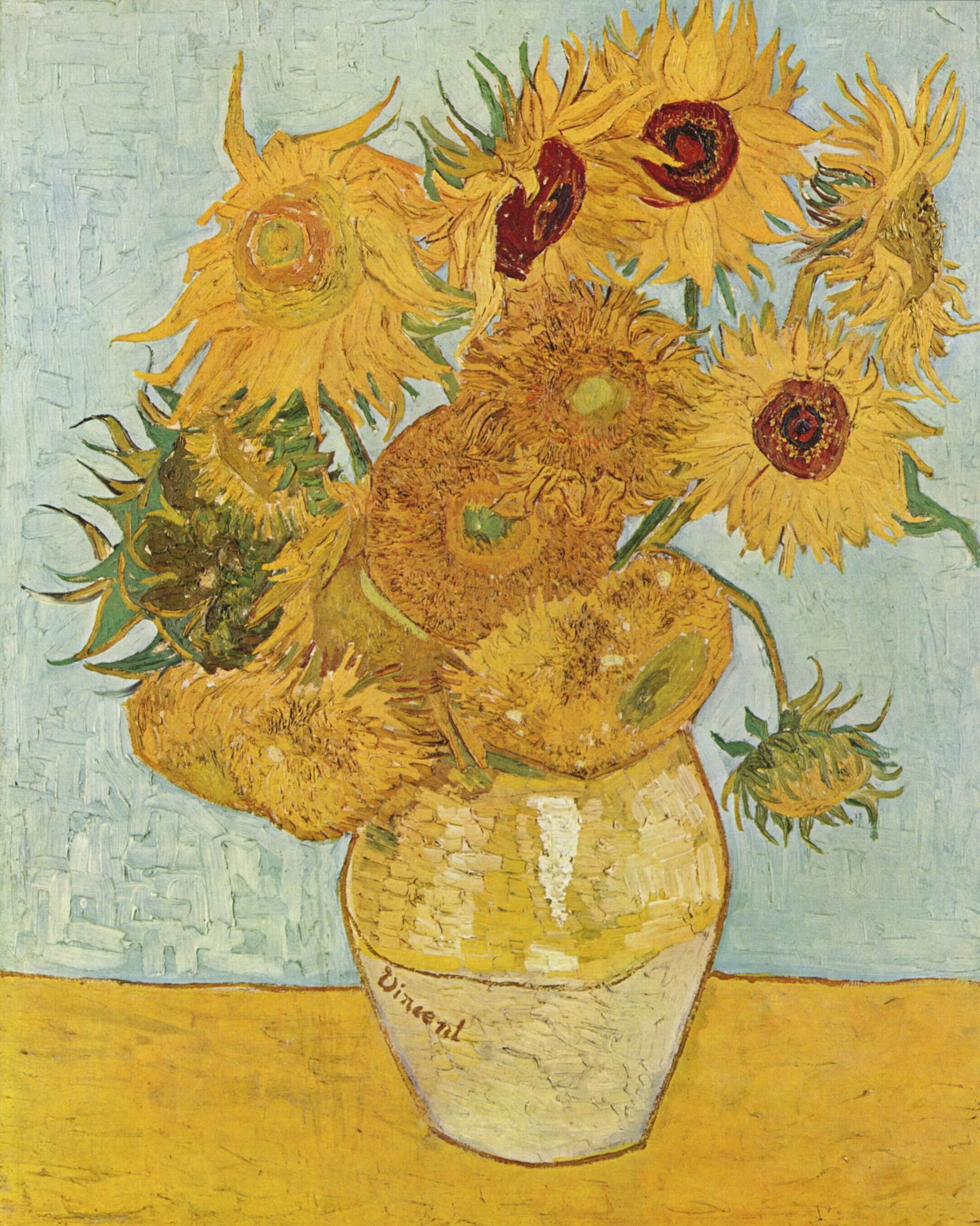
Obviously
I would say Van Gogh and Rembrandt – there is no substitute for standing in
front of either Sunflowers or The Jewish Bride and really looking, and working out how
those magical marks were made, and seeing how full of life they are.

Vincent van Gogh - Sunflowers

Rembrandt van Rijn - The Jewish Bride
But
I would also recommend looking at the work of Scottish artist
Joan Eardley. I saw her work when I was
young, and found the freedom with which she used paint, and her joy in the
texture of paint very liberating. She
was painting ordinary things I could see, the grey tenements of Glasgow and the
wild Scottish coasts, in a way that made them even more real and alive.
For
example, Eardley paints the sea with an absolute understanding of living beside
the sea. She used anything to hand – old
boards, household paint, decorators brushes, as well as mixing her own oils –
and used big, expressive, gestural marks.
Similarly, her paintings of the fields and houses around Catterline have
the freedom which comes from intimately knowing somewhere in all the weathers
and seasons. She uses a wide variety of
mark-making to build the picture surface, even to the extent of incorporating
real stalks of grass or particles of sand into the work. She paints the inner life of things, with an
absolute sense of place.

Joan Eardley - A Stormy Sea No 1
Charles
Rennie Mackintosh has also been a big influence, in terms of the principles
that underpin his work. Scottish
painting is all about contrasts, and he contrasted the geometric with the
organic, feminine white with masculine black, complexity with simplicity. In my painting, I feel it’s important to have
that tension of contrast, so the surface of my work is not just simply about
thick paint buttering the canvas all over.
So
the passages of impasto contrast with areas of thin washes, descriptive areas
with abstract, light and dark, broad brushstrokes with delicate sgraffito
work. Each compliments the other, and
emphasises the other, allowing you to read and understand each on their own
terms. You’re choosing the most
appropriate method of mark-making to describe each passage of the composition,
and allowing the space for each area to be itself, and to be read clearly.
Like
writing a novel, you need passages of calm as well as drama. So there are areas where there is lightness,
airiness and playfulness, but read further and there is also darkness, or depth
and detail. Up close, it can look like
an abstract pattern that is just paint, but stand back, and all the marks work
harmoniously together in order to be read as a real scene.
That
scene is a place I have been to, and hopefully communicates a sense of what it
felt like to be there. The viewer has to
feel that. So the mark-making and
colours are not only descriptive, but they also express an emotional quality
beyond that.
How
long do you need to leave a typical painting to dry before they are safe to
frame or exhibit?
Paintings
take different times to touch-dry, depending on lots of factors including the
time of year and the weather. Blues tend
to be surface dry quite quickly, even in a week in summer, but reds and whites
can take three or four weeks in a cold winter in the studio. Different areas of the piece will dry faster
or slower depending on how thick the paint is, but the paint will never
completely cure.
Obviously,
planning for gallery deadlines is part of my painting schedule. I try to allow
at least three weeks before a painting is sent to the framers, otherwise
there’s the danger both of damage in transit and of the paint sticking to the
slip.
My
largest paintings are unglazed, so I try and leave them the longest to dry, as
long as possible, ideally a month or two.
The impasto needs to be not only touch dry, but firm underneath.
A shorter version of this interview appears in the April 2019 edition of Artists and Illustrators Magazine, pp70-73.
A shorter version of this interview appears in the April 2019 edition of Artists and Illustrators Magazine, pp70-73.