Showing posts with label Vincent van Gogh. Show all posts

Monday, 17 September 2012

Van Gogh's Colours

You might have seen reports recently about new research which has shown that some of Van Gogh's colours are fading and altering in his paintings.  His paintings are of course around 125-130 years old now.

It seems to be a problem with his yellows especially.  Layers of varnish which were added later to his paintings appear to have absorbed some of the surface layers of the oil paint, leading to a dulling or fading effect.

This is one of the paintings which art restorers have been looking at, called Flowers in a Blue Vase.  Paint was extracted and examined in two areas (marked).


Cadmium yellow, which is this colour


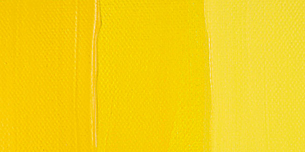
had turned a greyish-orange colour and had cracked.  Normally cadmium yellow gets paler and less vibrant as it ages.  However, in this painting the cadmium has formed oxalates within the surface layer of varnish.  

Ironically, this varnish wasn't put on by Van Gogh himself, who preferred his paintings to have a natural raw 'genuine' feel, rather than a pretty finished look.  The varnish was applied by later dealers, conservators and private individuals in accordance with popular taste and accepted practice of the time.  However, the fact that some of the paint surface has been drawn into the varnish creates a troubling problem for present day conservators, who of course want to prevent any further degradation but are duty-bound not to remove any original material.

Van Gogh also used chrome yellow a lot, which is a sharper, more acidic colour (cadmium is a more eggy colour).


Here's that chrome yellow in action in the background, along with cadmium yellow and yellow ochre (the more mustardy shade) on the flowers.

Vincent van Gogh, Sunflowers
 
For Van Gogh, the colour yellow in all its forms symbolised feelings of love, life, hope, positivity in the future.  However, chrome yellow is affected by sunlight, darkening to a brown shade over time.  New analysis using sophisticated X-ray techniques shows that the cause of the problem is a "reduction" reaction that alters the chemical make-up of the chromium in the paint.  

As you can tell by the names, these pigments are made from the colour-bearing metallic elements at the centre of the periodic table.  You don't really want to tangle with cadmium, lead, titanium, chromium or anything else in the paint too much - although as an artist, you do get covered in the stuff.  It's not really advisable to ingest it, although artists do have a habit of 'tipping' their brushes - licking the ends to get a fine point.  Charles Rennie Mackintosh, for example,  tipped his brushes whilst painting his watercolours in the south of France, and ended up dying of oral cancer.

Back at the Van Gogh's, the Van Gogh Museum in the Netherlands is on the case as regards the fading and altering pigments.  However, what about those paintings that are in private hands or in less pro-active or cash-strapped institutions?  

It could mean that, without conservation, we will be looking at some very faded and brown Van Gogh's in a hundred years time.  With colour so bound up with meaning in Van Gogh's work, it would fundamentally alter the essence of his paintings.

Monday, 11 June 2012

Favourite Paintings - Van Gogh's 'Crab on its Back'

Here's a painting that I really love, and try to see at the Van Gogh Museum in Amsterdam whenever I'm there (it's not always on display).  It's Vincent van Gogh's Crab on its Back, painted the year before he died.


Vincent Van Gogh, Crab on its Back (Oil, 1889)

It's not a very big painting....


..and is of a very ordinary subject.  Van Gogh had a real burning need to paint, and did so pretty much every day.  You get the feeling that perhaps the weather was too bad outside to go out to paint on this particular day, so he grabbed the first thing that came to hand indoors and set to work on it.  Perhaps it was his dinner...

Have a look at the picture.  How would you choose to paint a crab?  

He's put it on its back, off-centre, tipped up towards the light, at an awkward uneasy angle that gives a feeling of struggle.  He's deliberately put something under the shell at the back to tip it up so that it looks like that.  The sense of movement and struggle is further echoed by the surrounding brushstrokes. 

It has a background of sea green, which acts as a complimentary to the orangey red of the legs.  The brushstrokes are bold and obvious in the background, painted fast and with urgency using a flat brush about 3/4" wide.  The crab itself has been painted with a narrower round brush, and in the area of the ends of the legs it almost looks like a watercolour brush has been used, the lines are so fine.


So there are lots of contrasts going on - the large crab claws at the front have a real volume and strength to them, while the small legs at the back look spindly and frail.  The painting has contrasts of complimentary colours playing off each other, areas of luscious thick paint then passages of great delicacy, and the taking of a humble, everyday object that has been elevated to something monumental, made the entire subject of a painting - just like the  peasants that Van Gogh drew so often in his early years.

But there's more than that.  It's a crab on its back.  Something with a hard shell that's revealing its soft, vulnerable underside.  He's using the crab to say something about himself and his own feelings and siutation.

Have a look at this.

Eugene Delacroix, Christ on the Sea of Galilee (Oil, 1853)

This is Delacroix's painting Christ on the Sea of Galilee, painted the year that Van Gogh was born.  Van Gogh knew and admired this painting, mentioning it in his letters.  He admired Delacroix' "symbolic language through colour alone".  

Delacroix was an artist who knew a thing or two about colour, and wasn't afraid to use complimentaries as major themes in his work.  Have a look at that viridian green colour of the turbulent water and the orangey-red colour of the boat and the figures with their flailing arms.  Remind you of anything?


Delacroix's painting is about the vulnarability of a small shell of a boat on dangerous waters as Christ, the fisher of men,  sows the seeds of faith.  The image of a sower and reaper was very important to Van Gogh, who had of course initially been a preacher himself.

So the crab painting works on different levels of meaning - it's something low, common and ordinary, just a picture of a humble crab; but it's also something extraordinary, with a spiritual element to it.  It's vulnerable and fragile, but also enduring - something which will smell and decay tomorrow, but yet remains enduring and potent as a painting well over a century later.

It's a very, very beautiful painting, so if you ever get the chance to see it, please do.

(You can even order wools from a website that dyes them to match the colours of this particular painting - really! - which is very interesting, because Van Gogh used to have a box of wools, and used to spend time winding the different coloured strands together to see how they combined and the colours interacted with each other.


These are the wools to match Crab on its Back from website The Spun Monkey. I'm not sure what you're meant to do with them once you get them - knit your own masterpiece maybe!)

Thursday, 29 March 2012

Favourite Paintings - Van Gogh

Given the beautiful sunny weather at the moment, this is perhaps an easy choice for favourite painting - Vincent van Gogh's Sunflowers.

Vincent van Gogh Vase with 12 Sunflowers (version 3) (Oil on canvas 1888)

They're happy and vibrant and full of life-affirming optimism, and I think that's why so many people identify with and love these paintings.

Van Gogh had moved down to Arles in the sunny south of France in 1888, intending to set up a studio in the 'Yellow House' with his friend Paul Gauguin.  In preparation for his arrival, Vincent excitedly painted a series of 11 pictures of sunflowers to decorate the house.  Yellow, the colour of the sun, symbolised happiness, with the sunflower being a Dutch symbol of devotion and loyalty which he felt for his friend.  Also, by including flowers from buds and full blooms through to drooping seed heads in the paintings, it is a reminder of the cycle of life.
 
The paint is applied thickly, with love for the medium, and in a huge variety of strokes.  As well as the colour being expressive, the marks are too - fluid, lively, quick, with lots of texture.

Vincent van Gogh Sunflowers (detail) (Oil on canvas, 1888)
 
 Vincent van Gogh Sunflowers (detail) (Oil on canvas, 1888)

Initially, the sunflower paintings followed established painting rules, having a blue background (blue being the complementary of yellow, so that each colour is intensified by being beside each other).  However later paintings in the series have yellow backgrounds, so you have yellow on yellow with yellow, with just a central pop of blue.  It's turning the happiness and the message of the paintings right up to 11.
 
Vincent spent spent the summer of 1888 in a frenzy of work and waiting. Gauguin finally rolled into town in October, bringing a long roll of rough jute as a present, which both painters used as a substrate to paint on.  (You can trace their paintings they they did together at this time by piecing together the paintings that were cut from this roll of jute.)  
 
Having waited for months for his arrival, van Gogh must have been quite overwhelmingly fit to burst when his friend turned up.  Gauguin, however,  seems to have been quite arrogant and domineering. Unfortunately, it all ended in tears, with the actuality of the situation being nothing like the artistic idyll which Vincent had built up in his head.   The two artists didn't agree on anything, from domestic arrangements to painting, and van Gogh couldn't cope with Gauguin's overwhelming critical attitude.  
 
In only 2 months Gauguin was gone, and Vincent was plunged into severe depression.  
 
Eighteen months later, van Gogh was dead.

Vincent van Gogh, Still Life with Two Sunflowers 1887