Saturday, 12 March 2016

Today at the Affordable Art Fair...

Sold this painting today at the Affordable Art Fair at Battersea (which ends tomorrow).

 Towards the Cuillins, Sligachan (Oil on linen, 26 x 32)

Really pleased!  The fair seems to be going well - spring really must be in the air!

Sligachan is on the Isle of Skye, and the view in the painting is from near the old bridge just beside the Sligachan Hotel.  

You can explore the area HERE on Google Maps, and have a virtual walk around.

Thursday, 10 March 2016

George Martin, The Fifth Beatle

The death has been announced of George Martin, the producer and creative conduit for the uniquely influential sound of the Beatles.  His input to their success was such that he has been dubbed 'The Fifth Beatle'.

Here's Martin with the boys, second from right.

Getty Images

Which is all a bit confusing, because I wrote a blog some time ago called Stuart Sutcliffe: Artist and Fifth Beatle.  Scottish-born Sutcliffe was actually a fifth person in the Beatles, being the original bass player when the band was a five piece.  Maybe that makes him the First Beatle, not the Fifth?

 Photograph by Peter Bruchmann of George Harrison and Stuart Sutcliffe in Hamburg

Or what about Brian Epstein?  


Getty Images

He was their manager and mentor, and Paul McCartney summarised the huge importance of Epstein in a 1997 interview for a BBC documentary about Epstein, saying, "If anyone was the Fifth Beatle, it was Brian"  Or does that actually make him the Sixth or Seventh Beatle?

And then there's Pete Best, the original drummer, whom Epstein sacked a couple of months after their first recording session. 
                                                                             Pete Best, 1961 (Photo by Albert Marrion)

Or what about Johnny Hutchinson (of The Big Three)?  He played as drummer for three gigs in between Best and Ringo Starr. 


And then there's Andy White, a session drummer who played on two songs of the first recording session Ringo did with the band.  Ringo didn't play the drum for two songs of his first recording session with the Beatles (just other percussion). 


Then Ringo fell ill with tonsillitis just before the 1964 tour of Europe and Australasia, and was replaced by Jimmie Nicol.  Nicol, who had handily made an album of cover versions of Beatles songs and so knew all the arrangements, was phoned the same day that Starr became ill, and was called to the Abbey Road studios to rehearse.


27 hours later, he had completely mastered the full dazzling complexity of Starr's parts, and was on stage in Copenhagen.


Ten days and eight shows later, and he was out of the band again, but got (it's rumoured) the modern day equivalent of half a million dollars for his trouble.  Nine months later he was bankrupt, and later became a recluse.

Then there's Colin Hanton who was the drummer before Best, Mike McCartney (apparently), Tommy Moore (1960 tour of Scotland), and Norman Chapman who left to do his National Service.

How many Beatles is that we're up to? 

And to confuse things further, in the frame there's also Derek Taylor (the Beatles' public relations manager) and Neil Aspinall (their road manager, pictured below). 

 Getty Images

I'm not sure how many Fifth Beatles that makes, and there's possibly a whole lot more who are contenders.

But what it all goes to say is that, in fact, the Beatles weren't just  four people.  They were the core nugget of creativity, the people who had the vision and the raw ideas, but they also needed a creative team around them who could act as conduits, and who could crystallise and bring to fruition those ideas, and those sometimes tiny little seeds of something bigger (Lennon apparently once came to Martin with a single note as the basis for a song, which Martin then had to interpret and turn into musical gold-dust) . 

The creativity of the Beatles, therefore, relied upon building up a close and trusted group of people around them, a whole group ot 'Fifth Beatles', who not only had the technical knowledge, but also the necessary organisational, mentoring and pastoral skills as well, a whole range of people who could nurture and interpret and facilitate and focus the genius.

Affordable Art Fair, Battersea

Now that the sun is shining, spring is here, and my show in London is over, the next event in the calendar is the Affordable Art Fair in Battersea.


Held twice a year in the spring and autumn, Battersea is a very colourful affair, held in huge tents in the park, so that it's a very informal approach to viewing art.  I normally do the spring fair only, and have paintings on Stand A6 with Duncan R Miller Fine Arts.  

So if you're in the area, why not drop by and have a look - nearest underground is Sloane Square.

 Bed of Tulips (Oil on linen, 16 x 16)

The fair runs from 10-13 March, and you can find out more information about it HERE.  With over 100 galleries and 1000 artists, it's a great day out with plenty to get your artistic teeth into! 

Monday, 7 March 2016

Camusdarach

This is another painting from my show in London which ends tomorrow.  

It's of the beautiful white sands at Camusdarach on the Road to the Isles on the west coast of Scotland, on the way to Mallaig.  The sand really is pink and white!

In the distance you can see the islands of the Hebrides on the horizon.  The light is soft but bright, the sky has lots of little puffy fast-moving clouds, the long sweep of the sand is flat and wide and empty.  It's May, and the sun is out and it's nice and warm, but a light breeze is blowing.  The water is shallow as it comes in over the white sand, and it's an amazing Caribbean turquoise blue colour.

Everything is so clear that you have a real feeling of space and openness, and you have the whole place to yourself.

Wide Sweep of Sand, Camusdarach (Oil on linen, 26 x 32)

Friday, 4 March 2016

Last Couple of Days

We're now into the last couple of days of my big show in London, which closes on Tuesday 8th March.

Thank you very much indeed to everyone who has visited the show!  It's very much appreciated,and hope you enjoyed it

Before the show ends, there is still a little time to look at some of my favourites that are still for sale.

View the show HERE.

This little painting was done from the banks of the Thames at Bermondsey.  The sun was setting and the lights slowly appeared on Tower Bridge, bringing out its lovely sweeping shapes, and creating a soft orange glow on the surface of the river to match that of the gentle peach colours of the sky.

Tower Bridge at Dusk from Bermondsey (Oil on linen, 12 x 12)

This painting  is of the fountain in the middle of Central Park, when I was visiting New York.  (I also have paintings in the show of Clearwater in Florida, which I visited before going on to New York.)  

The park was busy, and it was a blistering hot summer's day, but I loved the way that there was so much coolness and calmness in the colours of the water and the greens, blues and purples of the plants, and in the simplicity of the beautiful, pure white waxy bloom of the lily itself.  

I loved the rhythmical shapes of the leaves and flowers against the water surface, and the way the fountain gently moved the reflections.  I also liked the way that the upright stems of the purple flower buds made a pleasing counterpoint to the horizontal planes of the lily leaves on the water surface.

White Waterlily, Central Park (Oil on linen, 26 x 32)

This is a painting of a favourite walk of mine in London.  I love walking across Hyde Park, especially during autumn, which is probably my favourite season of the year.  

Just in the distance on the right, you can catch a glimpse of the Round Pond, which usually has its fair share of Canada geese grazing around it.  The trees are turning all sorts of beautiful shades of crimsons and oranges and cadmium yellows, which catch the warm autumn sunlight.  Invariably, there is the rustle of squirrels rooting purposefully around the dead leaves.  It's all very peaceful in the middle of the big city.

Autumn Trees near Round Pond, Hyde Park (Oil on linen, 26 x 32)

This is of Sea Cliff beach, the great, wide sandy beaches on the east coast of Scotland near Edinburgh.  It's a great place to take a dog for a walk and let it run. That's the Bass Rock in the distance, with its little white lighthouse.  The rock is covered in noisy seabirds, whirling around their nests.

The sand has a pinky granite-like tinge to it, and the reddish tones contrast with the bright, sharp acid green of the seaweed on the rocks.  The sky is a brilliant, early summer blue, and the brisk wind is whipping up little white caps on the waves as they break on the shore.

Rocks and Seaweed, Sea Cliff (Oil on linen, 20 x 20)

This little painting is a like a bright jewel of a thing.  It's of the flowers which I grew in my back garden from wildflower seeds.  

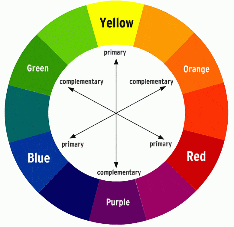
It was a happy accident that meant that the beautiful cadmium yellows of the calendula and California poppies came up against the lilacs of the tall honesty, as yellow and purple are of complimentary colours!

Calendula in Bloom (Oil on linen, 12 x 12)

Lastly, I'm going to mention one of my favourite Northern Ireland paintings.

I go every year to the Causeway Coast.  This is the view looking over the hedgerows and down the glen, over the fields towards the coast.  

Rathlin Island is the long, low island on the left on the horizon.  Fair Head is the little spur of dark headland towards the right, which the branches of fuschia are pointing to.  I love the pattern of the fields, like a huge soft quilt, which are all shades of green.  The soft greens contrast with the bright pinks of the fuschia hedges, which line the narrow roads.

There's a huge, exhilarating  feeling of distance which I like about the Causeway Coast, how you can look right along the coast, and right out to sea for miles and miles.  On clear days, you catch tantalising glimpses of the land beyond - Ailsa Craig, the Mull of Kintyre, Jura and Islay, Southern Ireland.

Fuschia Hedges Looking Across to Fair Head (Oil on linen, 20 x 30)
So if you're in London today or Monday, you can visit the gallery and see the paintings for yourself!  Let me know if you do and what you think, or feel free to email me at judith@jibridgland.com and ask me any questions.

Thursday, 3 March 2016

Delacroix and Colour

There's a big new exhibition on at the moment at the National Gallery in London about one of the great building blocks of modern art, Eugene Delacroix.

Delacroix and the Rise of Modern Art


I remember my fine art lectures about the riotous Death of Sardanapalus, with its great sensually unfurling tongue of red linking what would be an otherwise chaotic narrative in a wide, dynamic, diagonal slash.

Our lecturer drew attention to the reds and greens and the blues and oranges,  showing us how to read the painting and explaining their scientific significance.  It was like having a curtain pulled aside to see how the masters made the magic.  

So there was a methodology behind which colour Delacroix picked up on the end of his brush?  He wasn't merely painting what he saw, or what he imagined, or choosing a random colour.  This was serious stuff.  No wonder he had such profound implications for artists such as Cezanne.


Here's a really interesting little short film which explains Delacroix's use of colour.  

DELACROIX AND COLOUR

It's all about the complementaries.  

The idea is that by placing a dash of complementary orange against blue, for example, it makes the blue look bluer and the orange go pop.  Each colour becomes optically more intense than it would be just by itself, as you read and understand the particular qualities of a colour better by having its complimentary against it.  In other words, you understand something by demonstrating its opposite.  

It's only by understanding great artists and the problem they solved, such as Delacroix, that you can really have understanding and insight and depth in your own humble practice as an artist.  


(That's complementary colours, not complimentary colours, BTW.)

Tuesday, 1 March 2016

Another Couple of Sales

Two more gone in London today!

Some lucky people are going to have these beauties on their walls.  Both of them are floral pieces.  Here's a very cheerful painting of the spring flowers in my back garden.  I planted huge amounts of wildflower seeds so that I would get a lot of very intense mixed colour.


Spring Flower Border (Oil on linen, 12 x 12)

And another waterlily painting gone...


Blue Waterlilies (Oil on linen, 12 x 12)

Still a few more days to go, so fingers crossed!