Artists don't retire. In fact, the best artists achieve the culmination of a lifetime of experimentation and innovation by producing their best works in their final years.
This is the premise of the latest blockbuster show at the National Gallery in London, Rembrandt: The Late Works. By 'late', they mean work produced from his 40s (in the early 1650s), through to aged 63 when he died in 1669. Which means I'm into my late phase. But Late is Trendy.
Nothing in a blockbuster exhibition these days is presented chronologically, however, and this exhibition is no exception. A simple time-line, showing how an artist progresses, solves problems and explores themes, is just too darn simple. No, it's got to be all about Ideas. Themes. Because that's how we artists think, in great Lumps of Themes.
First up in 'Self-Scrutiny'. Rembrandt was, of course, famously a master of his own likeness. He didn't flinch in recording the passage of time and the trials of life on his own features, often to achingly honest effect. But it wasn't just about getting a likeness. He was also interested in dressing up, pulling faces, exploring chiarascuro, assuming a character, baring his soul.

Rembrandt, Self Portrait aged 63 (Oil on canvas, 1669. National Gallery, London)
The next room is called 'Light'. Although I have to say, the impression of the whole exhibition is not of light, but of gloomy brown. The lighting is very low, and the space feels crowded - not just by the number of visitors, whom you are constantly trying to negotiate, and tip-toe round, but also somehow by the arrangement of the rooms. It's impossible to stand back and look at anything.
Anyway, like Caravaggio earlier in the century in Italy, Rembrandt was also interested in the effects of light and shade in his 17th century studio in Amsterdam. He was a master of the monochromatic print medium, which was a way of producing revenue stream and of getting your work known to a wider public through cheap, large volume art works.
The exhibition shows numerous examples of his prints, often showing different 'states' of the same print - that is, different stages in working on the metal printing plate. By thinking in strong contrasts of white paper and black printer's ink, Rembrandt was also thinking through how to translate these effects into his oil work, both in terms of the bold, binary contrasts and the achingly small, subtle effects that can be achieved through the fine engraving needles.
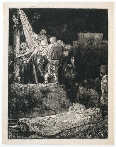
Rembrandt, The Descent from the Cross by Torchlight (Etching and drypoint on Japanese paper, 1654, British Museum)
Next is 'Experimental Technique'. Look closely at a Rembrandt, and it's a flickering surface of different impressionistic marks. Paint is used almost sculpturally, applied with brush, palette knife, fingers, or scored into with the end of the brush. In his drawings, he used dazzlingly confident, expressive washes of ink in a calligraphic manner.

Rembrandt, A Young Woman Sleeping (1654)
The paper sucks up the ink from the brush as soon as you put it to the paper - you can't change your mind, or procrastinate. You just have to make the mark, and feel the subject as you do so. This is empathy in ink.
In his prints, he radically altered plates, developing his ideas.
_-_WGA19085.jpg/697px-Rembrandt_-_The_Three_Crosses_(third_state)_-_WGA19085.jpg)
Rembrandt, The Three Crosses, 1653 (first state) Drypoint on vellum

Rembrandt, The Three Crosses, 1653 (fourth state) Drypoint on paper
The next is 'Emulation'. I have to admit, I'm not even entirely sure what that means. Apparently, it's about interpreting and referencing the work of others, but I have to say, it's not something that jumps out as a theme here. However, who cares, when you have this wonderful fragment of a painting in front of you.

Rembrandt, The Anatomy Lesson of Dr Joan Deyman, 1656, Amsterdam Museum.
Rembrandt's painting emulates the pose of Mantegna's Dead Christ of 1480.

I first saw Rembrandt's anatomy paintings when I was 8, during a school
project on Holland. I was given a slide of The Anatomy Lesson of Dr Tulp to look at in a hand held
viewer, which you held up to your eye and looked towards the light. Suddenly, there was
this strange painting, of a dissected body and calm figures.
On reflection, it's a bit of strange image to give a child, but I loved that I was being shown something that was obviously a serious subject. It's hard to underestimate how exciting a coloured image was in the 60s - newspapers and television and most books were in black and white - and here was that image, right up against your eye in this really intimate interaction. It was a very intense way of experiencing it, as if you were there. I loved
the feeling of the figures: the sense of skill in the hands, and the utter calm in the faces. This was about clever people, learning through observation.
The other slide was of Van Gogh's Sunflowers -
suddenly there was this huge punch of colour in that tiny slide viewer, a great roaring, undulating sea of paint.
It was just magical - I was hooked.
Needless to say, I studied both
Biology and Fine Art at University, dissecting and observing the anatomy
of plants, animals, humans and paintings.
Next is Observations of Every Day Life. We're still only in Room 3 by the way. But there are a lot of gems here, such as this
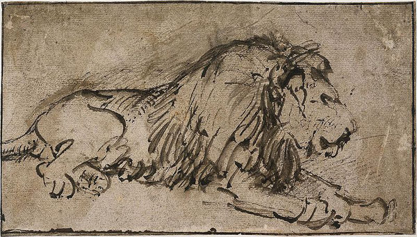
Rembrandt, Recumbent Lion, Facing Right (Pen and ink on brown paper, 1660)
and two strange drawings of an 18 year old girl hanged on a gibbet, whom Rembrandt travelled to view and sketch.
Room 4 is Artistic Conventions, which is all about his commission and portraiture, and jammed full of people, so I moved quickly on to Room 5 - Intimacy. Now you're talking.
One of the paintings I really wanted to see in my life was 'The Jewish Bride', which I first saw in Amsterdam in 1983 (I've blogged about it before here). And here is that painting again, like an old friend.

It's one of those paintings that you stand in front of, and just don't want to ever stop looking at. but you must - mostly because you know there's a whole row of other people silently willing you to move out of the way.
There's also this wonderfully loose, impressionistic little painting

Rembrandt, A Woman Bathing in a Stream (Oil on panel, 1654)
and this little print is also very beautiful. - mysterious and sensual.

Rembrandt, La Negresse Couchee, 1658
In Room 6 - we're nearly there - is an old familiar painting in the 'Contemplation' section.
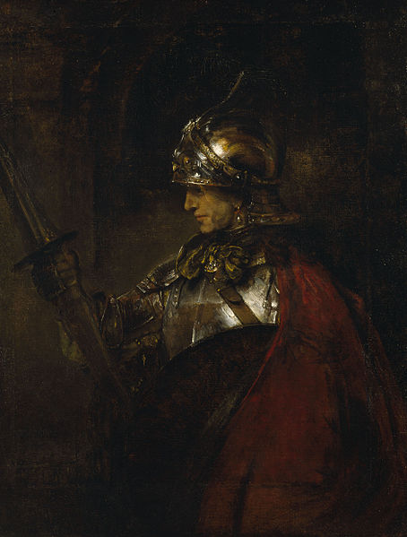
This is 'Man in Armour', from Kelvingrove in Glasgow. Home turf. I've seen it for decades, written essays about it, and here it is in London, its subject still mysterious, its armour still glinting. However, because of the low light level you can't really see the added strips and the dodgy colour match in the paint. It's clearly the finest painting in the room.
And then it's the last room. Inner conflict. Rather than the bravado and gesturing of his youthful work, this is all about a quieter introspection and internalisation of an idea, a psychological power. So here we have another old friend, from the Louvre this time, Bathsheba with King David's Letter.

The married Bathsheba has been summoned by the king, who is infatuated with her. What should she do? However, if you start looking at her incredibly lumpy breasts, you can't help worrying that being stalked by a sex-pest king isn't the most pressing of her problems.
Rembrandt's final painting in 'Reconciliaton' in Room 7 is Simeon with the Infant Christ in the Temple, which was left unfinished at his death.
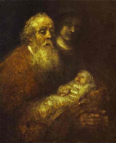
If you get up close to it and have a good look at the paint surface (which is difficult to do, as it's position in the room creates a bit of a log-jam of people), then it's all licks of flickering paint, dabs and smudges and smears, like a late Titian or late Turner. The paint seems to obfuscate the subject, which emerges from the gloom and floats, frail and stiff. it's a painting about the beginning of life and the end.
This is a wonderful show, but let's face it - stick a lot of Rembrandts in a room, and you couldn't really fail to have a magnificent exhibition. The gloom (for conservation purposes for the drawings and prints) is depressing and does no favours at all to the oils. The way the rooms are divided up with boards makes for difficult navigation and hard to stand back from the paintings, especially amongst the sea of people. And the wretched non-linear arrangement into chunks of bizarrely-themed groups just doesn't tell the story. It's hard to concentrate on the thrust of the intellectual argument, such as it is, when you're being jostled by throngs and shuffling past the work. It's hard work to see the show.
Sorry, but I've seen the exhibition twice now, and even after the second time I didn't come out with a clear idea of what Late Rembrandt is all about. And I've got an Art History degree.


