Sunday 30 September 2012

Paintings on my easel... Harvest Fields, Howe of Fife

I thought you might like to see some of the paintings 'hot off the press' from my easel.

Here's the first (sitting on my easel)....

Harvest Fields, Howe of Fife (Oil, 10 x 10)

I was through at Leuchars in Fife to see the big air show there a couple of weeks ago (Red Arrows again!!).  The journey there was through fields that were full of round bales of hay just brought in for the harvest, all under a bright blue autumn sky.

This is just a little painting, only 10" by 10".  It's meant to be quick and fresh, with the turquoise of the sky contrasting with the golden colours of the hay.

Friday 21 September 2012

Calling Art Lovers in Stockholm!

If you're in sunny Sweden this autumn, then you might like to call in to the new Stockholm Affordable Art Fair which is on from 4th to 7th October.


This fun four-day event will host a wealth of galleries and a huge array of contemporary art (including mine!),  in Frihamnshallen, Stockholm’s Cruise Center.  All art is under 45,000SEK (£4000). 

My work is on the Lime Tree Gallery stand, and I'm going to be showing a capsule collection of vibrant, colourful Scottish scenes, like this one of Skye....


Heather, the Cuillins (Oil on linen, 20 x 20)

and this painting of the white sands at Morar....


Bluebells at Camusdarrach (Oil on linen, 12 x 12)


Like a two-for-one admission to the Fair?  Then just click HERE to download your ticket. 

For more information on the Stockholm Affordable Art Fair, click here.

If you do go along, then please do drop me a line and let me know what you think!

Thursday 20 September 2012

Royalties, please

Apparently the art-restorer's nemesis, 81-year-old Spanish granny Cecilia Gimenez, has demanded royalties for her now-famous reinterpretation of the 120-year-old fresco of Jesus in her local church (see my previous blog post here).

Here's the lady herself with her masterwork in a local graffiti tribute.


Apparently the whole business is causing a world-wide sensation, and a new tourist trap has been created in Zaragoza.  The Sanctuary of Mercy church, where the fresco is housed, decided to charge visitors to see the newly 'restored' painting.  So big is the crowd-pulling sensation, that the church made 2,000 euros in the first 4 days.

As well as a Facebook fan page, Spanish graffiti artists The Graffiti Company have also paid tribute to Ms Gimenez by creating a mural (see above) depicting her alongside her Ecce Homo handiwork.   Bizarrely, her 'restoration' has now become an artwork in its own right, to the extent that it's spawning its own artwork and reinterpretation.

The reaction is certainly nothing like Elijah Garcia Martinez (the artist of the painted-over work) ever created with his original fresco!

Wednesday 19 September 2012

Monday 17 September 2012

Van Gogh's Colours

You might have seen reports recently about new research which has shown that some of Van Gogh's colours are fading and altering in his paintings.  His paintings are of course around 125-130 years old now.

It seems to be a problem with his yellows especially.  Layers of varnish which were added later to his paintings appear to have absorbed some of the surface layers of the oil paint, leading to a dulling or fading effect.

This is one of the paintings which art restorers have been looking at, called Flowers in a Blue Vase.  Paint was extracted and examined in two areas (marked).


Cadmium yellow, which is this colour


had turned a greyish-orange colour and had cracked.  Normally cadmium yellow gets paler and less vibrant as it ages.  However, in this painting the cadmium has formed oxalates within the surface layer of varnish.  

Ironically, this varnish wasn't put on by Van Gogh himself, who preferred his paintings to have a natural raw 'genuine' feel, rather than a pretty finished look.  The varnish was applied by later dealers, conservators and private individuals in accordance with popular taste and accepted practice of the time.  However, the fact that some of the paint surface has been drawn into the varnish creates a troubling problem for present day conservators, who of course want to prevent any further degradation but are duty-bound not to remove any original material.

Van Gogh also used chrome yellow a lot, which is a sharper, more acidic colour (cadmium is a more eggy colour).


Here's that chrome yellow in action in the background, along with cadmium yellow and yellow ochre (the more mustardy shade) on the flowers.

Vincent van Gogh, Sunflowers
 
For Van Gogh, the colour yellow in all its forms symbolised feelings of love, life, hope, positivity in the future.  However, chrome yellow is affected by sunlight, darkening to a brown shade over time.  New analysis using sophisticated X-ray techniques shows that the cause of the problem is a "reduction" reaction that alters the chemical make-up of the chromium in the paint.  

As you can tell by the names, these pigments are made from the colour-bearing metallic elements at the centre of the periodic table.  You don't really want to tangle with cadmium, lead, titanium, chromium or anything else in the paint too much - although as an artist, you do get covered in the stuff.  It's not really advisable to ingest it, although artists do have a habit of 'tipping' their brushes - licking the ends to get a fine point.  Charles Rennie Mackintosh, for example,  tipped his brushes whilst painting his watercolours in the south of France, and ended up dying of oral cancer.

Back at the Van Gogh's, the Van Gogh Museum in the Netherlands is on the case as regards the fading and altering pigments.  However, what about those paintings that are in private hands or in less pro-active or cash-strapped institutions?  

It could mean that, without conservation, we will be looking at some very faded and brown Van Gogh's in a hundred years time.  With colour so bound up with meaning in Van Gogh's work, it would fundamentally alter the essence of his paintings.

Friday 14 September 2012

Favourite Paintings - Rauschenberg's Untitled (Red Painting) at the Guggenheim Museum, New York

When I was in New York earlier in the year, I visited Frank Lloyd Wright's masterpiece, the Guggenheim Museum.  You know the one....


Just look at it compared to the building beside it.  It's like a 1950's spaceship.  It must have been totally mind-blowing when it was first built.  It still is!

Inside, it has a huge atrium with an ascending spiral walkway which leads your eye up to the glass roof.  All white, it's an almost religious space with no intrusion from the outside world apart from pure light;  like an art cathedral, or an art casino (if you've ever been to the gambling houses of Vegas, where there's no clocks or windows and  time stands still). 

The walkway has a very low barrier at the edge (suprisingly, vertiginously low), and it's all sloping floors and curving walls.  The art is displayed up this ramp against the curved walls and in shallow bays.  Which isn't great.

It's a bizarrely dizzying and pretty overwhelming effect - you feel as if you're about to tip over the edge.  You don't really feel safe stepping back to look at things.  In fact, the architecture is so very dominant that it pretty much overwhelms the experience of being there, and also overwhelms the art itself. The building isn't a subservient shell for the art, it's the dominant art-piece which is being decorated by the contents.  Tail wagging the dog.  It's like being in a giant Frank ego. 

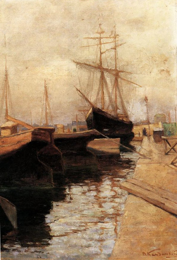
There's surprisingly little art for the size of the building, as there's only the stairwell and then a couple of side rooms. However, one piece which really jumped out at me was Robert Rauschenberg's Untitled (Red Painting).  It's a big painting, and just throbbed away like a heartbeat on the white curved wall.
Robert Rauschenberg, Untitled (Red Painting) 1953 
(Oil, fabric and newspaper on canvas with wood)

Obviously, it's a little difficult for this little image to convey the impact of the piece, which is why you really always need to see art in the flesh, so to speak.  

It's got a lot of surface texture going on with layers and layers of collaged materials of different textures and thicknesses, such as newspaper and fabric, and layers of differently applied types of paint and varnishes.  Two pieces of wood lie at the top and bottom of the paint surface.  These echo the more subtle brown shades in the painting, and are organic beginning and end-points for the piece, which have been machine-cut to fit.  So they are organic and natural, but tailored by machine.

Although it is one colour - red - there are lots of subtle colours - oranges and vermillions and ochres, and shadows cast by the layers, and then really deep parts where you can physically look right into the dark heart of the picture, and then bright reflected light on the varnished surface.  

The paint, which could be oil or household, is in parts dribbled or splattered or brushed, so there are different forms of action used to apply the parts, some carefully, some energetically, some thoughtfully, some accidentally.  Instead of mark-making with a brush or charcoal, it is huge gestural mark-making with scraps of two dimensional materials which are then wrinkled and layered to make animated three-dimensional form, in a method of art-making that is right in the point between a sculpture and a painting.  

When he was a child, because they were poor, Rauschenberg's mother resourcefully made clothes from scraps of materials in order to make do and mend, even, apparently, making a skirt for herself out of a suit which her brother had died in. Nothing was wasted.  The house was always full of these scraps of material being transformed and pieced together into a new shape and a new life, although Rauschenberg longed for something new and shop-bought.  

His art, then,  consists of taking the found and treasuring it, transforming it into something new that is labelled as and revered as 'art'.  He would also later make a series of work called the 'Glut' series, a comment on the throw-away consumerism of middle-class America.  He travelled round the roads of the US, stopping to pick up car wreckage and other discarded objects, and taking them back to the studio to make into assemblages.

Untitled (Red Painting) is both beautiful and raw, formed and unformed, organic and man-made.  It's very, very exciting and full of a powerful energy.  I couldn't take my eyes off it.

I came across quite a bit of Rauschenberg's work in New York.  Here's 'Bed'.  Long before Tracey Emin was making art of hers in 1998, Rauschenberg was picking up his bed in 1955 and turning it into art, much to the disgust of his father.

Robert Rauschenberg, Bed 1955
(Oil and pencil on pillow, quilt and sheet on wooden supports)

Interestingly, Emin said "It's art if I say it's art", and Rauschenberg declared pretty much exactly the same thing of his work. Invited to create and display a portrait of gallery owner Iris Clert, Rauschenberg's submission consisted of a telegram sent to the gallery declaring "This is a portrait of Iris Clert if I say so."

As I said, Rauschenberg's ordinary, hard-working thrifty parents were baffled by their son's work, which quite frankly, wasn't work by any definition they had ever come across.  You wonder where Rauschenberg got the thrawn, independent spark to recreate himself in such a completely new way as an artist, totally outwith anything in his surrounding working-class experience.  

I particularly like the story about his mother who, when faced with her house being in the path of Hurricane Andrew, boarded up her windows by bringing down some of her famous son's work from the attic (worth about a million dollars each), and nailing it over the windows.  She took care to assure Rauschenberg that he wasn't to worry, she had been very careful to nail them painted surface inwards, so as not to advertise to the neighbours the sort of embarassing nonsense that her son got up to. 

What Rauschenberg's work does, which is so very exciting and joyful, is to say 'anything is art'.  anything is art and an expression of yourself if you say it is.  So we have this...

Robert Rauschenberg, Canyon (1959) Mixed

and this...


Robert Rauschenberg, Monogram (1955) Mixed

Yes, that's a stuffed goat and a tyre on a piece of canvas.  It's texture and collage gone mad, pushed to extremes.  Ok, so maybe some of you are going along with Rauschenberg's dad on this one - call that art?  But think of this.  
Think of what you did at work today, or yesterday, or will do tomorrow.  Routine stuff, probably.  Very likely sitting at an office desk, with very little visible product at the end of the day.  Now imagine the working life of Rauschenberg.  Popping off to the local flea market or dump.  Grabbing a stuffed goat.  Picking up a car tyre.  Painting the tyre and rolling it along a giant length of paper to make a print.  Mucking about with arranging things on a canvas.  Really looking at objects, their shapes and textures.  How they interact with other objects that they would never normally be seen with.  Doing all those sort of creative things that you used to do with left-over toilet rolls and cereal boxes when you were small, gluing and painting and arranging.  It was fun.  This is fun.  This is art!

Because, once you have that mind-set that anything can be art and everything has potential, it's actually very  liberating and very exciting.  
Look around you.  Try it!

PS One last word on Frank Lloyd Wright's style-over-function Guggenheim museum.  Frank wasn't great at signage - probably because signs would spoil the aesthetic of the concept.  Although it wasn't a problem for Charles Rennie Mackintosh in his iconic masterpiece, Glasgow School of Art - he just invented his own font, et voila, signs a go-go.
Anyway, it's really, really hard to find your way to, say,  the Guggenheim gift shop - which you can see over one of the balconies, but can't actually find a way to - or locate the secret tea-room.  Very very hard, especially in such an organic, asymmetric building.  When you do find the cafe, up a little stairway, it, too, is a tiny, curvy nest of a place, where the chosen few can perch on seats and nibble on a sandwich.  They obviously aren't expecting a lot of people to be able to find it.  
Oh, and the toilets.  There is a single unisex toilet roughly on each level of the walkway, which is fine, but it doesn't have an 'engaged' sign on the outside, just a knob.  So as soon as you go in, people are banging on the door, because there's no way of telling if there's anyone inside.  It's pretty annoying, and all because it just hasn't been thought through that little bit further (the way Mackintosh did).  
So the Guggenheim may look like an utterly astonishing iconic architectural masterpiece, but for a visitor actually using an art gallery, it has to also be about the useability, accessability and functionality of the basics of an art gallery; the art, the cafe, the gift shop and the toilets. So a whole load of curvy walls and bendy floors doesn't cut it on the practicality front.  
Sorry, Frank...


Thursday 13 September 2012

20/21 British Art Fair Opens

The 20/21 British Art Fair opens today, which is very exciting. 

Definately one of the highlights of the art calendar, it's a chance to see a plethora of quality British art all under one roof, with world-class names from both painting and sculpture.

(c) David Ing (www.daviding.com)

It's at the Royal College of Art, right next to the Albert Hall in leafy west London.


The stands cover several floors of the College, so there's a great deal to see - pace yourself!

(c) David Ing (www.daviding.com)

(c) David Ing (www.daviding.com)

My work is on the Duncan R Miller stand, which is in the main corridor near the entrance.  

The fair is on until Sunday 16th September, and if you manage to get along to see it, please do let me know what you thought of it!

For more information about the fair, please click here. 

Wednesday 12 September 2012

Murray wins! Woo-hooh!

Ok, so this isn't art, but as a proud Scot, I had to mention the phenomenal achievement of Andy Murray winning the US Open Championship.

WELL DONE ANDY!!


Now, how to honour such an achievement? 

They've already got Murrayburgers in Dunblane, but maybe a statue?  Or a victory parade?

Or Andy for Scottish PM?  You can just imagine his deadpan response to any pressing problems of state. "Prime Minister, what are we going to do about health/transport/roads/education...?"  "Deal with it."  It'd be brilliant!

No, I suggest that a nation honours him in the only way we Scots can - by embedding him into our very culture.

So, next time you want to go out for a curry, remember;

don't say you'd like a Ruby Murray - say you fancy an Andy Murray!

Tuesday 11 September 2012

Exhibiting at the 20 21 British Art Fair

Not long now before the 20 21 British Art Fair opens at the Royal College of Art in London for another busy show. 


Running from the 12-16 September, this fair kicks off the new autumn art season in London, and showcases all the best in British 20th and 21st century art.  

Big names such as Bacon, Freud, Frink, Frost, Hepworth, Hockney, Hodgson, Lanyon, Lowry, Moore, Nash, Piper, Riley, Scott, Spencer and Sutherland will all be there, as well as the Scottish Colourists...and me!

So if you're going to be there, look out for my work on the Duncan R Miller Fine Arts stand, and paintings such as these...

Evening Torchlight, Bath (Oil on linen, 15 x 15)

Spring Tulips with Cherry Blossom (Oil on linen, 12 x 12)

Sun and Approaching Rain, Catbells (Oil, 10 x 10)

Harebells in the Sun near Cushendun (Oil on linen, 20 x 20)

For more information about the fair, go here.

Monday 10 September 2012

Before They Were Famous - Answers

Ok, here's the answers....

1.  

Dutch artist, Theosophist and member of the De Stijl movement, best known for his ruthlessly vertical and horizontal compositions in primary colours -

PIET MONDRIAN

Piet Mondrian, Chrysanthemum (1906)

 Piet Mondrian, Composition II in Red, Blue and Yellow (1930)


2.

Convention-busting Spanish painting genius and inventor of cubism -

PABLO PICASSO

Pablo Picasso, Science and Charity (Oil, 1897)
 
 
Pablo Picasso, Weeping Woman (Oil, 1937)

There's 40 years between these two though.

 
3.

Droll commentator on 20th century consumerism

ANDY WARHOL


Andy Warhol, My Shoe is Your Shoe (1955)

 
Warhol, Red Car Crash (1963)

From shoes to death in 8 years.  Consumerism will consume you.
 
4.

French Impressionist, painter of light, colour, modern life and precursor of Jackson Pollock's action paintings

CLAUDE MONET


Claude Monet, Fishing Boats at Etrekat (Oil, 1883)


Claude Monet, Waterlilies (Oil, 1916)


5.

Dutch symbolist/post-impressionist best known for his expressive exuberant brushwork in bright life-affirming colours

VINCENT VAN GOGH


Vincent Van Gogh, The de Ruijterkade in Amsterdam (Oil, 1885)


Vincent Van Gogh, The Starry Night (Oil, 1889)

There's only 4 years difference between the execution of these two paintings, but then Van Gogh had to move fast - he only had a 10 year painting career.


6.

And finally, Russian painter of spiritual abstract work, leading us all towards a higher plane of being

WASSILY KANDINSKY


Wassily Kandinsky, Odessa Port (Oil, 1898)


Wassily Kandinsky, Composition IV (Oil, 1911)


Friday 7 September 2012

Friday Teaser - Before They Were Famous

Ok, just for fun, can you guess (without resorting to Google Images) which artists these pictures are by?

They are all very very well-known artists, but these are all early works!

1.


2.


3.


4.


5.


6.


Thursday 6 September 2012

Pottery Demonstration

My friend Anne Morrison is a well-known potter and award-winning ceramic sculptor (and niece of Joan Eardley, co-incidently) (oh, and she has the same birthday as me!).

These are some of her amazing raku-fired pots, which have found-driftwood handles.


This weekend she's holding a demonstration to show how she makes her hand-built pots and sculptures.  Here's some of her mixed-media sculptures, which combine found items such as drifted and wire, along with slumped glass and ceramic figures.


Anne Morrison, On the Edge (driftwood/ceramic)
I own this one...

Anne Morrison, They Dreamed Their Dreams So We Could Live Them (Wood/Glass/Mixed) 
It has old family photos and letters transferred onto the found wood and the fused glass elements of the piece.  It's very feminine and tactile.
If you'd like to see more, then Anne will be at the 
Lillie Art Gallery, Station Road, Milngavie G62 8DZ (near Glasgow) from 10am to 3.30pm on Saturday 8th September 
and she's happy for you have a chat and to watch her work.  So if you're in the area, please do drop by!


Contact her on annemorrisonpots@hotmail.co.uk

Visit her website here.