Here's Caravaggio's Judith Beheading Holfernes of 1599, which hangs in the Galleria Nazionale d'Arte Antica in Rome.
(Read more about the subject matter of Jewish heroine Judith here.)
(Read more about the subject matter of Jewish heroine Judith here.)
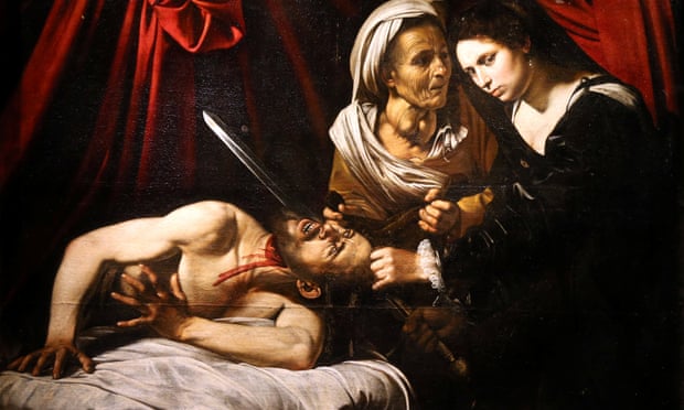
Here's Eric Turquin, an expert, standing beside a new Caravaggio - a version of the same subject found recently in a French attic. If it's authentic, it's worth a strangely precise £94 million.
AFP/Getty
My, my, wouldn't we all like to find a lost Caravaggio? Why, it would make our reputation as an art expert.
So let's take a look at the two.
In the top authentic one, a great writhing swag of red drapery hangs in a V shape, emphasising the line of Holofernes' right shoulder and the straightened cutting arm of Judith, which is doing all the work. The V points down to the nub of the action, the hand of Judith held against the side of the head of Holofernes (who is still alive at this point) and to his eyes which see the hand delivering his own death. Because of the angle of the head, the light source catches his right eye, allowing us to look into that eye, and to feel his horror and pain, and his horrified realisation that his end has come at the hand of a woman.
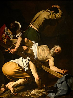
Caravaggio often painted wheel-like compositions, which have a dramatic fulcrum, giving energy and movement to the composition, which suggests the action will continue, like the frames of a film. Look at this, the Crucifixion of St Peter.
If Holofernes's head is the fulcrum, then out of it radiates the stiff arms of the disgusted but determined Judith, the muscular arms of Holofernes, the blade of the sword, the spurts of arterial blood, and the red folds of the curtain. There is purpose and direction and strength and logic to all of these movements. It all makes sense.
Holofrenes's arms thrust back into the painting and down and out of the painting, their muscelature highlighted in chiaroscuro, and the cast shadow of his right arm delineating the string, robust curve of his chest. The shadows explain the volumes. They emphasise the masculine V shape of his upper body, marking out his physical strength. They tell the story of her bravery that this is a big, strong man for a woman to take on, that what she is doing is determination in the face of almost overwhelming odds.
Judith, in her pale dress, is clearly all woman, with her chest emphasised by the full directness of the light source. Caravaggio is spelling out her femininity - that's the story. She's a practical gal as well, who has literally rolled her sleeves up to do the job, and has bare arms so she can get a good grip and not get her sleeves soaked in blood. Her elbows are locked, and a lot of force is being applied.
The old woman's gaze is firmly and unflinchingly on the victim - she's seen it all before and holds a cloth to catch the head in a gesture of practicality.
Let's look at the 'new' Caravaggio.
For a start, Judith is dressed in a long-sleeved black gown and head-dress, which means it is difficult to read her figure, or the important gesture of her arms. Her femininity is hidden. She's skulking in from the right looking a bit apologetic, and reminds me strangely of Mary Queen of Scots.
Her left hand holds Holoferne's hair in a dainty gesture with her pinky out, like she's picked up a tea-cup. The hand doing the crucial cutting is in shadow, and there's a curious lack of force. She's not even looking at what she's doing, but is looking at us.
The angle of the sword in the new painting exactly follows the line and shape of the lower fold of the curtain in the 1599 version, which is very odd. Except the curtain here isn't a heavy swag of fabric helping us to read the composition. Now it is an explosion of jarring lines radiating out from somewhere outside the top of the picture frame, with a strange dangly Christmas bauble thing, like a giant uvula. It's like the whole thing is staged inside Moby Dick's mouth.
The Quentin-Matsys-like old women
with a huge goitre is having a bit of a gossip with Judith, like Mme
Guillotine doing a spot of knitting as the tumbrils roll up. She's meant to be standing further back than Judith, but seems to hover almost in front of Judith's pale head.
And here, Holoferne's isn't the powerful, rhythmical figure as before. Here, his figure is again hard to read, strangely un-3-dimensional, like a squashed toilet roll tube lying on top of a pile of white bedclothes that take up far too much space. His face doesn't communicate with you.
The 1599 version also has a broad, undulating band of action that runs horizontally across the painting allowing you to read it and make sense of the horror. It simplifies it all and turns it into rhythms. Look at the 'new' one. It has no rhythm when you read it. It's all over the place. It's illogical. There's a small compositional X in the centre of the painting, formed by the sword, the spurt of blood and the cloth held by the old woman, but it's a feeble thing, lacking strength and not bourne out or echoed by further elements in the rest of the composition. Even the spurt of blood lacks force, with a dweebly curve to it.
And the whole thing, ultimately, has a strangely Flemish look to it..
And the whole thing, ultimately, has a strangely Flemish look to it..
So - initially - Oooh!!
AP
And then when you look closer - er, no. It's a compositional and narrative hotch-potch. Lovely quality. But not Caravaggio, and I'd say not even Italian.
So if it's not Caravaggio - who is it..?


No comments:
Post a Comment