As a card-holding member of the Royal Academy, it's always good to make the most of my subscription and see as many of the shows as I can.
So whilst I was down in London at the Affordable Art Fair in Hampstead, I went along to the massive annual Summer Exhibition.
Here's some of the work... lots and lots of red dots.... no glass on the frames...and not a lot of framing at all, actually...
This was a huge painting, very mysterious - a giant sun contained within a caravan, like something out of Doctor Who
Each room had been curated by a different artist, which was very effective indeed. It meant that you read the ethos of the selection for that particular room, then looked out for the highlights that it mentioned. It also made you question why particular works were included under the heading or theme of the room, what connected them. It was a great way to curate such an huge, unwieldy mass of work, and made you eager to look into the next room. It was like a collection of lots of different exhibitions.
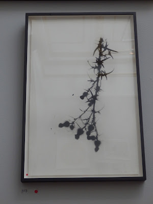
The picture above was in a room of prints. The introduction told you that there was a piece which was by a father and daughter, and was a picture of potato prints, the easiest of all forms of printing. It was a joyous celebration of basic forms, and demonstrated the most unsophisticated yet unpretentious form of all printing. However, although it is a simple print, it is also about a relationship, father and daughter, experience teaching youth, and all sorts of more complex things. So although simple, it carried an emotional punch.
The room of prints ranged from this right through to the most complex technical print.
I loved that (although how the selection committee would know the touching story behind the blobs as they whizzed past, I don't know. Things that do rather make you go 'hmmmm'....)
Spot the potato print in the centre here.
Barbara Rae. Not a potato print.
Jake and Dinos Chapman. Not a fan.
Very popular...
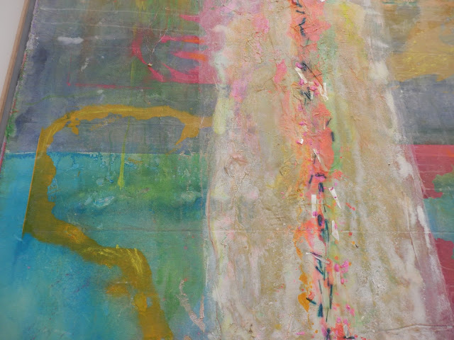
Loved this...
Here's the back of it.
Joe Tilson wall hanging. Hurrah! Mr Tilson, pop art god, came to speak to my fine art class in the 80s, when he was into plywood cut-out keyholes in a big way. It made a huge impression that we mere mortals should be listening to a Real Live Big Name Proper Artist.
Video of seabirds - strangely captivating.
Piece of toast. (Sold)
Gilbert and George. Not pretentious.
And then, sometimes the visitors and their hats were just as exciting as the art....


good
ReplyDeleteWow!! I really liked these arts here. Every art looks creative and excellent. I honestly love being a part of such art exhibitions. Well, an art show was arranged at one of local event space San Francisco where I found best and creative art work. Really liked and enjoyed being there.
ReplyDelete