Tuesday, 27 March 2012

Next show heads for Bristol

My next show heads off in a van to Bristol today.

Called 'The Great Welsh Journey', this very special event is a one-off collection of landscape paintings, drawings and postcards from a journey around the Principality.   

 Rainclouds over Llandudno Pier (Mixed Media 29 x 24)

I went on a trip round Wales in September last year, from Llandudno and Anglesey in the north, through Snowdonia (very wet!!), down to Aberyswyth and the coast, Fishguard, across Pembrokeshire, Tenby, Swansea, round and round the Gower Peninsula, and then across to Neath, Merthyr Tydfil and the Black Mountains to Brecon.  All the while, through sunshine and showers,  my trusty camera was on hand!

 Rhossili Bay (Oil on linen, 32 x 48)

It's a really exciting show, as it was a chance to do something a bit different, with a real mixture of work in different media.  I'm hoping it will give a flavour of the excitement of documenting a journey and discovering a place.  As well as oils, I've used acrylics and mixed media drawings to give a sense of this fluid, quick response to a landscape.

 Clouds over Wolf Castle (Acrylic on card, 10 x 10)

The postcards were also very nice to do, as they're almost like postcards to myself about the journey, and their size means that they look really cute.

Bwlch (Oil on postcard, 5 x 7)

The exhibition also includes works by Welsh artists such as Vivienne Williams. There's a 'meet the artists' preview (I'll be there) on Saturday 28 April 11am - 4pm at the Lime Tree Gallery, 84 Hotwell Road, Bristol BS8 4UB. All welcome! 

Monday, 26 March 2012

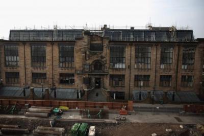
New View of Mackintosh Building

Earlier this year, the 1960s concrete block of the Newbery Tower at Glasgow School of Art was demolished, gradually nibbled away by a rather intriguing dinosaur-like piece of machinery over the course of a couple of weeks.


(Thanks to Anne Morrison for her photos.)

Whilst it's goodbye to the Textile Department, and to the end of term exhibition in the Newbery Gallery, it does mean that for the first time in 50 years, you can actually see the whole facade of Charles Rennie Mackintosh's masterpiece.

Picture: Jeff J Mitchell

It's a great opportunity to see it before the new buildings opposite once again obfuscate the view.  You can read more here in an article in today's Herald.

There's also what promises to be a very interesting programme on BBC4 on Thursday which includes a discussion on Mackintosh and his influence, and also that of arguably the greater talent of his wife, Margaret MacDonald.  Sex and Sensibility: The Allure of Art Nouveau is on BBC4 on Thursday 29th March at 9pm.  You can see details here.  

You can catch up with episode one of this 3-part series about this lusciously sensual decorative style in Paris on BBC i-player here.

You can also read more in a piece in today's Guardian here called 'Art Nouveau - a Magical Style'.

Friday, 23 March 2012

Favourite Paintings - Rembrandt

When I was 8, we did a project on Holland in Primary School, and our teacher brought in some slides of Dutch paintings which we looked at through a viewfinder which you put up to your eye.  One was Van Gogh's Sunflowers, and the other was Rembrandt's The Anatomy Lesson of Dr Tulp (on reflection, a rather strange combination of images).  

Seeing coloured images like that was a reasonably uncommon experience in the 60s, in a house with no books and before colour television, so the experience and surprise of seeing these paintings in that small but intimate way had a rather profound effect.  One image was all about colour, the other all about gesture, both were full of emotion.  I loved them both.

Years later, when studying abroad as part of my degree, I had the opportunity to stand in front of Rembrandt's The Jewish Bride in the Rijksmuseum in Amsterdam, one of my must-see artworks.

 Rembrandt van Rijn The Jewish Bride (oil on canvas c.1667)

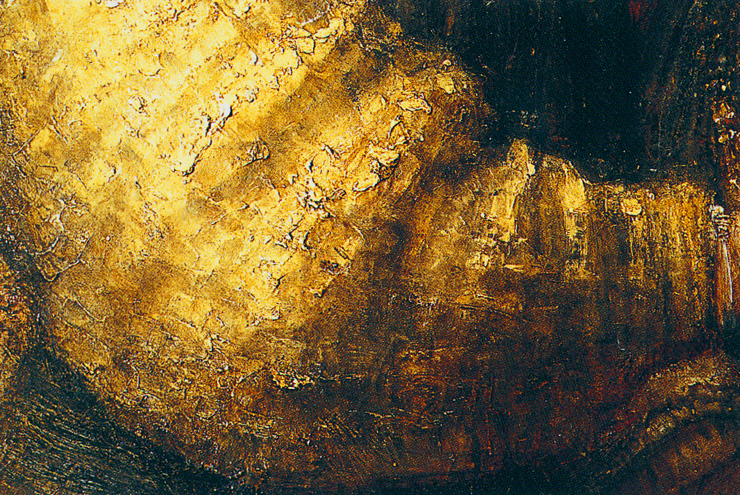
The title is a speculative one added in the 19th century.   It's a big, dark painting, and yet it seems to glow. You can't take your eyes off it when you stand in front of it is because it is all about texture and colour and gesture and emotion.  It had layers and layers of paint and flickering brushwork that suggests different materials and textiles catching the light, and three dimensionality.  This is the golden sleeve of the man.


It's just paint, and yet it has a reality and a volume about it.  It actually seems to be coming out of the painting towards you, but also has a certain abstract quality about it close-up.

There is also a lovely sense of abstract pattern making in the gesture of the hands.


You can see that it's just paint, you can see the actual brushstrokes, and get the sense of the person making the brushstrokes and creating the artifice of the work; and yet it seems to become actual fabric, and light, and flesh, and touch and life, and also more than that - it becomes a real sense of something human and tender.  And that's quite an astonishing thing to do with paint and canvas.

As Fine Art students, we were also lucky enough to visit the Jan Six house in Amsterdam, which was not open to the public.  One of the paintings there was Rembrandt's portrait of his friend Jan Six.

Rembrandt van Rijn Portrait of Jan Six (Oil on canvas, 1654)

Again, it's a big old dark painting with that punch of orangey red, but the stunning thing, which has stayed with me all these years and which was right at eye level, was not the face, but the gesture of the hand pulling on the gloves.  


It's clearly just paint, and big, expressively loose gestural marks of paint at that, and yet it's the volume and weight and movement of a real hand pulling on a glove.  It is a casual yet hugely informed passage of paint which tells you all you need to know about the character of the sitter and the relationship between the artist and his friend, who allows himself to be preserved for all time in this intimate, informal act of dressing.

If you'd like to read more, there's an interesting essay here musing on the meaning of this gesture. 

Whichever way you look at it, it's just genius.

Thursday, 22 March 2012

Glasgow Art Show

The Glasgow Art Show opens tonight, and there is much speculation amongst artists and gallery owners as to what this new fair is going to be like.

The Glasgow Art Fair was a regular feature in a tented village in George Square for 15 years until 2010.  And then, with a funding cut,  it was no more, and it has been sorely missed.  

It's ridiculous that a major arts centre such as Glasgow has had no annual showcase of this nature for its talent and its art businesses.  Not only has it meant a significant loss of income for the city's artists and a financial blow to its galleries already hit by the recession (as well as to the hospitality industry who benefitted from the national and international trade that the fair brought), but it shows a lack of confidence and pride in Glasgow's art sector.

Now the same group that organises the Edinburgh Art Fair is organising an event in the Grand Ballroom at the Thistle Hotel in Glasgow's city centre - which doesn't quite have the same punch or profile as the George Square settting.  Notable by their absence are long-established galleries such as The Scottish Gallery, Open Eye and the Compass.  You can read what the papers have to say about it all here in The Herald article.

I'm going to the opening tonight, so we'll see what it's like!   I have work with the Cotswold-based Wren Gallery on stand A5.  For more information about the fair, go to the Glasgow Art Show website.

Burnt Orange Moorland (Oil on canvas, 24 x 26) will be on stand A5.

Wednesday, 21 March 2012

Out in the Lakes

Just looking at the photos which I took out in the Lake District.  

The weather wasn't too kind, but it did make for some dramatic clouds over the hills, and lots of nice reflections in the water.


Tuesday, 20 March 2012

The Scottish Colourist Series: FCB Cadell

I went to see the final week of the big Cadell exhibition at the National Gallery of Modern Art in Edinburgh last week.  Born in Edinburgh in 1883, Cadell was the youngest of the group known as the Scottish Colourists, and exhibitions of the work of fellow Colourists Peploe and Fergusson will be held at the Gallery of Modern Art in autumn 2012 and 2013 respectively.

This is the first solo exhibition of Cadell’s work to be held in a public gallery in seventy years - that's a long time to wait. The word that you'd probably use to describe Cadell is 'stylish', with his portrayals of Edinburgh New Town interiors (often his own lavish apartments of shiny floors and minimalist furnishings) and the sophisticated society that occupied them.  Equally stylish, and very much of their time,  are his vibrantly coloured, daringly simplified still lifes and figure studies of the 1920s and his evocative depictions of the island of Iona.

Initially living in Paris, and studying in Munich, a trip to Venice in 1910 seems to have loosened up his technique and turned up his colours.  Could anything be more vibrant, sun-soaked and life-affirming than this picture of St Marks Square with the punchy vermillion of the fluttering Italian flags?

FCB Cadell St Marks Square, Venice (Oil on board, 1910)

In these years before the first world war, Cadell also visited Iona for the first time (which he would return to practically every summer) and began a career as an artist of note.  He developed an elegant palette based on white, cream and black enlivened with highlights of bold colour.

Enlisted during World War 1, Cadell produced the 'Jack and Tommy' series of watercolour drawings, with their pared-down, simple, expressively humourous lines.

 
He uses the negative space and the colour of the page itself as part of the design of the image.

Building on this, following demob, Cadell's work becomes more art deco and graphic, with a greater interest in pattern-making. He used tightly-cropped compositions, usually approached at an angle, flat application of paint and the use of increasingly brilliant colour for his  interiors, still lifes and figure studies.

 FCB Cadell Portrait of a Lady in Black

FCB Cadell Still Life with Lacquer Screen (Oil on canvas, mid 1920s)

Cadell painted the actual chairs that he owned in his flat a vibrant vermillion, and they feature frequently in his paintings as flat, accenting colour-notes, like  props in a stage-set.  Elegant models are placed leaning enigmatically against the mantle-pieces in his flat, with fan, hat and dress like flat black cut-out shapes, and you get the feeling that this is a small moment of drama from part of the larger theatrical stage-set of Cadell's life.
 
Each year Cadell returned to paint Iona, with its white sands, turquioise seas and remarkable light.  Usually small and portable in size, his paintings had an absorbant ground, so that the paint has a chalky, dry look to it, with scumbled textural brushwork.  This is one of my favourites, and I had a postcard of this for years on my wall.
 
 FCB Cadell, Iona Croft (Oil on canvas board 1925) 
 
With all the reflected light from the white sands and the white walls of the croft, the tones of this painting are predominantly blue, except for the joyous central burst of the red tin roof.  There's something very appealing and cosy about it, very happy; you want to go there.
 
However, although outwardly successful, Cadell’s financial position, and his health, deteriorated. Despite a post-war recession and a decline in the art market, Cadell still tried to cling on to his lavish lifestyle.   Even with loyal patrons, he was forced to move home three times between 1928 and 1935. His last years were dogged by ill-health and Cadell died in Edinburgh in 1937.

Cadell's work is full of exuberance and life and optimism.  It has a tremendous joy about it.  It shows a delight in paint, and colour and mark-making, in design and the good things in life; from elegant furniture, to a beautiful woman in lovely clothes; the solitude of a quiet interior, the beautiful light on a summer beach; to a single perfect bloom, or a simple red chair.

Monday, 19 March 2012

Thank you!

Thank you very much indeed to everyone who saw my work at the Affordable Art Fair in Battersea over the weekend, and to those of you who have since got in touch with me to comment on my work.  Thank you for all your feedback!

 
Remember, you can always get in touch with me either by leaving a comment here on the blog (you don't have to be a follower in order to do so), or by contacting me by email at judith@jibridgland.com.

The next art fair at which you can see my work is the Glasgow Art Show, which runs from 23 - 25 March.  I will have paintings on Stand A5, with the Wren Gallery.  

For more details on the fair, go to The Glasgow Art Show 2012 website.