You've probably heard of the 'Golden Section' or the 'Golden Ratio' in relation to art and the composition of a painting.
Put simply, the Golden Section - also called 'Phi' and equal to 1.618 - refers to the aesthetic rule that a composition will look pleasing if there are certain proportions underpinning it. Which basically boils down to 'things look good when they are roughly in thirds'. Here's what I mean:
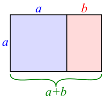
You can view a short video about how to draw the Golden Section (or Golden Ratio) HERE.
Imagine that the rectangle above is a landscape painting. Theoretically, if you put a tree on the black vertical line (for example), it'll look good and the painting will 'balance'.
It seems that ours brains are 'hard-wired' to make sense of the world by looking at the patterns which underpin it, whether we consciously realize that those patterns are there or not. So even if we look at an abstract painting, we can make sense of it by referring subconsciously back to the patterns which we have seen in nature, and we will find some abstract patterns more pleasing than others because they more closely follow these rules of proportion. It's called neuoraesthetics.
One experiment in Canada, for example, asked volunteers to look at an abstract painting by (amongst others) Miro, and then a slightly different version of the painting, and asked them which looked more pleasing (read the paper here).
Here's the paintings - which do you prefer?
 Miro's genuine Bleu 1 is on the left, with its red lozenge carefully balanced on the golden section.
Imagine that the rectangle above is a landscape painting. Theoretically, if you put a tree on the black vertical line (for example), it'll look good and the painting will 'balance'.
It seems that ours brains are 'hard-wired' to make sense of the world by looking at the patterns which underpin it, whether we consciously realize that those patterns are there or not. So even if we look at an abstract painting, we can make sense of it by referring subconsciously back to the patterns which we have seen in nature, and we will find some abstract patterns more pleasing than others because they more closely follow these rules of proportion. It's called neuoraesthetics.
One experiment in Canada, for example, asked volunteers to look at an abstract painting by (amongst others) Miro, and then a slightly different version of the painting, and asked them which looked more pleasing (read the paper here).
Here's the paintings - which do you prefer?

The maths of the Golden Section is very very interesting, and has fascinated mathematicians, philosophers, painters, architects, scientists, biologists and thinkers for centuries. As I've said, it has a basis in nature, whether it be the proportions of a curve of a shell or the petals of a flower, or the spirals of a galaxy...

It can be applied to music. It can be found in architecture, such as the Pyramids at Cheops (I've been inside one of the pyramids at Giza - surprisingly hot down there) and the Parthenon in Athens...

..and in the famous double-helix (like DNA strands, life itself) staircase at the Vatican (the one you can ride your horse up) (or down)...

It can even be found in the stock market, where it is found in the complicated patterns of Fibonacci numbers, and used in market strategies such as Fibonacci retracement.
But back to paintings.
I tend to paint on a square canvas, or just off square (24" x 26" for example). Lots of Scottish artists paint on a square - I'm not sure why. When painting a landscape, a square format will give a dynamism to the composition, as you have very dramatic diagonals and a strong central focus. Perhaps that's something that suits the Scottish temperament.
Traditionally, canvasses were rectangular. If you see an Old Master that's square, it's usually because it's been cut down. Painting on a square format is a pretty modern idea. Degas uses it, for example in his Portrait of Edmond Duranty in the Burrell Collection in Glasgow.

Edgar Degas, Portrait of Edmond Duranty (Pastel and tempera on canvas, 1879)
Have a look at where the vertical lines for dividing the painting into thirds come. On the right at the bottom, it's where Degas' signature is on the book. On the left, further up, there's a black vertical line just above Duranty's shoulder. Going back to the right, further up, the golden section is at the edge of a pile of books or papers resting on a shelf.
Taking the painting horizontally, there is a bookshelf going across the golden section horizontally in the top third, and in the bottom it draws attention to the awkwardly clawed hand, increasing the power of the gesture.
Your eye is thus led into the painting, moving around the composition from side to side and up and down like a tennis match.
The square format, as I said, means that you have dramatic diagonals. Imagine the diagonals drawn from corner to corner.
In the top right of the painting, you have nothing but orderly bookshelves. That's half the painting with nothing going on, nothing of the subject that the painting is about. But by devoting half the painting to the books, they do actually add to our knowledge of the sitter. They are almost about to fall down upon and engulf Duranty - they emphasise his scholarliness, his 'bookishness'. They speak of his knowledge, but also of a certain fragility, of him about to be overwhelmed almost.
The bottom left diagonal has all the action squashed into it, all the scattered, disorderly papers, the sitter himself. And guess where the diagonals interesect? On the gesture of the two fingers pressed against the temple, emphasising the mind, the brain behind the man.
The format therefore adds hugely to our knowledge of the sitter himself. Degas exploits the qualities of the square to suggest the nature of Duranty's character. Clever, eh?
Vincent Van Gogh used a double square format excusively in the weeks before his death, in the summer of 1890.

Vincent Van Gogh, Wheat Fields with Crows (Oil on canvas, July 1890)
It's almost as if he's trying to double the drama.

Vincent Van Gogh, Undergrowth with Two Figures (Oil on canvas, June 1890)
A double square format used with a landscape could easily end up looking like a big sandwich, but look how Van Gogh keeps the tension there, playing with the proportions and the centres and keeping your eye moving. It's a very restless type of format, as there are two centres, and two squares to read round, two squares playing off each other. It's a big statement to make.
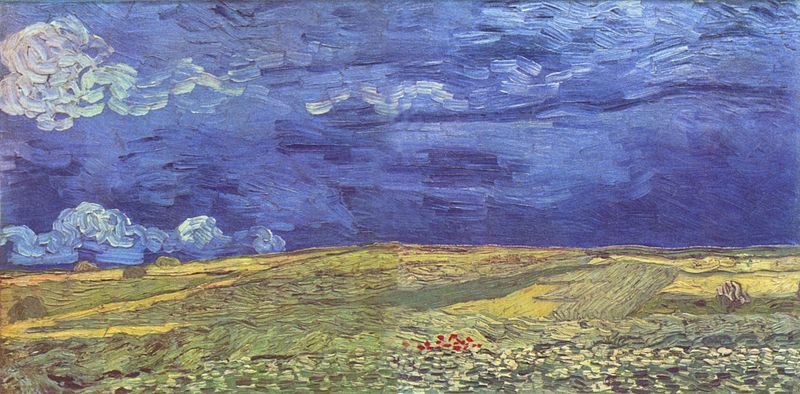
Vincent Van Gogh, Wheat Fields Under Clouded Sky (Oil on canvas, July 1890)
When I'm painting, these 'rules' of composition are in my mind, but it's not so calculating that I get out a T-square and start measuring the golden section. Instead, you go by your instinct, and trust your own eye. If it pleases you, it stays. If it doesn't, you change it. Sometimes you can't quite analyse why it isn't pleasing you, but you just know you've got to change it or else it will always bother you when you look at that particular painting again.
The golden section may be an almost mystical mathematical formula which underpins aesthetics, but it doesn't mean that there's a formula for painting the perfect painting.