Showing posts with label Lucienne Day Calyx. Show all posts

Wednesday, 10 May 2017

Lucienne Day at the Whitworth Art Gallery, Manchester

Whenever I'm in a town for a concert (as I was on Friday to see Steve Hackett in Manchester), I like to take some time to visit the local art galleries.  As you might expect me to.

So on Saturday morning I went to visit the Whitworth Art Gallery at the University of Manchester to see the newly opened Lucienne Day exhibition.  And what a treat it was - not just this little gem of an exhibition, but the whole art gallery itself.

The gallery is a massive, expansive exhibition space which in parts seems to open right out into the grounds that surround it - a bit like the Burrell Collection building - bringing nature inside.


Exhibits were allowed to have their own space, rather than being crowded in - such as this mobile which turned in the sunlight, forming a dialogue with the surrounding architecture and the parkland outside.


There were various other exhibitions going on, including performances by hipsters of the Siobhan Davies Dance Group, and a rather beautiful but ultimately harrowing video installation by John Akomfrah called "Vertigo Sea", about the cruelty and horror of the whaling industry juxtaposed with the plight of migrants making sea crossings.

But on to Lucienne Day.  

Best-known for her textiles, Lucienne Day (1917 – 2010) is a virtuoso pattern designer and colourist. She was an enthusiastic gardener and plant forms inspired many of her textile designs.  I love her textiles, which completely capture an era of optimism and a sense of moving towards the future after the war, whilst combining quirky graphics and clever observation.  It's that combination of clever design, awareness of purpose, and the capturing of the essence of the time in which they were made that makes them so very special.

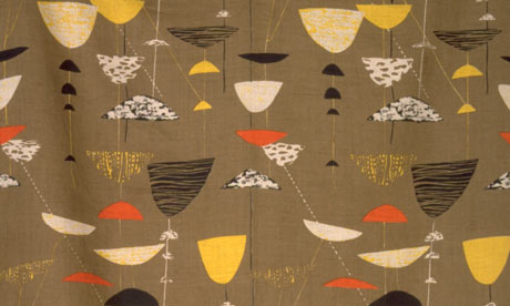
This is probably the most famous of all - Calyx.


After the gloom of the war, this must have looked like a jaunty explosion of colour and mind-blowing frivolity.  After six years of people having to endure their families and houses being bombed to bits and having to make do, they could now buy fabric just to make their houses look pretty.  How crazy is that?  I love this pattern because it is both simple and complex at the same time, and is a balance between the sprinkling of almost childlike shapes and the solidity of the background colour.   It looks random, but there is a very careful mind at work behind it. There's a delicacy and an understatement, but also a strong command over the pattern-making.

Here is a display cabinet showing 'Trio', designed for Heals (bottom left).  Lucienne's daughter wrote that this strange little design, showing rather alien, ameoba-like creatures in groups of three, was possibly her own family group.  Lucienne and Robin Day were married for a good number years and were a closely-knit design group of two before along came their daughter and made it a trio.  


The design is both micro and macro - rooted in the organic forms you might see down a microscope, and expansive, like 1950s creatures from outer space.

Some years ago I saw a fascinating show at Glasgow School of Art showing Lucienne's rough designs.  They were large squares of card with coloured paper shaped stuck onto them.  It was really fascinating to see them, and the process leading to the final design.

Very careful thought has gone in to the practicalities of how the patterns were to be used.  Dress fabric, for example, has patterns which can be turned to match on both the warp and weft.  This meant that every piece of fabric could be used without wastage in having to match the pattern and leave large areas of unused material.

Similarly, the design Sequoia was meant for long drops of curtains in large corporate buildings.  Sequoia is a very simple pattern with long tree trunks.  When hung in repeat down a very tall, very wide glass area, the pattern forms rows of hugely tall tree trunks - just like being in a forest.  It therefore brings nature into the office environment in an exquisitely simple way.
 
This reliance on natural forms, the balance of contrasts and opposites - simple with complex, solid colour with delicate lines - and the real fundamental understanding of the purpose of design, that form should not occlude function - reminds me of the design work of Christopher Dresser, Charles Rennie Mackintosh, and the goddess of achingly stylish yet practical pottery, Susie Cooper.  

All of these designers have incredibly individual styles, but are linked because their work is all rooted in natural, observed forms, and has a generosity and a simple understatement to it.  

All of them had a letting go of ego, because they understood that the things they made had to be used by other people for practical everyday purposes, and become part of other people's everyday lives, become part of them - to literally become part of the furniture.

Thursday, 6 November 2014

Anarchy and Beauty

I was down in London at the weekend, and took the opportunity to go to the National Portrait to see the exhibition about the legacy of William Morris, called Anarchy and Beauty.
It sounded pretty exciiting - Morris textiles, Pre-Raphaelite paintings and designs, all the way through to Bernard Leach pottery, Eric Gill sculpture and Lucienne Day textiles.  Wow!  There's a tempting mixture.  

I couldn't wait.... so I paid my £14 and in I went.  £14!! Never mind, it was bound to be worth it.

It's a teeny tiny exhibition, full of people.  People crowded round the jam-packed exhibits in cases with their explanatory labels,  so it's difficult to get in to read them.  But the gist is that visionary Victorian artist, writer and designer Morris was down with the people, and that his group of like-minded chums were all socialists/bohemians/Marxists/Communists/rebels./radicals  Because artists do tend to be, on the whole, socialists/bohemians/Marxists/Communists/rebels/radicals.  

Anyway, whilst it was quite a narrow exhibition space, it was strangely difficult to get close to the exhibits to actually see them, and to be honest, I got tired of queueing to try and get close to read them.

There was a Bernard Leach pot, and a little 2-minute video about him, which was moderately entertaining in a general between-programmes potters-wheel way.  But it didn't say anything particularly about Leach's specific technique or style.  You certainly got no inkling of his whole Japanese vibe.
I've seen a far better and more informative film at his studio in St Ives (which was manned, incidentally, by a very rude young besom, who threw my Scottish money back at me at the door, snapping "It ain't got the Queen's 'ead on it.").

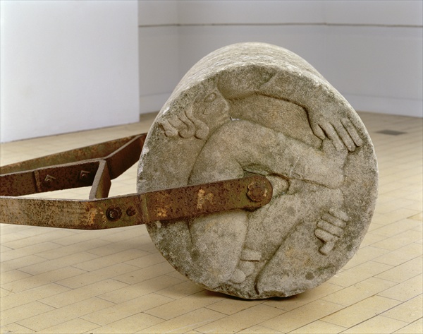
To the left of the Leach exhibit is the highlight of the show.  Eric Gill's garden roller.  Yes, really.  


Eric Gill, Adam and Eve Garden Roller (1933, Portland stone and iron)

Sans-serif sculpting sex-pest, Gill invented the Gill font (unsuprisingly), sculpted the art deco figures on the Midland Hotel and Broadcasting House

Eric Gill, Ariel between Wisdom and Gaiety

and generally set about forcing himself on anyone, and anything, that ventured in his priapic path.  Not even the family dog was safe.  However, no worries!  Because he's now cast as 'eccentric bohemian' rather than 'Savile-like monster'.

Anyway, this is all summed up in the garden roller of Portland stone that he used on his tennis court (there's a socialist in action for you).  The ends of the roller are decorated with a typically flambouyant figure of the naked Adam, ready for a bit of roll-on-the-hay action. Presumably an exhausted and fed-up Eve is on the other side, but I couldn't see that, nor was there a photo, or even a mirror so you could see it.  

As I said, this is a small exhibition, which all feels a bit crammed in, so when I came to the exciting stuff - the Leach and the Gill - there was only one example, so nothing really to get your teeth into.  

Similarly, right along from the roller was Lucienne Day.  Lucienne Day! Designer of some of the most fab 50s textiles ever created!!  Here was a length of Calyx - but a reprinted length, by the Glasgow School of Art Advanced Textiles Department, rather than an original piece.  
Now, when the textile department started the reprinting project, I went up to see an exhibition in the Art School Museum of the fabrics and Day's original artwork for designs such as Spectators and Magnetic.

It was utterly fascinating.  They were created out of cut pieces of paper, stuck on to large boards.  You could see the hands-on rawness of the designs, the mind in action, thinking out, and indeed cutting out,  these hugely influential, Festival-of-Britain zeitgeist pieces of design.  They were like little teeny tiny Matisse cut-outs, which were of course being produced at the same time (1950s).

Any of that Lucienne contextual preparatory work here?  Nope.  Just half a curtain.

And...well, that was basically it.

Now there was a lot in there.  A lot in a small space,  But, conversely, not much at all.  It was like a sandwich tin of amuse-bouche, but no substance.  And not worth  £14.  After seeing the exhibition I have no idea how, in terms of the argument and context of this show,  Eric Gill related to William Morris or Lucienne Day or Bernard Leech.  

It was like a blunderbuss filled with marshmallows and fired against a wall.  Sorry...
 Any & Beauty Exhibition Supporters Group.
Take a look at the National Portrait website exhibition link to Anarchy and Beauty .