Wednesday, 7 March 2012

Sculpture completed...

Thought you might like to have a look at the sculpture that I finished at Art School last night.

You might remember that this involved casting myself in plaster using a large sheet of hessian and a lot of clingfilm (not pleasant), and that it originally liked like the Grim Reaper, which wasn't my intention at all.  This is how it began...


However, with the addition of a proper armature, inner plaster core section, and following a lot of work refining the surface and some finishing touches, here it is.


Not the most scenic of surroundings - it is a casting workshop - but you get the idea.  

The piece has flowers and butterflies bursting out from inside the inner folds of the garment.


The butterflies are on wires, so that they move.


I then had a battle on my hands to wrap the thing up and get it back to the studio - at 6 foot tall, and heavier than a small planet, it wasn't the easiest item I've ever had to transport.  However, with the help of my tutor, the rest of the class, and some sheer brute force, I managed to wrestle it into submission!

Tuesday, 6 March 2012

Canvasses

I thought I'd say a word about my canvasses.

With conservation in mind, it is good practice to use the best possible support for an oil painting, especially when you hope that it will last for perhaps a few hundred years!

Because of the textural quality of my work, I use Belgian linen canvas rather than cotton duck, as it is a better support for thicker paint and longer lasting.  I have my canvasses made for me by Bird and Davis in London.  


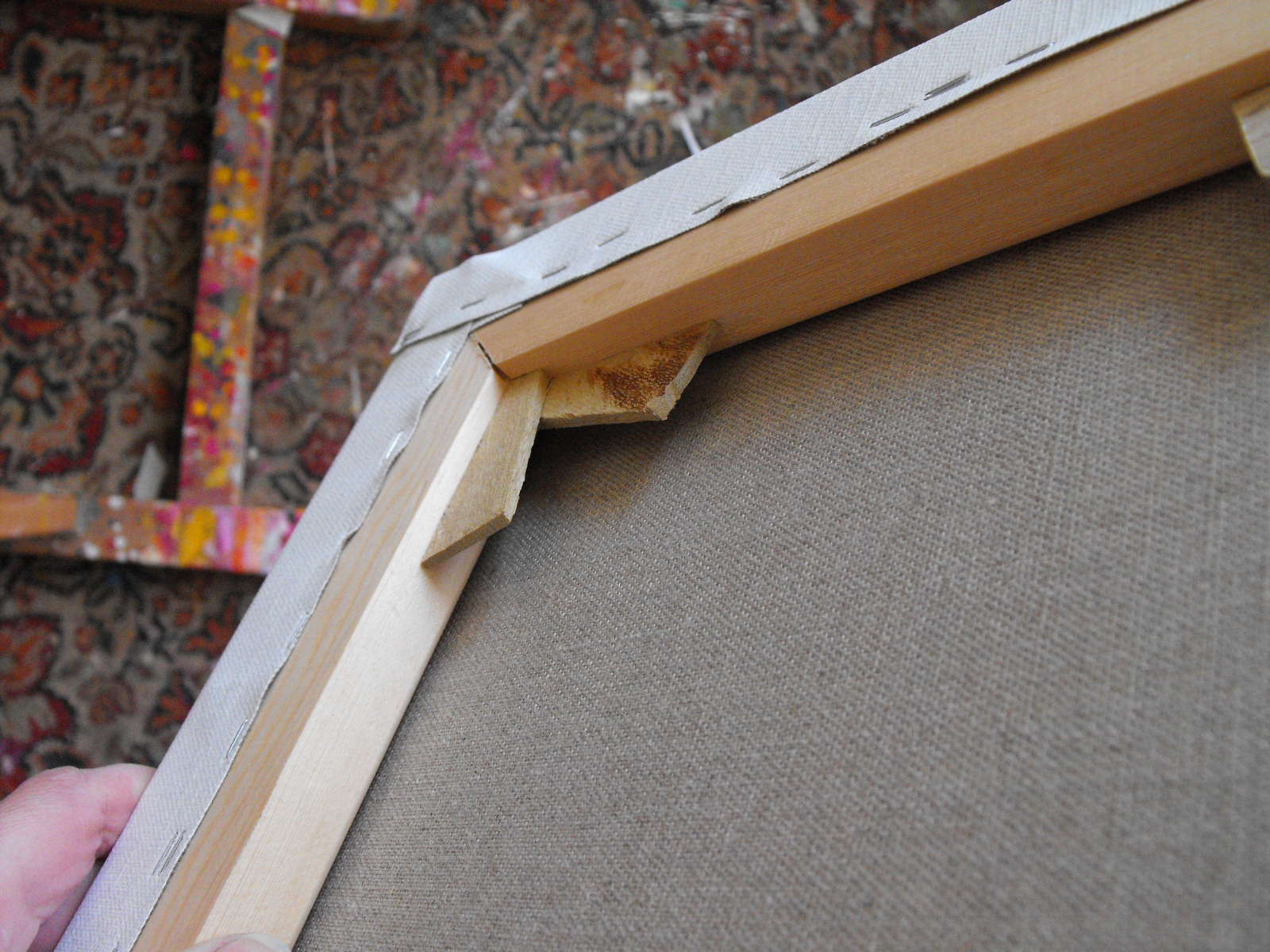
This is the back of the canvas, where you can see the natural colour and texture or 'tooth' of the linen.

The lengths of canvas are put on to wooden stretchers.  The stretchers keep the canvas taught, giving an even, springy surface tension on which to apply the paint. Triangular-shaped wooden keys at the corners can be tapped in with a hammer to open up the joints of the stretchers, in order to further tension the canvas.  

On a big canvas, there will also be one or even two cross-bars at the back to further strengthen and stabliise the canvas.  These, too, have keys to widen the joints and tension the canvas.

The stretchers are not the same on both sides.  One side is flat, one side has a slight camber to it.  This is so that the flat surface of the stretchers doesn't sit directly against the canvas, and a slight gap is created.  


See the shadow of the slight gap there?

If you're buying your own stretchers to make up your own canvasses, watch out for this. Take a look at the profile of the stretchers and check that they are all round the right way, and that they are being placed with the correct profile to the back of the canvas.  The correct order when you're going to attach a canvas to your stretchers is to have canvas with unprimed side facing you, and then place stretchers on top with the flat side facing you. 

Watchout for cheap stretchers which have knots in them - these compromise the strength of the stretchers, can also weep an unpleasant piney residue, and cause problems when pinning.

Check the you have right angles on the stretchers - you can either do it the hard way, by measuring you have equal diagonal measurements, or the simple way, by holding a one of those plastic right angles out of your old geometry set in to the corners. Then stretch and pin.

The canvasses are pre-primed.  Priming the canvas, first with a glue-like size (traditionally made from rabbit skin) and then with a white ground, stops the paint from reaching the fibres of the canvas and rotting them (although artist such as Francis Bacon painted on the unprimed side of the canvas).


This is the joint at the corner with the keys.  It's a work of art in itself!

You can see why I get someone else to do it for me.  It's time consuming to get it just right, and it needs to be just right, so I leave it to the experts!

Monday, 5 March 2012

A Bigger Picture - David Hockney Exhibition

Now, it does seem as if I'm banging on a bit about David Hockney, but it's a major exhibition of landscape, and I haven't mentioned the actual exhibition yet.

If you've had a look at the BBC film The Art of Seeing, then you'll have seen the exhibition being hung in the Royal Academy, with lots of lovely space where you can stand back from the paintings and contemplate.

However, if you visit the Royal Academy, you will be battling with crowds from the moment you enter the courtyard.  Crowds queueing on the off-chance of a day ticket, crowds going up the stairs, in the entrance hall, through the gift shop, and even with a timed ticket, crowds packing every one of the 13 huge rooms.  It's a physically huge show, with huge, searingly bright paintings, and the heat of huge numbers of people bumbling about trying to look at them and read the labels.  It's exhausting (but worth it), and with 150 paintings on show, it's impossible to talk in depth about any of them here.

The first room has 4 versions of the same group of trees done in the four seasons.  It is painted from memory, and sets the theme of the show - that landscape is all about experiencing a motif through time, that it is something to be moved through and lived through, something basic at the centre of our lives and not something peripheral.  Naturally, as a landscape artist,  that's something I'd endorse - landscape isn't just about trees! 

The next room, with its earlier works, has the simply stunning A Closer Grand Canyon from 1998.  Now, I've been to the Grand Canyon, and this really is the closest thing you'll get to the experience of being there.  


It's a vast, volvanically bright painting on 60 canvasses, and like the real thing, has no focal point and a high horizon which plunges your eyes dizzyingly downwards.  It's just amazing.

Then there are photomontages of the Grand Canyon and the Pearblossom Highway.  Reminding me rather of Rauschenberg's Glut series, these are picaresque patchworks of photographs recording a journey, and the movement through a landscape.

Pearblossom Highway (1986)

Room 3 has Yorkshire landscapes (Hockney's native landscape), but there's no dull greys here.  The Road to York Through Sledmore has red houses, lilac shadows, lime trees and a high horizon, like an urban Grand Canyon.

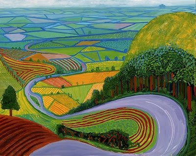
Roads and fields curve and writhe and undulate like snakes, and the paint is dabbed and combed into shape, as in Garrowby Hill (1998).
Battling past the students armed with sketchpads, Room 4 has watercolours and landscapes from observation.  Here, paintings are hung together in large groups.  Whilst individually, if you popped some of these in a local art show without a Hockney signature, you might be inclined to think "How did that get in?", the cumulative effect here is of a joyous abundance of nature.  There is a lovely sense of the actuality of real places, that you can identify real wheatfields, hedges or clumps of thistles, something which is important in my own work.  It elevates the mundane, that which is normally only glimpsed on the way to something more important.
Room 5 is 'Tunnels', again returning to a single motif through the seasons with some lovely work.
Winter Tunnel with Snow (2006)
Room 6 is Woldgate Woods, where Hockney placed an easel at a particular point amongst the trees and returned to it throughout 2006.  There are some lovely charcoal drawings here, and the denseness of the tree branches in the paintings with little sky, along with the way the paint is applied,  gives a lively surface texture like that of Monet's Waterlilies.
Woldgate Woods, November (2006)

At this point in the exhibition, you are beginning to wonder how many rooms are left, and how to pace yourself, but in fact you are only about half way through - so that's where I'm leaving it for today!

Friday, 2 March 2012

The Thames at Night

Even when you've still got a show on, you're always thinking ahead to the next one.

Whilst in London, I took photos in Trafalgar Square and also along the Thames at night.


Hopefully you'll be seeing paintings from some of these in September!

Thursday, 1 March 2012

Green Park, Autumn

This is one of my paintings currently on exhibition in London.

Green Park, Autumn (Oil on linen, 24 x 26)

I was in London in November last year, and had just been to see the Degas exhibition at the Royal Academy with a friend.  Green Park Underground Station was closed, so we had to walk across Green Park to another station in order to continue our journey.

What was initially an irksome inconvenience turned out in fact to be a very fortuitous change of plan.  It was a beautiful late autumn day with a clear blue sky, just right for a stroll in the park, and the ground was carpeted with the wonderful reds, oranges and yellows of the fallen autumn leaves.  

It was a lovely peaceful oasis in the city, and the most amazing burst of colour.  I had my camera in my bag, as always, and started to take photographs.


Small Dog, Green Park (Oil on linen, 24 x 26)

I loved the colours in the park, and the shapes of the trees and the patterns of the shadows, but the paintings that I did later back at the studio from those photos were about more than just that - they were also about a lovely, special day in London, and the joy of an unexpected gift of an autumn walk in the park.

Wednesday, 29 February 2012

My Cameras - Canon PowerShot G12

As well as using my Nikon as my main 'serious' camera, I also find it useful to have something a bit more handbag-sized and portable but which still has all the features I need and takes a great picture.

To this purpose, I have a Canon PowerShot G12 more information here.


It wasn't the camera that I went out to buy - after reading all the reviews, I had an Olympus I mind. But when I got to the shop and tried out all the cameras, this was the one which was most comfortable to use in my hand, even though it is quite heavy and a little bulky.

It's built like a tank, so it's great when clambering over rocks and rough ground, or using it on the beach.  It has a really good 5x zoom, and has a high-sensitivity sensor which means it is really good at shooting in low light conditions - ideal for the Thames at night!  It also has an image stabilizer, which is an anti-shoogle feature that means you can take a picture really quickly and spontaneously out of a car window if you see a scene (as a passenger, I hasten to add, not driving), and you don't have a complete blur.

The best feature, though, is the big screen.  You can flip it out, turn it round and tilt it up and really move it around - you can use it screen-side out,  or store it screen-side in (clever) and just use the viewfinder.  It also allows you to see exactly the shot you are taking at any angle, so you can hold the camera down low (and get lots of nice foreground vegetation in the shot without lying on the ground or randomly pointing the camera at foliage) or right up high so you can get overhead shots.  This allows for great versatility and control of composition, so it functions equally well as a work camera or for getting a really nice sharp shot of Steve Hackett at a concert without the rest of the audience in the way!

It's pretty expensive on the company website, but if you shop around, you really can find some great bargains.

Tuesday, 28 February 2012

David Hockney: The Art of Seeing

As a landscape painter, it's a big thrill to see a huge landscape exhibition taking pride of place at the Royal Academy, and one which is such a talking point.  

David Hockney's A Bigger Picture really is that - a vast exhibition of big, big paintings, in a big big space (all 13 rooms of the RA), which is ironically filled with huge amounts of sharp-elbowed folk in a marked contrast to the empty people-free calm of the pictures.

Sometimes as a painter of landscape, you feel that you might be considered to be at the edge of things, painting in some sort of old-fashioned sub-genre whilst the real artists get on with cutting sharks in half and embedding skulls with diamonds.  

"Landscape finished?" snorts the eloquently plain-speaking Yorkshireman Hockney in his BBC Culture Show Special film, "Only our way of looking at landscape is finished - so find a new way".  

And here is that new way, with i-Pad print-outs and multiple viewpoint films and great pulsating canvases of colour, all expanding on the sense that landscape is something to be experienced and lived and moved through like life itself.

If you've got any interest in the exhibition, or in landscape, painting, or just the way that paintings make us look at the world afresh and feel alive, then take a look at  David Hockney: The Art of Seeing on BBC i-Player.  It's a treat.

David Hockney painting on location in Yorkshire