Friday, 6 July 2012

The Friday Spot - Wife vs Secretary

I'm going to mention my brother-in-law here, whose band Wife vs Secretary was featured on Marc Riley's Radio 6 Sessions.


(I'll leave you to guess which one's the brother-in-law...)

Born out of previous bands V-Twin and 1990s, this new band is named after an old Clark Gable and Jean Harlow film that they have all sworn never to see, and has been described as sounding like "Captain Beefheart waylaying Bruce Springsteen in a dark corner with a bottle of whisky".  Woo-hooh!

Judge for yourselves on Youtube.

Thursday, 5 July 2012

Composition and the Golden Section

You've probably heard of the 'Golden Section' or the 'Golden Ratio' in relation to art and the composition of a painting.

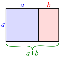
Put simply, the Golden Section - also called 'Phi' and equal to 1.618 -  refers to the aesthetic rule that a composition will look pleasing if there are certain proportions underpinning it.  Which basically boils down to 'things look good when they are roughly in thirds'. Here's what I mean:
You can view a short video about how to draw the Golden Section (or Golden Ratio) HERE.

Imagine that the rectangle above is a landscape painting.  Theoretically, if you put a tree on the black vertical line (for example), it'll look good and the painting will 'balance'.

It seems that ours brains are 'hard-wired' to make sense of the world by looking at the patterns which underpin it, whether we consciously realize that those patterns are there or not.  So even if we look at an abstract painting, we can make sense of it by referring subconsciously back to the patterns which we have seen in nature, and we will find some abstract patterns more pleasing than others because they more closely follow these rules of proportion.  It's called neuoraesthetics.

One experiment in Canada, for example, asked volunteers to look at an abstract painting by (amongst others) Miro, and then a slightly different version of the painting, and asked them which looked more pleasing (read the paper here).  

Here's the paintings - which do you prefer?
Miro's genuine Bleu 1 is on the left, with its red lozenge carefully balanced on the golden section.

The maths of the Golden Section is very very interesting, and has fascinated mathematicians, philosophers, painters, architects, scientists, biologists and thinkers for centuries.  As I've said, it has a basis in nature, whether it be the proportions of a curve of a shell or the petals of a flower, or the spirals of a galaxy... 


It can be applied to music.  It can be found in architecture, such as the Pyramids at Cheops (I've been inside one of the pyramids at Giza - surprisingly hot down there) and the Parthenon in Athens...


..and in the famous double-helix (like DNA strands, life itself) staircase at the Vatican (the one you can ride your horse up) (or down)...

It can even be found in the stock market, where it is found in the complicated patterns of Fibonacci numbers, and used in market strategies such as Fibonacci retracement.

But back to paintings.

I tend to paint on a square canvas, or just off square (24" x 26" for example).  Lots of Scottish artists paint on a square - I'm not sure why.  When painting a landscape, a square format will give a dynamism to the composition, as you have very dramatic diagonals and a strong central focus.  Perhaps that's something that suits the Scottish temperament.

Traditionally, canvasses were rectangular.  If you see an Old Master that's square, it's usually because it's been cut down.  Painting on a square format is a pretty modern idea.  Degas uses it, for example in his Portrait of Edmond Duranty in the Burrell Collection in Glasgow.

Edgar Degas, Portrait of Edmond Duranty (Pastel and tempera on canvas, 1879)

Have a look at where the vertical lines for dividing the painting into thirds come.  On the right at the bottom, it's where Degas' signature is on the book.  On the left, further up, there's a black vertical line just above Duranty's shoulder.  Going back to the right, further up, the golden section is at the edge of a pile of books or papers resting on a shelf. 

Taking the painting horizontally, there is a bookshelf going across the golden section horizontally in the top third, and in the bottom it draws attention to the awkwardly clawed hand, increasing the power of the gesture.

Your eye is thus led into the painting, moving around the composition from side to side and up and down like a tennis match.

The square format, as I said, means that you have dramatic diagonals.  Imagine the diagonals drawn from corner to corner.  

In the top right of the painting, you have nothing but orderly bookshelves.  That's half the painting with nothing going on, nothing of the subject that the painting is about.  But by devoting half the painting to the books, they do actually add to our knowledge of the sitter.  They are almost about to fall down upon and engulf Duranty -  they emphasise his scholarliness, his 'bookishness'.  They speak of his knowledge, but also of a certain fragility, of him about to be overwhelmed almost.

The bottom left diagonal has all the action squashed into it, all the scattered, disorderly papers, the sitter himself.  And guess where the diagonals interesect?  On the gesture of the two fingers pressed against the temple, emphasising the mind, the brain behind the man.

The format therefore adds hugely to our knowledge of the sitter himself.  Degas exploits the qualities of the square to suggest the nature of Duranty's character.  Clever, eh?

Vincent Van Gogh used a double square format excusively in the weeks before his death, in the summer of 1890. 

 Vincent Van Gogh, Wheat Fields with Crows (Oil on canvas, July 1890)

It's almost as if he's trying to double the drama. 

Vincent Van Gogh, Undergrowth with Two Figures (Oil on canvas, June 1890)

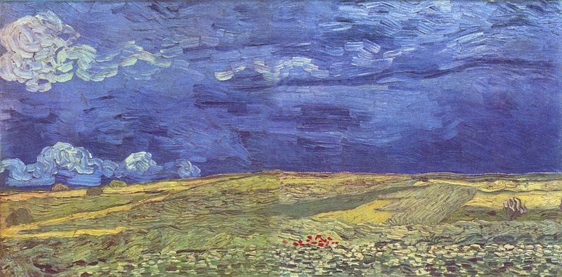
A double square format used with a landscape could easily end up looking like a big sandwich, but look how Van Gogh keeps the tension there, playing with the proportions and the centres and keeping your eye moving.  It's a very restless type of format, as there are two centres, and two squares to read round, two squares playing off each other.  It's a big statement to make.

Vincent Van Gogh, Wheat Fields Under Clouded Sky (Oil on canvas, July 1890)

When I'm painting, these 'rules' of composition are in my mind, but it's not so calculating that I get out a T-square and start measuring the golden section.  Instead, you go by your instinct, and trust your own eye.  If it pleases you, it stays.  If it doesn't, you change it.  Sometimes you can't quite analyse why it isn't pleasing you, but you just know you've got to change it or else it will always bother you when you look at that particular painting again.  

The golden section may be an almost mystical mathematical formula which underpins aesthetics, but it doesn't mean that there's a formula for painting the perfect painting.

Wednesday, 4 July 2012

Gorse by the Shore with Distant Houses, Morar

Here's a cheery painting that I've just completed, finishing off my consignment for September's 20/21st British Art Fair...

Gorse by the Shore with Distant Houses, Morar (Oil on linen, 24 x 26)

This year there was a huge amount of gorse in bloom when I visited the white sands at Morar, along with lots of bluebells and primroses.  

It's always good to find new things in familiar scenes, so when I found this profusion of evocatively-smelling cadmium yellow flowers at the side of the road, I immediately thought of the great painting that it would make.  And here it is.

I think it's turned out to be really cheerful and uplifting.  Smell the sea air and that coconutty scent!!

Tuesday, 3 July 2012

Art No-one Can See

I came across this little article on the BBC website.  It's 'Why Make Art No-one Can See?' by Lucy Townsend.

From a man in Ghana who makes beautifully carved coffins (and who wouldn't want to get buried in that rather cheery giant goldfish?)

Getty Images

...to an artist who drops his sculptures deep into the sea off Mexico so that they can only be found by divers...

Jason Decaires Taylor

...to a man who buries his work beneath a sewer in a main road in Ontario, so that it can't be seen by anyone...

Judith and Norman Alix Art Gallery

...it begs the question, does a piece of art need an audience in order to be a piece of art?  Or if it isn't seen by a viewer (someone other than the artist), does it exist as art?

Instead of Schrodinger's Cat, it's Schrodinger's Art....!

Sunday, 1 July 2012

Jenny Saville

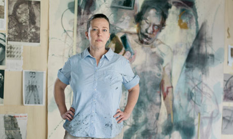
Working in the studio today and listening, as usual, to Radio 4, I heard a piece on Pick of the Week (first broadcast on Radio 3's Night Waves) about Jenny Saville and her first major solo show in the UK which is opening at the Ashmolean Museum in Oxford.

The painter Jenny Saville, photographed in her Oxford studio, June 2012. Photograph: Pal Hansen for the Observer

Saville is famously a painter of flesh; big, lined, oversized, marked corporeal female flesh that tells a story of what it is to have lived.  Her new show is an exploration of both human and animal form, living and dead, male and female.

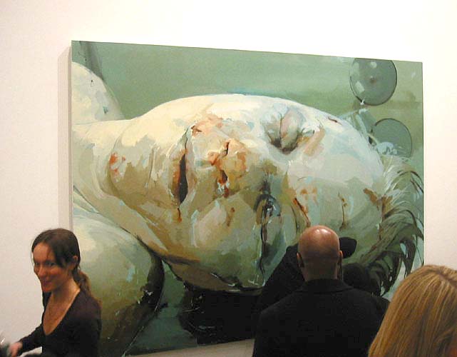
Jenny Saville Still 2003
oil on canvas, ca. 108 x 144 in.
Gagosian Gallery

She trained at Glasgow School of Art, and was one of the big names in the art world in the 1990's (although she doesn't appear to get a mention in Glasgow School of Art's major upcoming exhibition on its female alumni 'Studio 58; Women Artists in Glasgow Since World War Two' - click the Glasgow School of Art website for more details on the show).

Saville was feted by Charles Satchi and exhibiting in the Royal Academy's Sensation show in 1997 alongside the likes of Damien Hirst.  She has built her career in abroad and in the US, and now aged 42 and with two children, she is back working in Oxford, near to the location of her retrospective.

According to the Radio 3 interview, her show in Oxford is also about the cycle of life and death, influenced, amongst other things,  by her time spent painting in a studio in Sicily near a meat market.  The show displays massive paintings of the flayed carcasses of animals, which are dead flesh, but part of the essential cycle of life.

 Jenny Saville, Torso 2 (2004,  Oil on canvas, 360 x 294 cm)

These paintings are monumental (12 foot tall), sculptural and visceral.  It takes a lot of confidence and ego (and money) to create something on that scale.  The butchered bodies twist and contort in death, and whilst full of pathos, lack the serenity and spiritual overtones of, for example, Rembrandt's similar theme (which Saville would have seen 'in the flesh' as it is Glasgow Art Gallery and Museum).

Rembrandt van Rijn, The Slaughtered Ox (Oil on canvas, 1655)

Instead, it has more of the visceral feel of Chaim Soutine's work

Chaim Soutine, Carcass of Beef (Oil on canvas, 1925)

Ah, Chaim Soutine.  Now, I must just have a quick aside here.  

Mr Soutine, as a very poor, and, by all accounts, very intense young artist in Paris in the 1920s,  admired the work on this theme by the likes of Rembrandt and Chardin, and saved up to buy an animal carcass from the slaughterhouse - the way you do.  This he hung in his studio, and did a total of ten paintings from it.   

They are convulsive, animated, agitated pieces of impastoed colour, which get at the heart of what it is to have a body, and to give it up to the process of decay.

Chaim Soutine, Carcass of Beef (Oil on canvas 1924)

This series of paintings took a bit of time, so Soutine got buckets of blood from the butcher to throw over the carcass to keep it looking fresh.  And so from death and decay came fresh colour and new art full of life.

Not that the neighbours agreed, as the stench was appalling, and the blood dripped through their ceilings, and the police were called.  Soutine argued that art came before hygiene (and apparently that also included personal hygiene, unfortunately).   

The art collector Dr Albert C Barnes (of the just-opened Barnes Foundation in Philadelphia - more of that in a future post, because I've just been there...) bought 52 of Soutine's work in a bargain-basement career-making job lot, paying the penniless artist between $15-30 per painting, depending on which one of Barne's letters you believe.  Soutine immediately hot-footed it to the south of France.  Barnes, knowing full well that he was creating a market in an artist, was now sitting on a small fortune, with keen interest from dealers.  In February 2006, an oil painting from this series 'Le Boeuf Écorché' (1924) sold for a record £7.8 million ($13.8 million) at Christies in London....

But back to Jenny Saville...

Saville seems to have aways had an interest in this cycle of life and death; she has talked of an art-historian uncle who gave her, as a child aged 11, a section of hedge in the garden and told her to observe it as it changed throughout the year, thus teaching her vaulable lessons about observation and seasonal change.  (Parents amongst you might think of your own computer-fixated bairns and raise a sceptical eye at this story, but she must have been a suitably receptive child to appreciate such a gift.)  She also had a friend photograph her as she gave birth, which I must say made me feel somewhat inadequate as part of the sisterhood, in that in my case I merely pushed out a baby and didn't turn the hospital into an art installation.

In Saville's show, which includes fresh-from-the-easel work as well as back catalogue, she also displays new paintings of Carla, a transsexual, whose modern ability to transform her body fascinates Saville.  She talked in the Radio 3 'Night Waves' interview of Carla's body being a 'landscape of gender' and a 'modern architecture of flesh'.  

Her interest lies in recording, in painterly terms, that which is between states - between life and death, or male and female, because by an understanding of one gives you an increased awareness of the other; in other words, an understanding of death makes you feel more alive.

See a slideshow of the work here.

Read more here from articles in the Guardian here  and also here.

Jenny Saville is at Modern Art Oxford and in Room 43 of the Ashmolean from 23 June to 16 September.

Hear the interview with Matthew Sweet and Jenny Saville on Radio 3's Night Waves here.

Thursday, 28 June 2012

Reading about Caravaggio

If you're only going to read one definitive book about Caravaggio, then I guess it has to be Andrew Graham Dixon's 'Caravaggio: A Life Sacred and Profane'.

I enjoy Andrew Graham' Dixon's obvious passion for his subject, whether he's presenting on television, or in his writing.

It's well-researched, well-written, and scholarly without being dry.  It is informative about the paintings, the person and the times in which the artist lived, which help to contextualise and explain the dark aspects and contrasts of Carvaggio's personality and his art, which are inextricably intertwined.  It's a painstaking piece of research which forms an authoratative account of a larger-than-life, bigger-than-death character. and functions both as a definitive piece of art historical research and also as a really good read.

(My only quibble is that the indexing isn't great, and there is a lack of cross-referencing between text and illustrations, but I guess that wasn't Mr Graham Dixon's department.)

For another aspect of Caravaggio, there's this book - 'Painting for Profit; The Economic Lives of Seventeenth Century Italian Painters' by Richard E Spear and Philip Sohm.


This is the nitty-gritty of business and accountancy deflating the loftiness of art, as a group of art historians and economic and social historians get out their calculators and tape measures, apply them to the works of the Baroque Italian masters, including Carvaggio and his contemporaries, rifle through their expense accounts and get down to brass tacks with an audible ka-ching.

Thus we have the cost per square metre and per figure of various Italian altarpices, such as Caravaggio's Calling of St Matthew in S Luigi dei Francesi in Rome - at 322cm x 340cm, it cost 200 scudi in total; 18 scudi per square metre, and 27 scudi per figure.  Domenichino's Life of St Cecilia in the same church 10 years later commanded only 8.5 scudi per square metre and 10 per figure.  Those are the figures, but what does that say about the comparable 'worth' or value of each piece of art?  How do you actually value art, its skill, its emotional power, its message?  Can a piece of art be worth more to one person than other?  Is one person's art not actually art at all to another person?

TThese aren't questions covered in this book.  With its tables of figures, details of the economics and politics of commissions, inter-studio rivalries and the basic necessity for artists to run a business and make a crust, it's a sobering and dry counterpoint to the creative process.  Behind the aesthetics, the beauty and the ideas, there is the reckoning.

Art may be big business today - take a look at a book such as Seven Days in the Art World by Sarah Thornton...


...but art as an economic commodity certainly isn't a modern idea at all.

Wednesday, 27 June 2012

Big Day

It's my son's last day at primary school today.

His school makes a big event out of it, with a special leaving ceremony.  The children wear their 'grown up' uniform and receive their new school ties, then sing the Leavers Song.  (It wasn't like that in my day...)

Needless to say, it's an emotional day, with huge excitement and many mummy tears.