Showing posts with label Andrew Graham Dixon. Show all posts

Friday, 10 January 2014

Italy Unpacked

I'm looking forward to watching Italy Unpacked  tonight at 9pm on BBC2 as a bit of a Friday-night treat.

It's got pasta and Andrew Graham Dixon - and that's a powerful combination.

BBC

First stop is the Genoa, once a great maritime republic, whose former glory is reflected it its opulent Baroque palaces with their imposing facades, glamorous decor and splendid paintings by artists such as van Dyck and Bernardo Strozzi. In contrast to these grand statements of wealth, Giorgio Locatelli whips up the simple dish that the city is famous for - pesto alla genovese.  (That's pay-sto, by the way, not peh-sto.  So I'm told.  )

Although I've been to Italy quite a bit, and by various modes of transport, I've only ever been to Genoa once.  That was when the ship I was on docked on the way back from Australia -  which is a rather quaintly Phileas-Fogg way of travelling.

Meanwhile, back on the art history, I've still to watch Apples, Pears and Paint: How to Make a Still Life Painting, which is a look at the history of still life painting, featuring a range of delights from the earliest existing Xenia mural paintings found at Pompeii to the cubist masterpieces of Picasso, via Caravaggio, Chardin and Cezanne.  

And it's got Andrew Graham Dixon in it.


Let's just hope the poor man manages to string a sentence together better in the still life programme than he did on his woeful appearance over on University Challenge's alumni special over Christmas. 

AGD may be an undisputed art history god on Caravaggio, but throw him a few questions on general knowledge or, indeed, art history, and the poor man grinds squeakily to an embarassing halt.  

If you saw it, then no doubt you, too, were face-palming away and screaming "Botticelli, Andrew, Botticelli!!!!" at the television...

Christ Church Oxford - they lost.  (BBC)

Monday, 29 April 2013

The High Art of the Low Countries

Regular readers of this blog will be aware that if there was a television series that consisted of Andrew Graham Dixon reading the back of a cereal packet to camera, I would be eagerly watching every minute of it.

So, given my fondness for Dutch art,  it was with great excitement that I tuned in to the three part series The High Art of the Low Countries on BBC4 with Mr AGD.

In these programmes, Andrew Graham Dixon tours the Low Countries, exploring how history has influenced the area's art, architecture and culture. 

BBC

In the second programme, I was thrilled that AGD visited the Jan Six house in Amsterdam, and discussed the wonderful portrait by Rembrandt of his friend, the first Jan Six. 

I was lucky enough to see this painting in a visit through my University in 1983 (the house is normally closed to the public), which I wrote about in my blog here.  I was very struck by the gesture of Jan Six's hand being thrust into his glove, as if caught in the moment before turning to leave, and rendered in quick, impressionistic darts of paint which said everything about the personality of the sitter and captured the immediacy of the momentary act.


Moving from the Golden Age of Rembrandt to the modern age, the general thrust of the third programme was that following a brief period of decline, the entrepreneurial and industrious region of the Low Countries rose again to become a cultural leader in the modern age. Despite its small and almost insignificant size it produced important forward-thinking artists like Van Gogh, Mondrian, Magritte and Delvaux, who changed the face of art forever. 

Vincent Van Gogh was originally a missionary in Belgium before he found his true religious vocation as a painter.  Nature was at the centre of this new faith, exemplified by his early painting The Potato Eaters, which he considered to be 'one of the best things I have done' throughout his life.  

With its dark brown potatoey colours, and almost characatured, potatoey faces of the sitters, never has paint more accurately summed up a life of earthy toil.

Vincent van Gogh, The Potato Eaters (Oil on canvas, 1885)

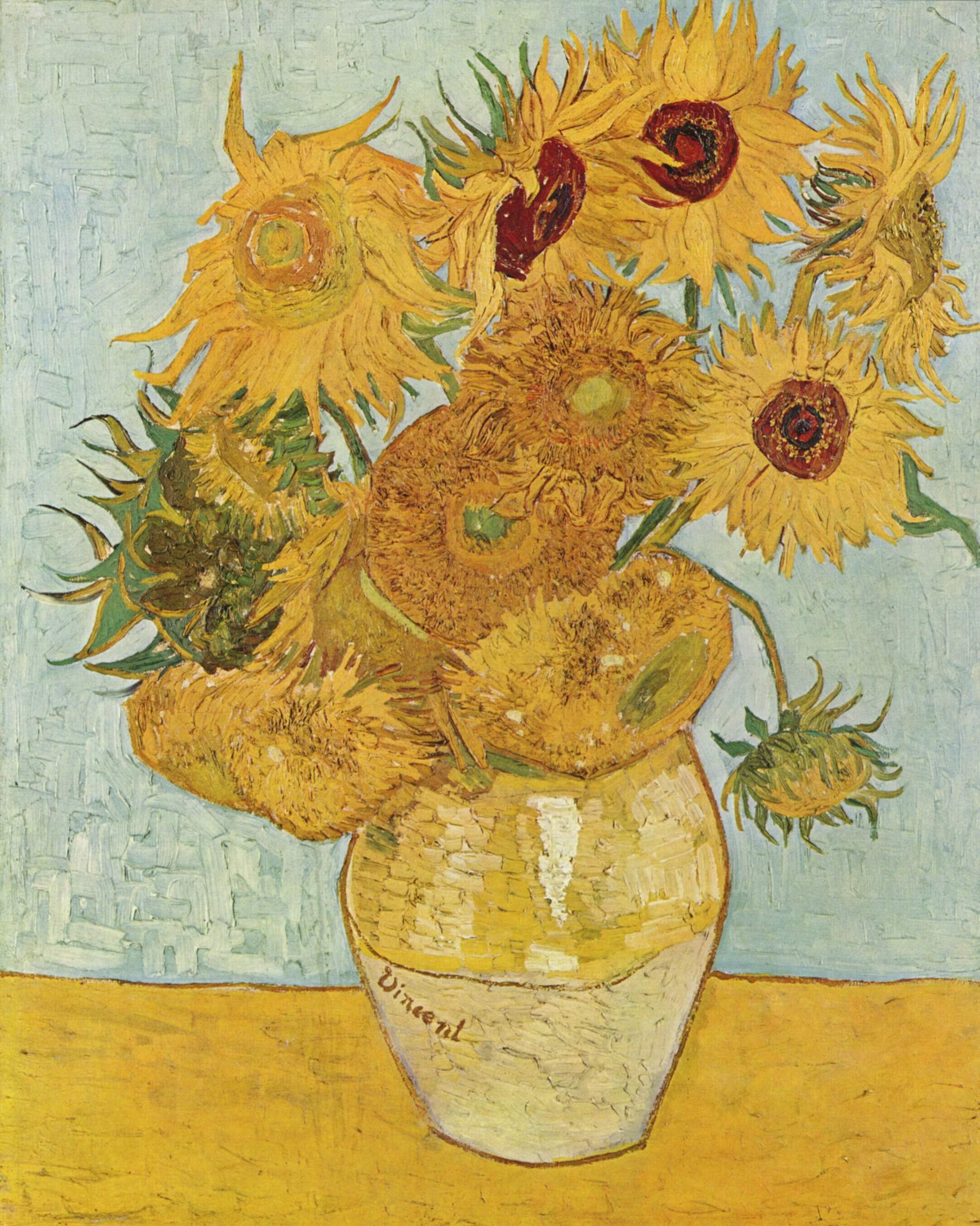
Van Gogh was 'forging a new religion for the common man with images of divine beauty'.  In his paintings of sunflowers he was painting, according to AGD, his sense of himself (he signed the vase with his Christian name).  The whole cycle of life and death, with the buds of the flowers, the full-blown sunflowers and the dying seed head containing the new life, is all in one painting.

Vincent van Gogh, Vase with Twelve Sunflowers (Oil on canvas 1888)

Van Gogh spoke of the paint itself in very sensual terms, using food metaphors like that of the garlicky mayonnaise that is common in Holland.  (In fact, he apparently did, in some less lucid moments, actually eat his paint, never a good thing considering the poisons that it contained, such as arsenic and heavy metals.)  

There is a feeling in the sunflower paintings (as there is also in Joan Eardley's late work) of a great sense of urgency, that there is but a brief time in which to create - indeed, two years after he painted the sunflowers, Van Gogh was dead, aged 37. 

But the crux of the meaning of the sunflowers is that they are used as a metaphor for self, that nature is a conduit by which you can communicate something about what it is to be human.  And in Van Gogh's case, something which is fragile, mutable and passing, something which, like food itself, can be consumed.  Perhaps Vincent himself felt eaten up and consumed by the weight of his mission of serving as a conduit between nature and art, the enormity of all of nature waiting to find a voice that is you.  No wonder it blew his mind.

Nature also blew the mind of Mondrian.  Here he is in 1907, painting a low tonal, mystical landscape.

Piet Mondrian, Trres by the Gein at Moonrise (Oil on canvas, 1907)

and here he is after seeing the paintings of Van Gogh.

Piet Mondrian, Evening, The Red Tree (Oil on canvas, 1908)

It is as if Van Gogh has lit a match that has set fire to his world.

Mondrian was a member of the Theosophists, who believed that there was a spiritual life beyond the visual appearance.  He therefore moved towards distilling the visual appearance of things to release the spiritual within, creating a cathedral of nature.

The thing that struck me most forcibly about my trip to the Netherlands in 1983 was that when I saw the landscape, Mondrian made sense.  Mondrian's work was a logical progression towards expressing landscape in terms of the horizontal and the vertical, and in Holland, that's all you had - flat landscape punctuated by the odd vertical of a church spire of a row of trees.  Mondrian, says AGD, took control, seeing the pattern and structure of the world, distilling, purifying and reducing.

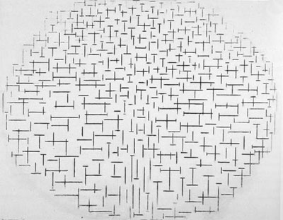
1914 found Mondrian cooped up in Domburg in north west Holland, spending day after day sketching the sea and sky in charcoal. It inspired Mondrian's transition to his abstract grid paintings. Here's the beach at Domburg.

 http://galerie.chip.de/index.cfm?pid=1511&pk=358332

and here's Mondrian's painting of it.

 Piet Mondrian, Pier and Ocean (Oil on canvas 1915)

It was only when I saw this painting again during this programme that I thought "Ah - I get it!", and also its resonance of the rows of crosses of first world war graves.  

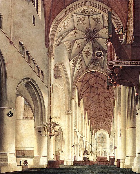
The simplicity of the image, the stripping it down to a sense of just a cross, refers back to the simple church interior paintings of Pieter Saenredam, three hundred years earlier.

Pieter Janszoon Saenredam, Interior of the Church of St Bavo in Haarlem (Oil on panel, c1660)

Mondrian then went to the most grid-like place on earth to live, New York, and merged the essential underlying grid of nature with the jazz-age vibrancy of colour.

Piet Mondrian, Broadway Boogie Woogie (Oil on canvas, 1942)

In this programme we even got to see inside the De Stijl house of 1924, unfortunately situated in right next to a busy road in downtown Utrecht, but still very very exciting. 

Rietveld Schröder House
photo: Ernst Moritz

Here's the funky interior, where every window and door, as AGD demonstrated, forms a new piece of 'art'.

Photo: Ernst Moritz

However, when Andrew opened the door to the toilet, it was just a normal toilet - not a funky square red and black toilet with a blue seat.  Nor was the stove or the door furniture designed along De Stijl lines - it just looked like B&Q.  I can't help thinking that if Charles Rennie Mackintosh had been designing that house, he'd have paid a bit more attention to that sort of detail.

It was at this point that the programme sort of fell into a bit of a dip, because AGD started talking about Belgium.  Sorry Belgian readers - but it was as if he was told that he was contractually obliged to talk about Belgium for the last part of the programme, and was trying to find something interesting and cohesive to say.  

This seemed to involve referencing Tintin and Andy Warhol (who wasn't to my recollection Dutch or Belgian), a quick discussion on Magritte, and then a long piece about Paul Delvaux.  


 Tintin and Snowy ©HergĂ©-Moulinsart


I couldn't quite connect with AGD's argument.  Delvaux's paintings seem to be elusive in their meaning, and the protagonists in them are enigmatic and indecipherably expressionless, despite the oddness of the narrative setting in which they find themselves.  They are oddly free of emotion because you can't really connect with what they're all about.

Paul Delvaux, Sleeping Venus (Oil on canvas, 1944)
  
I felt that the programme had similarly run of emotional steam by this point.

However, the final scenes took us to a vault in Holland where the state had sponsored the making of art by giving grants to artists.  It had stockpiled 50,000 works, of varying levels of competence, before the money ran put in the 1980s.  The art is under lock and key.  We were shown a state which encourages art, but doesn't necessarily want to be challenged by it.

It was a great series.  If it's repeated again, I'd watch it again quite happily.  AGD speaks knowledgeably and with great insight and passion about his subjects.  He takes you on a journey that feels like the natural and obvious progression of things.  And he can do a piece to camera whilst riding a bicycle.  You can't ask more of a man than that.

Watch it on i-player here.

Thursday, 28 June 2012

Reading about Caravaggio

If you're only going to read one definitive book about Caravaggio, then I guess it has to be Andrew Graham Dixon's 'Caravaggio: A Life Sacred and Profane'.

I enjoy Andrew Graham' Dixon's obvious passion for his subject, whether he's presenting on television, or in his writing.

It's well-researched, well-written, and scholarly without being dry.  It is informative about the paintings, the person and the times in which the artist lived, which help to contextualise and explain the dark aspects and contrasts of Carvaggio's personality and his art, which are inextricably intertwined.  It's a painstaking piece of research which forms an authoratative account of a larger-than-life, bigger-than-death character. and functions both as a definitive piece of art historical research and also as a really good read.

(My only quibble is that the indexing isn't great, and there is a lack of cross-referencing between text and illustrations, but I guess that wasn't Mr Graham Dixon's department.)

For another aspect of Caravaggio, there's this book - 'Painting for Profit; The Economic Lives of Seventeenth Century Italian Painters' by Richard E Spear and Philip Sohm.


This is the nitty-gritty of business and accountancy deflating the loftiness of art, as a group of art historians and economic and social historians get out their calculators and tape measures, apply them to the works of the Baroque Italian masters, including Carvaggio and his contemporaries, rifle through their expense accounts and get down to brass tacks with an audible ka-ching.

Thus we have the cost per square metre and per figure of various Italian altarpices, such as Caravaggio's Calling of St Matthew in S Luigi dei Francesi in Rome - at 322cm x 340cm, it cost 200 scudi in total; 18 scudi per square metre, and 27 scudi per figure.  Domenichino's Life of St Cecilia in the same church 10 years later commanded only 8.5 scudi per square metre and 10 per figure.  Those are the figures, but what does that say about the comparable 'worth' or value of each piece of art?  How do you actually value art, its skill, its emotional power, its message?  Can a piece of art be worth more to one person than other?  Is one person's art not actually art at all to another person?

TThese aren't questions covered in this book.  With its tables of figures, details of the economics and politics of commissions, inter-studio rivalries and the basic necessity for artists to run a business and make a crust, it's a sobering and dry counterpoint to the creative process.  Behind the aesthetics, the beauty and the ideas, there is the reckoning.

Art may be big business today - take a look at a book such as Seven Days in the Art World by Sarah Thornton...


...but art as an economic commodity certainly isn't a modern idea at all.

Friday, 30 March 2012

Treasures of Heaven

When I was in Paris at Easter last year, I went into Notre Dame.  Whilst I was there, a ceremony took place which had at its centre a large round glass case held by the priests, which a line of people were approaching to venerate, some on their knees.  As I sat and watched, I realised that the object in the case was the Crown of Thorns.


It gave me quite a jolt when I realised what it was I was seeing.  Having studied Fine Art, which is all bound up with the patronage of religion, I've seen a lot of reliquaries and unusual holy objects, from parts of the cross to bits of saints.

I've been to Jerusalem, to the Dome of the Rock, the exact location where Christ is said to have been crucified, and to Bethlehem, supposedly where the stable was.  Bethlehem was rather an underwhelming and unromantic place, but in Jerusalem, you could put your hand into the indentation in the rock where the cross would have been held upright during crucifixtion.  The intense atmosphere of everyone in the confined space of the vaulted room where the rock is was highly charged, and some people actually fainted when they felt the rock.

In Notre Dame, some approached the Crown of Thorns on their knees, and almost passed out when they were in front of it, such was the intensity of the moment.

Whether or not you believe that you can place your hand in the indentation of the stone of the exact spot where Christ was crucified, or that that object in the glass case in front of you in Notre Dame truly is the Crown of Thorns that touched the head of Christ, is not actually the point of a relic.

The potency and power of the object lies in the fact that it is the focus and embodiment of human belief and faith.  As such, it is a direct conduit to heaven, and therein lies its power. Instead of being separated from God, you are by your faith directly connected, just for a moment.

I don't know if you caught the BBC4 programme Treasures of Heaven, in which Andrew Graham Dixon looked at reliquaries, including the Crown of Thorns in Notre Dame.  Unfortunately it's no longer available on i-Player, although you can see more details and a small clip at Treasures of Heaven.  

It's a really interesting little programme, a gem in itself.  However the most memorable and moving moment is also the bit which you will need the strongest stomach for - I'll just say it's a very visceral moment involving an eye.

Thursday, 9 February 2012

Favourite paintings - Caravaggio

If I was to be give one painting in the world to own, then I think it would probably be this one.


It's The Deposition from the Cross by Caravaggio, painted in around 1600-1604, and it's in the Pinacoteca in the Vatican in Rome.  It's just beautiful.  You look at the real thing close up and you think 'how did he do that??'

It shows Christ being taken down from the cross to be laid in his tomb.  It's a huge painting, and when you're standing in front of it and looking up at it, the figures seem to tumble down onto you in an almost inevitable movement towards the grave, in which you seem to be standing.

It's a fine example of the dramatic lighting that Caravaggio was famous for 'chiaroscuro' or 'light dark'.  It's almost like looking at a still from a film where the characters are bathed in a spotlight.  

Caravaggio was pretty clever in his use of light - often the paintings were commissioned for specific places within chapels (such as in S Maria del Popolo in Rome), so he used real light sources in the chapels which hit the figures in the paintings in the same direction as the painted light source.  In The Calling of St Matthew, this is divine light, following the gesture of the hand of Christ as he calls Matthew.  

But it is also real light from a window to the right in the chapel where the painting is hung.  Caravaggio is playing a complicated game on lots of different levels.  His paintings communicate with and refer to their surroundings as well as with us.  He's extending the 'world' of the painting into our personal space, which is a pretty conceptual, sculptural idea.  

He filled his work with plain ordinary people in contemporary clothes in the scenes of biblical events.  Sometimes he even included a portrait of himself in the scene, to say 'I'm right here - you are too.'  The figures in the deposition have dirty fingernails and bare feet and struggle awkwardly with their task, something which outraged patrons and shocked polite society when they saw Caravaggio's paintings.   I doubt he cared much.  His message was that religion isn't about saints and heaven, as so much of Baroque art was, it's about ordinary people right here and right now (and that included women - he was an amazing painter of women as real women).  It was totally inclusive.  He didn't compromise.

To get the drama of the light and dark in the paintings, Caravaggio painted quickly out of a dark ground, moving towards the light colours.  There weren't any preparatory sketches, he just got right on with it.  

He painted from life, posing a group of models, and then scratching the main thrust of the composition and main lines into the ground with the end of a brush.  If you stand to the side of a lot of the paintings, you can see this when the light catches the marks.  (You can see it especially clearly on The Sacrifice of Isaac.)  

He painted fast.  He had to, as there's only so long models can hold poses like that, plus he was usually on the run.  He had quite a temper, and was always getting into trouble.  This was a man who matched his work.  He was dressed in black, dark eyes, dark hair, dark beard, slept in this clothes because he was always ready for a quick getaway.  He picked a fight with a waiter about a plate of artichokes (the old butter/olive oil debate).  He killed someone during a game of tennis.  His paintings were all light and dark and simple and complex, and so was his life, all contradictions.  What a guy.

I could go on for ages.  Luckily, the world's hottest fine art historian has recently published the definitive biography of Caravaggio, so if you're interested, read Andrew Graham Dixon's 'Caravaggio; A Life Sacred and Profane'.   

Agree?  Disagree? (Not with Andrew Graham Dixon being hot - no-one disagrees with that on my blog).  Got a favourite painting of your own you'd care to share?  Then let me know, either below or at judith@jibridgland.com