Friday, 18 May 2012

The Friday Spot - Star Wars Wedding

Just as a bit of Friday fun, I thought I'd share a photo with you.

These are my friends Andrew and Vaila, who got married a couple of weeks ago.


Doesn't get much more traditional than that, does it?

Huge congratulations - and may the force be with them!

Affordable Art Fair, Bristol

If you're anywhere near Bristol over the weekend, then I've got paintings there at the Affordable Art Fair at Bristol Temple Meads - AFFORDABLE ART FAIR.

This is one of them...

Cranes by the Waterfront, Bristol (Oil on linen, 24 x 26)

It's a well-known group of 4 cranes on the waterfront at Bristol, along from where Brunel's SS Great Britain is berthed (and very near the Lime Tree Gallery!).  

It's great to paint something which is a little grittier and more industrial, and to find colour in something urban.  It's also good to try and depict man-made, non-organic things, after all that landscape, and to give them a certain life and vigour.  

To do that, I have to remember to keep everything quite loose and relaxed, and not get too caught up in depicting every last strut and line.  It's about an impression of the cranes, the feeling of them standing there, rather than an exact architectural rendering.  So the complicated structure of the metalwork of the cranes is sillhouetted and contrasted against the fluffy, organic clouds, the grey of the metal against the bright blue of the sky.

If you want something exact, then you can refer to a photograph, but it's the job of an artist to go beyond that, and tell you what it was like to be there.  Hopefully that comes across.

The Fair is open all weekend.  You can see my work with the Lime Tree Gallery (Stand A10) and the Wren Gallery (Stand D9).

For a half price ticket to the Fair, go to the Wren Gallery website here, click on the Affordable Art Fair picture on the right hand side of the page, then click on the pink Affordable Art Fair icon on the right of the page to print your ticket.

Thursday, 17 May 2012

George Wylie - Scottish Scul?tor

It's been announced today that sculptor and artist of the people, George Wylie, has died aged 90.

If you were in Glasgow in 1987, you'll remember his Straw Locomotive hanging from the Finnieston Crane, a tribute to Springburn's railway heritage.  The 40ft long train was then burned as a symbol of the decline of Scottish industry, leaving a blackened wire skeleton.


Or you might recall his Paper Boat, launched on the Clyde as a comment on the state of the shipbuilding industry.  


It travelled to New York in 1990, berthing at the World Financial Centre in New York, where it made the front page of the Wall Street Journal.

He wrote an award-winning play about world banking, A Day Down a Goldmine.  He was a musician, wrote poetry, and was friends with the German conceptual artist Joseph Beuys.  This from a man who didn't attend art school, but was a sailor in the Royal Navy (during which time he made a life-changing visit to the charred remains of Hiroshima) and later worked in the customs service.  

However, in 1965 he decided it was 'time for art', and went to welding classes in Greenock, where he began to recycle materials into sculpture.  In 1979, at the age of 58, he left the customs service to become an artist.  With his puckish nature, he described himself as a 'scul?tor', emphasising the importance of asking questions of the world by putting the question mark at the heart of his art.

Yesterday I talked about the Orbit tower in London.  It's a massive, capitalist jumble of a thing. To me, it's not playful, or beautiful.  What does such a huge thing say?  Does it say anything? 


George Wylie, unfettered by an art school training, but stood in good stead by a social conscience and a sense of humour, made massive statement pieces that weren't in-your-face (as well as much smaller ones).  It felt like he was like an ordinary guy who was making things on your behalf, which asked the sort of questions you wanted to ask.


So, if you were asked to make a large monument, what would it be of? 

A massive piece of sculpture placed in the public space of people's lives demands a big subject.  Not something egotistical, but a subject which people can identify with, something beautiful.  So if you're from Glasgow, you might just choose to build a train or a boat.  After all, Clyde-built trains and boats were world-famous, big and strong, they crossed empires; but now they're gone.  So you might just think of making your train or boat sculpture out of something as fragile and fleeting as straw or paper.

And now George has gone.  It seemed like he would last forever as well.  

Just remember to keep asking the questions...

Wednesday, 16 May 2012

The Orbit Tower

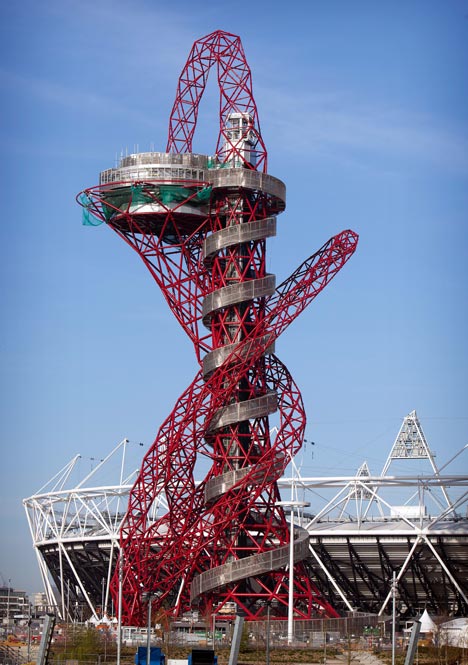
This is the newly unveiled Orbit Tower, built in London for the 2012 Olympics.


It's a 115 metre high scultpure designed by Anish Kappor and structural engineer Cecil Balmond.  Visitors will be able to ascend in an elevator to the top to stand on an observation deck.  

I'm not sure what your initial reaction is.  It somehow reminds me of something scientific, but without the beautiful pattern - like a diagram of a double helix gone wrong, or blood capillaries spurting.  It has a certain roadkill feel about it - something's got run over, and it's all a bit of a mess.

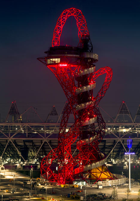
However, it does seem to look better at night...


This is Turner-prizewinner Kapoor's Marsyas, which was exhibited in the Turbine Hall at the Tate Gallery in London.


You can see that he enjoys making big, audacious, colourful pieces.  However, whilst Marsyas would appear to have a certain elegance (although unfortunately it's one of the Unilever series that I didn't see), I'm afraid I can't say the same for the Orbit.  Obviously I'm not standing underneath it to see it, but it strikes me that it's not exactly...

Vladimir Tatlin, Monument to the Third International (Tatlin's Tower)

Or maybe I'm missing something.  

What do you think...?

Tuesday, 15 May 2012

Using Liquin

I've been asked about the textures of my painting - how do you make paint thick? 

My paintings rely on textural contrasts between thick and thin passages of paint.  Oil paint is made up of pigment suspended in an oil medium, and the thickness or thinness of the paint depends on changing the proportions of the medium in which the pigment is held, by adding thinning or thickening agents.  

With a 'thinner' such as turpentine, the paint can be transformed into a near transparent glaze, and layered up - a technique mastered by Titian in the 16th century.  He revolutionized the use of the relatively new medium of oil paint with his slow, exacting method of glazing his canvasses. He painted over a reddish ground layer, then built up the paint in layer upon layer. His subtle use of glazes (called velatura or veiling) brought out the richness and subtlety of the different pigments, but it was a very time-consuming and painstaking process. "Trenta, quaranta velature!" ("Thirty, forty glazes!") he is said to have cried in frustration.   Imagine painting over this thirty or forty times...

 Titian, Danae and the Shower of Gold (Oil on canvas, 1554)

With a 'thickener' such as linseed oil (for example), the paint can be bulked up and made to sit proud of the canvas to give texture - 'impasto'.  

Rembrandt, Flora (detail) (Oil on canvas, 1635)

Here's an article speculating on the sort of thickener that Rembrandt used for his paintings Rembrandt and Burnt Plate Oil

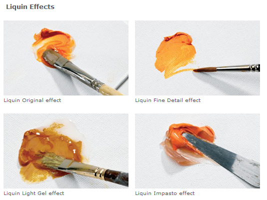
I use liquin as a medium.  This is liquin here -


It's like wash and go for oil paint, making it manageable and giving it body. I always have a dollop of it on my palette, and cover it with an upturned pot when I've finished for the day so that it doesn't dry out.  You can see it on my palette as the glossy looking patch in the middle of the bottom right quarter of the palette.  The pot that I cover it with is at the top right next to the bowl of turps (which is largely just for cleaning brushes).


A dollop last for a long time, and I don't use huge amounts (as you can see by the ratio of the vast mountains of paint to the small bit of liquin!!), it's just for when I feel it's required.  So there's no set 'recipe' or particular set of circumstances for using it. 

I can mix it with oil paint to form glossy textural paint, or I can then dip into it, and use a small amount of paint and a large amount of liquin, so that I can have a transparent glaze.  It's great stuff. 


However I should say that by and large, I tend to use my oils as they are, and not mess around with any sort of mediums.  You get to know how to make the paint work for you with different tools and how it responds when you apply it to the canvas with different mark-making actions. The liquin is purely there as an occasional supplement to help me do what I want to do with a particular passage of paint, because that's what works for me.

It may work for you too. You'll just have to try it for yourself and see.

Monday, 14 May 2012

West Coast Sun and Rain

Here I am on the beach at Morar at the weekend, taking photos for a new series of paintings.

Luckily there was a blink of sun between torrentially storm-force wet weather!


Friday, 11 May 2012

How Modern is Modern?

Just for a bit of Friday fun, take a look at these six landscape paintings, and have a guess at who painted them and when, based purely on what you see and how the paintings are painted.

Have a close look at the way that they're painted - the brushstrokes, the colours.  Can you see the brushstrokes?  Do the paintings look 'real'?  Or are the pictures more 'pattern making'?  I've put in some ideas to start you off, but look for yourself and make up your own mind.

What order would you put them in for date, starting with the earliest?  Answers are at the bottom!

Painting 1
Now, the houses look like quite flat geometric shapes arranged in the landscape here, with the curve of the rainbow adding to the feel of something out of a geometry set....


Painting 2
It's quite similar to what's going on here, except the houses feel a bit more three dimensional....


Painting 3
This seems to be a painting about nothing, or all about texture - it's just a wall.  At the top there's a block of plain flat white and plain flat blue.  Where's the focal point?  It's all quite flat...


Painting 4
Here's those flat blocks of colour again - you're led into the painting, but what's it about?  Where's the focus of the painting?  There's a sense of depth, but it's just blocks...


Painting 5
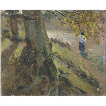
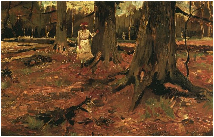
Ah, here's something more realistic...but it is also painted loosely, so you can see the brushstrokes, how it is made.  There's a high viewpoint, so you're looking down on the girl, almost spying on her, and there are bright dabs of colour as the light catches the leaves, and blue shadows.
  
Painting 6
It's almost the same picture, a girl in a wood, but less colourful, more browns, perhaps more 'realistic'?


Right, it's make your mind up time....

Ok, here's the order they should be in, starting with the oldest.

This one is 1782.  1782!!!

 Thomas Jones, A Wall in Naples (Oil on panel, 1782)

(Want to read more about this painting?  Look here)

Next are these, 40 years later, from 1821.  It's Mr Haywain himself, John Constable, looking more impressionist than the Impressionists (admittedly, they're sketches rather than finished paintings, so the brushstrokes are looser and more fluid, but wow....)

John Constable, The Grove or Admiral's House, Hampstead (Oil on paper , 1821)

 John Constable, Study of Tree Trunks (Oil on paper, 1821)

 Then 60 years later, it's the father of modern painting, Paul Cezanne.
Paul Cezanne, Houses in the Riaux Valley near L'Estaque (Oil on cavas, 1880)

Yes, the Impressionists get all the credit for painting outdoors on the spot, but others were there before them.  There's Constable out and about in the 1820s, and Salvator Rosa was painting outdoors in the mid 1600s, over 200 years before Cezanne strapped an easel to his back.  

Then it's Vincent Van Gogh, again 60 years after the Constable painting of a girl in a wood, and strangely looking less 'modern'.

Vincent Van Gogh, Girl in White in the Woods (Oil on canvas, 1882)

And lastly it's forward 80 years to this painting by Richard Diebenkom, but is it really any more 'modern' in style and subject than Thomas Jones's painting nearly two centuries previously...?

 Richard Diebenkorn, Cityscape 1 (Landscape No 1) (Oil on canvas, 1963) 


The thing is to learn to just LOOK, really look at a painting, without any preconceptions....