I was very much looking forward to this new BBC4 series, which explores how, in the hands of artists, the colours gold,
blue and white have stirred our emotions, changed the way we behave and
even altered the course of history.
I missed the first episode, which was 'Gold' - rather irritating as gold is a precious metal rather than a colour, so somewhat went against the premise of the title.
However, last night was 'Blue'

It started with Dr James Fox bobbing about on the Venetian lagoon with a big lump of lapis lazuli, the exotic blue stone like a piece of the sky itself, that changed how art looked.
Previously, blue didn't feature much in art or language. Colours were made from earth pigments, so art was rather brown. There was an interesting segment where Dr Fox watched a piece of lapis being made into pigment, and the huge effort and time (up to 2 weeks) that goes into grinding the very hard stone and processing the colour. Perhaps the most striking image of the whole programme was when he then held up a small bottle of the finished product, a mesmerising ultramarine - intense, bright, pure and strong.
Then is was off to Padua, to see the Giotto frescoes in the Scrovegni Chapel, one of the most important rooms in the whole of Western art, and a hymn to the colour blue.

Giotto, Scrovegni Chapel, Padua (Fresco, 1305)
I've visited the chapel in the 80s, when you could just walk in off the street, and take as much time as you liked to look at the paintings, while the sun beat down outside and you could hear the sound of the swifts. I revisited in 2004, having driven to Italy in my mini, and this time, you had to book in advance for a timed ticket. The chapel has been restored, and is all climate controlled, so you have to wait in a sealed room before proceeding into the chapel for your allotted 15 minutes with the frescoes. It doesn't make for relaxed viewing.
Giotto used lapis lazuli blue on the ceiling vault (and what a fortune that must have cost) to depict Heaven itself. Thus you are standing up and looking right into another world, with the Virgin Mary, Jesus and saints. The colour thus becomes emblematic of the divine.

Giotto, Vault of Scrovegni Chapel, Padua (Fresco, 1305)
Blue became the colour of Mary, and began to be controlled by the Church, who maintained its high price and coralled its use. Two hundred year later, however, Titian defied the convention, and Dr Fox looked at the restored Bacchus and Ariadne in the National Gallery in London.
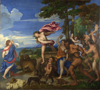
Titian, Bacchus and Ariadne (Oil, 1520)
If you take a diagonal from top right to bottom left, half the painting is blue - costing a fortune to make. It's not a biblical subject, and Ariadne is wearing the Virgin's colour of blue robes. How exactly Titian got away with incurring the wrath of the church wasn't really explained.
Then it was on to Picasso, via a rather strange and unclear bit about Romantics and flowers. In any programme about art history and the colour blue, you have to talk about Picasso and his Blue Period.
"What was the event that triggered Picasso's Blue Period?" mused Dr Fox. Well, it was the death of Picasso's friend Casagemus, wasn't it? Woah, not so fast!
And this is what began to annoy me about the programme. Dr Fox takes a very, very long time to make an obvious point, when a bit of judicious editing would make the whole programme more to the point and less about the presenter.
And so we had the mean and moody monochromatic Dr Fox, in crisp white shirt, black tie and jacket and black hipster jeans, slouching about a train in a recreation of his Inter-railing youth on a trip to Paris. Then he was wandering about Paris with some arty camera work. Then he was in a bar. All this to get across the point that Picasso and his best pal Casagemas went to Paris, where Casagemas killed himself. It took an age. I understand that not everyone might be familiar with Picasso and his story, but it still took an eternity.
Finally, we got to see a few paintings.

And then we also had the opinion of a Jungian psychoanalyst thrown in, that Picasso was schizophrenic. Which didn't sound much like Picasso at all.
Next it was Yves Klein, who actually invented his own colour (International Klein Blue) with the help of pigment specialist Edouard Adam. The way you do. Here is one of his textural all-blue paintings in his very own colour.

Yves Klein, IKB 191, 1962
There was a lot about Mr Klein (such as his love of judo), which would again have benefitted from editing, as it didn't really add anything to the main thrust of the programme, which was meant to be an exploration of the colour.
Thus we got a baffling segment about a photo of Klein throwing himself out of a first floor window and taking a photo of the act (with Dr Fox climbing up a concrete pillar on the spot where the incident took place in order to make some sort of point - mostly that he's rather fit and flexible). It wasn't made entirely clear what the outcome of the incident was or why it got such a prominent mention in the programme. Again it was almost as if it was included in order to inject some drama and some sort of action sequence for the presenter.
Anyway, I think what he was getting across was that the point of Yves Klein was to do with blue being a liberating colour (it was the 60s after all), a colour that opened the windows to freedom and the great blue beyond where you could leave your earthly existence behind. Except the photo was faked. And wasn't blue. It was all a bit muddling.

Yves Klein, Le Saut dans la Vide (Photomontage, 1960)
Which took us to the Most Annoying Bit of the whole programme. A trip to Austin, Texas, to talk to a Saturn 5 astronaut.
Because Dr Fox had travelled all the way to Austin, Texas, and had sought out a real, live Saturn 5 astronaut, there was a long segment where we heard about the mission, where the astronaut repeated himself about the Cold War space race and described the rocket engines shaking him about, and how he nodded off at one point. All very well, but detail we didn't really need to know about in the context of an art programme, because you could see with crystal clarity where we were being taken, and the whole narrative story arc that was about to clunkingly be made.
At the start we had Giotto with his other worldly blue of heaven. This astronaut guy was the one who took the photo of Earth as a blue planet. So blue is actually also the colour of home, and of Earth. Get it? Except, it wasn't an artist that was being interviewed, it was an astronaut, and it was a scientific photograph taken as part of his work, not a creative artwork. The title of the series is "A History of Art", and this final conclusion didn't actually involve an image from the history of art at all. Ok, so it was a very influential image. But it isn't art, because it wasn't made by an artist.

So that really, really annoyed me.
I really can't engage with Dr James Fox at all, and his presenting style. I really want to, but I just can't. I want someone who really speaks to me, not tells me how clever they think they are. Just in the way that his whole outfit and persona should add up to him being one groovy, fit guy, it just kind of doesn't. Similarly, the programme involves lots of exotic places, and hip camera work and on-the-spot re-enactments, but it somehow doesn't hit the mark. It's not 'come with me on this journey' it's 'look at me'. It's just not as insightful or as instructive or intelligent as it could be, and good art programmes are so rare that I really wanted this to be insightful and instructive and intelligent.
For a series that's meant to be about the emotion of colour and the passion of art history, it's all rather cold. You can see the end point of the arguments way before they happen, and they take a maddeningly long time to finally arrive, via a whole load of extraneous whoffle that really should have hit the cutting room floor. It's frustratingly less than the colourful sum of its parts.
If we had time for astronauts, why didn't we have time to look at the science of the colour blue? Why is it so intense? How does it work on our eyes optically? How does it act on our brains? Why are Georgian libraries and reading rooms painted blue? (Blue makes it easier to see printed word.) Why are motorway signs blue with white lettering? (Ditto.) Why do painters go to St Ives? (It's the intense blue light, which makes everything clearer and more beautiful, due to the reflection of light and the sky and the curve of the bays with the sea. And they have good fish and chips.)
In short, it's a series that needs to be a whole lot less Foxy and more carefully thought out in order to actually be "A History of Art in Three Colours".
Colour? It just doesn't quite do what it says on the tin.
Next week it's "White". I'm not sure if I'll be tuning in.
View the episode on BBC i-player here.
'But it isn't art, because it wasn't made by an artist.'
ReplyDeleteOops!
Oops?
ReplyDeleteIt's not meant as an elitist statement. Apologies if it came across as such. Let me explain.
The programme was specifically called 'A History of Art', but the photograph I was referring to wasn't an art historical image, made by an artist, and art historians study stuff made by artists.
As I say in the blog, 'it wasn't an artist that was being interviewed, it was an astronaut, and it was a scientific photograph taken as part of his work, not a creative artwork.' So if the astronaut had declared himself to be an artist, making an artistic image, that would have been a different thing (and anyone can say that they ARE an artist, making artworks). But as far as I understand, he wasn't.
So yes, it's a lovely, influential image, but it wasn't created specifically as a work of art. Therefore, it shouldn't, by definition, have been in the programme, I would argue.
There's a whole world of art out there which could have been included in the programme, so why include something that isn't...?
I have just watched this programme as it has just been repeated on BBC4 and I came across your review. I would have to completely disagree. As an art student myself, I would say the exclusion of references outside the 'history of art' in this documentary would be a very ignorant and narrow minded decision to make. The creation and inspiration behind art comes from the world, fact or fiction, it is all "of this world" in some way: art is not an insular field. Personally, I feel that these references strengthened the concept of what the programme was exploring. I think you are thinking of the word/concept of 'art' in a very traditional and dated sense. However, this is personal choice.
ReplyDeleteThanks for that.
ReplyDeleteOf course the creation and inspiration behind art comes from the world, and the human experience and interpretation of that world.
It’s just that the programme is defined as ‘A History of Art’. Not ‘A History of Anything and Everything’.
I have no problem with relevant references that add to an understanding of the subject. It’s just that I don’t get the pertinence and logical argument in the particular references which Dr Fox uses, such as Mussolini in the ‘White’ programme, which in that case seems to have more to do with his dramatic narrative arc of 'white can actually be black!' rather than any logical input into his stated objective of 'The History of Art'.
However, as you point out, this could be less to do with a problem with the programme itself, which you obviously found enlightening, and more to do with my personal ignorance and narrow-mindedness combined with a traditional and dated education :-(.
Please do not take offence by what I said, I just felt that your review was very harsh but you gave a good argument. Everyone is entitled to their own opinion and if that is the way you felt then you are right just as much as I am. I am sure people would disagree with my response just as I disagreed with yours!
ReplyDeleteOn the contrary, I did really enjoy reading your review, you are a great writer! Also, can I just add that I do agree with your point about the Gold programme - I would have much preferred they chose another colour as the programme was dominated by the metals history which I was slightly disappointed by! I found Blue and White most interesting.
Don't worry, it's kind of you to write back, and thank you for your positive comments.
DeleteI guess it's safe to say that I really didn't engage with the programmes (or Dr Fox) in the way that you did, probably because I do have quite a concrete way of looking at things, but felt mostly that it was a missed opportunity to get to grips with the huge plethora of more relevant (I felt) material out there. I even found the inclusion of Whistler in the White programme rather odd - I saw the Whistler collection every day in the Hunterian at University, and it was all about grey, black, blue or gold in his nocturnes and portraits...
I just can't help thinking that if I'd written an art history essay for my undergraduate course and banged on about astronauts and dictators, it would have come back with a big red pen mark through the lot and a giant question mark scored on it! Although essays aren't television programmes.
However, part of the point of a programme is to be thought-provoking, and it's certainly that. I don't blog about the mediocre stuff, and it's good and healthy to have different opinions.
I haven't seen 'Gold' yet, but thank you for your comment on it. I will have a look for it on I-player (and keep a wooden spoon handy to bite on!).
How interesting. I also studied History of Art at uni (sounds like it was the same one as you attended) but left in 3rd year to go to art school, and I entirely agree that if I had written an essay for uni that referenced anything "out of the art world" then I would have scored badly, which I did. However, at the art school I am an A student in this field which I was both relieved and shocked by. I think it is two very different ways of thinking about art but I think I am stuck in the middle. I felt that while studying history of art that contemporary art was frowned upon, while at art school, the Italian Renaissance is very very rarely mentioned or regarded upon.
ReplyDeleteI have also been to the Hunterian many times and agree that Whistler paintings are all darker, so I was shocked when it was revealed that he had such a fruitful relationship with White, regardless of my knowledge of his white paintings. Also very shocked that he pioneered the "white cube" gallery space, very interesting. Perhaps it was usually gold before this?
It was nice talking to you!
Now that's really funny! If you went to Glasgow, then we'll probably have had some of the same lecturers!
ReplyDeleteVery interesting what you have to say about University v Art School - which I guess encapsulates the divergence of opinion which we have about the programme.
"How exactly Titian got away with incurring the wrath of the church wasn't really explained."
ReplyDeleteMaybe because the story about "the Church" controlling the use of blue pigments is false . That's the explanation.
This is so interesting, thanks for sharing! It goes to show that the use of blue in paintings isn't just for sadness (e.g Picasso's blue period)
ReplyDeleteMy pleasure! Indeed, blue isn't just one colour - it can be a hot or a cold blue, cobalt or Prussian, French or ultramarine, and as you say, can be both uplifting as well as signifying sadness. Plus if you put it against orange (an old trick of Delacroix), then the complimentary makes it zing! Kandinsky also talked in a synesthetic way of the musicality of blue, which makes it recede whilst other colours such as red advance and shout like a trumpet. So much more to say!!
ReplyDeleteThis is such an excellent article! I also entirely agree. Artists have been seeking to express our "blue gem" of a planet for many centuries. Artists have to use materials to do that, or reflected, projected and emitted light. Maybe some get close to their experience of the color blue (and indigo and violet) but seem never to be completely satisfied with their efforts to ground the color in their materials/pigments. With paints we have reflection and refraction, and scattering, to deal with in opaque to transparent pigments with different grinds and binders. I personally find that a transparent French Ultra with a warm metallic gold really like each other. Both are 'colors of earth' too.
ReplyDeleteLovely - glad to hear that you found the article and programme thought-provoking, and thank you for taking the time to comment!
ReplyDeleteColour is such a simple word, but such a very very complex, mysterious, chemical, scientific, aesthetic, measurable and unquantifiable, definable and undefinable, subjective and objective subject!
Writing a good essay isn't easy and it's the fruit of hard work. You can get help from essay writing. Check out, please Evolution Writers
ReplyDeleteCrushing, Anna.
ReplyDeleteThis comment has been removed by the author.
ReplyDeleteProblems? :-(
ReplyDeleteOh Anna.....
You are welcome to visit our brilliant writing company in order to get rid of your academic writing problems once and for all! Evolution Writers
ReplyDeleteOh dear, Anna.
ReplyDeleteAre you saying it's all too academic...?
I found this episode deeply irritating. It seems Dr Fox is far more committed to producing a dramatic TV programme than he is to scholarly reality.
ReplyDeleteIn his desperation to dramatise the import of lapis lazuli into Europe during the late Middle Ages, he is so eager to pretend that the colour blue played hardly any role in earlier European art that he chooses the dreariest examples he can dredge up and flashes them quickly on the screen. In reality, though other dyes such as indigo or cobalt may not have been quite so vivid as lapis lazuli, blue was an extremely common colour in European art long before the late Middle Ages. The frescoes in Roman Pompeii, for instance, had brilliant blue skies. How about the famous 1st-century BC mural from Boscoreale in the Met? How about bright blues used in the Lindisfarne Gospels of c. 700? How about the dazzling blue in the stained glass windows of the 12th-century Basilica of Saint Denis?
But hey, why let facts stand in the way of making a TV programme?
Thank you for taking the time to comment David. You obviously found the same problem with the programme as I did!
ReplyDeleteI really don't know who art programmes are aimed at on the BBC - with the exception of Andrew Graham Dixon's series, they don't seem to engage people who know very little, or inform people who know a reasonable amount. It's like there's a formula at the BBC which is "sexy subject + quirky presenter + good-looking travel sections - intelligent argument = art programme".
Wait till you see an art programme presented by Prof Amanda Vickery -
http://jibridgland.blogspot.co.uk/search?q=amanda+women+artists
- you'll be throwing a brick through the television in frustration.
First, my apologies for venting my frustration on your blog post of five years ago. I'd just seen a rerun of the programme and was googling to see if anyone else had reservations about the programme. I'm glad to see I'm not alone!
ReplyDeleteSadly, I think your summary of the BBC formula is perfectly spot on. I look forward to the Vickery programme with trepidation. Thanks for the warning!
Vent away,David!
ReplyDeleteAlso avoid *anything* with Waldemar Januszczak presenting. I literally cannot listen to him, as once again, the subject matter of the programme (and a lot of licence fee money) is used as a vehicle to magnify him and his ego. It doesn't matter what he's talking about, his delivery is just far too stylised and knowing - it becomes the whole focus.
I heard a lecture at the Edinburgh Festival by Andrew Graham Dixon on Caravaggio. It was just him, his deep knowledge of the subject, a few slides, and his animated enthusiasm. It was mesmerising. It's exactly how I learnt art history for goodness sake - and let's face it, art history is exciting and astonishing and profound and human and visual enough as it is without all the frills!
xcellent post.For more information visit sole trader accountants in london
ReplyDeleteĐồng hồ pha lê | Đồng hồ pha lê để bàn
ReplyDeletehttps://cupphale.net/xuong-san-xuat-cup-vinh-danh-gia-re-tai-ha-noi.html
ReplyDeletehttps://phalebinhminh.com
ReplyDeletehttps://phalebinhminh.com/cup-pha-le.html
https://phalebinhminh.com/cup-tennis.html
https://phalebinhminh.com/cup-golf.html
Cúp pha lê là sản phẩm cúp sang trọng được công ty chúng tôi sử dụng chất liệu là pha lê cao cấp để sản xuất ra chúng.
ReplyDeleteCúp pha lê có thể sử dụng làm các cúp giải thưởng cho các chương trình, các cuộc thi, hoặc là dùng để tặng tri ân khách hàng, cán bộ công nhân viên trong công ty. Ngoài ra tặng phẩm pha lê còn có dùng làm vật trang trí trong nhà rất là đẹp mắt
https://phalebinhminh.com/y-nghia-cua-cup-pha-le-va-pha-le-mang-y-nghia-la-gi.html
Pha Lê 3D
ReplyDeleteBác Hồ 3D và Đại Tướng Võ Nguyên Giáp
Làm cách nào để đưa hình vào khối pha lê 3D
Pha lê 3D Chủ Tịch Hồ Chí Minh
love it
ReplyDelete