Friday, 16 March 2012

Off to the Lake District

I'm just off to the Lake District for the weekend to take photographs.


The weather isn't looking great - rather wet -  but I'm hoping it will make for some mean and moody pictures!!  

Either that, or you could be seeing a whole new genre of work based around ducks...

Thursday, 15 March 2012

Dark Clouds over the Beach, Aldeburgh

Here's a last quick word about one of the paintings in my show before it closes tomorrow.

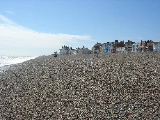
This is Dark Clouds over the Beach, Aldeburgh, Aldeburgh being a little seaside town on the Suffolk Coast by the North Sea.  Composer Benjamin Britten lived there, so this is the coastal scenery that inspired the famous 'Four Sea Interludes' from his opera Peter Grimes.  So Aldeburgh looks how Britten sounds.

 Dark Clouds over the Beach, Aldeburgh (Oil on linen, 20 x 40)

I first went to Aldeburgh because I had a show in a gallery there.  I'd never been to Suffolk, and considering it was so flat, it was never a place that I had thought of visiting in order to paint.

However, being beside the sea is always wonderful, and I quickly found that it was the most amazing place to be, just captivating.  Aldeburgh has the most wonderful long sloping shingle beach with fishing boats pulled up on it.  Walk along the beach and you are having a conversation with the sea and the sky.


I did a series of studies on small 6" x 6" wood panels using collages of sand from the beach, acrylic, tissue and printed papers.  I used a long format, because that's what the experience of being on the beach is like, but each of the squares works as a stand-along picture.


I then scaled up these small textural explorations into the larger double-square format of the 20" x 40" canvas of Dark Clouds over the Beach, Aldeburgh.  I tried to keep the texture and feel and movement of the studies, but just using paint.  

There are no straight lines or horizons as it feels as if everyuthing is constantly moving - plus, if you had a big straight horizon line across the middle of the picture, it would look like a sandwich!

I also did a lot of work at Walberswick, along the coast, where Charles Rennie Mackintosh lived and worked during the first world war.  But that's something for another time.

Wednesday, 14 March 2012

Favourite Paintings - Hornel

One of my very favourite paintings when I was little was Edward Hornel's Blue Flax. I found the picture, quite small,  in a magazine, cut it out and kept it.

E A Hornel Blue Flax (Oil on canvas 1927)

I think what I liked about it, apart from the colour, was the sense of freedom.  I suppose I was identifying with the children in the picture, who were in an idyllic, sunny, adult-free flower-filled world by the sea.  It was light years away from life in grimy Glasgow in the 60s.

Hornel was one of the group of early 20th century painters known as the Scottish Colourists, and this particular scene was painted at Brighouse Bay near Kircudbright.   The link shows a photo of the actual place today.

Being with a gallery that deals in the Scottish Colourists, and also knowing a picture conservator who restores work like these, I'm lucky enough to see quite a few Hornels close up and be able to handle them.  You can turn the dark canvasses over, and see how he applied the paint and made the marks, using various methods including a knife, and how he used the texture and colours of the canvas by allowing it to show through, alternating the thickness of the paint and types of mark across the surface.  You can also really appreciate how cleverly he composed the pictures, and how he arranged the elements.

Having said all that, he's not really an artist I would choose as a top favourite now - there seem to be great numbers of nearly identical overly-sentimental Hornels featuring rosy-cheeked little girls, and I really don't have any sort of an emotional response to them.  But I hadn't seen all the other paintings back then, only Blue Flax, and I loved it.

Years later, in the 1980s, I was at a meeting in Glasgow City Chambers, and was hanging up my jacket on a coat-stand before going in to the meeting room.  As I did so, I caught a glimpse of blue coloured oil paint on the gloomy wall behind, and, like going through the wardrobe to Narnia,  pushed aside the coats and jackets to see what it was.  

Yes, it was Blue Flax.  I'd only ever seen it before on a tiny, faded picture, and here was the real thing, made flesh, so much bigger.  Unloved, hidden away, behind a coat stand.  It was a very strange moment.

I still have the little picture, in a frame. 

Tuesday, 13 March 2012

Affordable Art Fair, Battersea

The first UK-based Affordable Art Fair of the year kicks off at Battersea Park in London on Thursday.


It has a casual tents-in-a-park setting and a price tag of everything under £4000, and the whole experience is designed to take the stuffiness out of buying art.  You can even take your dog for a walk in the park and then take it to the art fair (it might not appreciate the colours though).

There are now 18 Affordable Art Fairs worldwide, from Rome, Amsterdam and Stockholm to New York, Melbourne, Mexico City, Singapore and soon even Delhi.  They were founded in 1999 by Will Ramsay of Will's Art Warehouse, with the ethos that art is for all, and should be within the reach of everyone's pockets.

The fair at Battersea runs until Sunday, and you can find out more at the Affordable Art Fair website.  You can also read an article in the London Evening Standard, and also one about art collecting for beginners at the Affordable Art Fair in the Huffington Post.

I have work on Stand D1 with Duncan R Miller.

Monday, 12 March 2012

Last week of 'Between Tides'

It's the final week of my exhibition in London. 

It's always a big thrill to have a show in the capital, and it's rather sad that it's nearly over, with no more solo shows until 2013.  That seems such a long time away!

Against all the current economic odds, the show has pretty much been a complete sell-out, which is fantastic news.  Especially popular have been paintings of the west coast of Scotland with the white sands around Morar, the Causeway Coast in Northern Ireland, and autumn trees at Green Park in London.  

All the work is still on display in the gallery, and there are still a few are available for sale, including this one.

Curve of White Sand, Morar (Oil on linen 24 x 26)


'Curve of White Sand, Morar' was painted at the beach at Camusdarach on the 'Road to the Isles'.  From the amazing pink and white sands, you can see right out to the islands of Rhum, Eigg and Skye.  Because of the pale sands underneath reflecting the light, the sea is the most amazing colours of  green and turquoise as it rolls in over the beach.  It's an amazing place to be, and one which has a great sense of freshness and openness.  There's usually hardly anyone else around on the beach.

It's great to have had such a wonderful response to the show.  Perhaps the Hockney exhibition up the road from the gallery has had a positive influence on people's appreciation of brightly-coloured landscapes!

Friday, 9 March 2012

A Bigger Picture - David Hockney Exhibition Part 2

Just as we are coming into spring itself here, so you progress through the seasons in the massive Hockney exhibition.  

I left you earlier in the week half way through the show - now, in Room 7, is the explosion of Hawthorn Blossom with the depiction of what Hockney calls 'Action Week'.

David Hockney Hawthorne Blossom, Woldgate No. 6 2009 (oil on canvas, 60 x 72) 
 
I wasn't so keen on these pictures, although Hockney obviously found the experience of the hedgerows and lanes bursting forth with frothy, creamy fullness and the whole expulsion of bounty a very... exciting experience.  Instead of delicate forms, the resulting foam-laden branches take on the guise of sea-creatures, writhing about in an agitated manner like some over-inflated Roger Dean stage set.
 
Room 8 is Trees and Totems, and the mood changes to one of the cycle of life, and to death and decay.  Hockney takes something almost insignificant, a dead tree stump in the woods near Woldgate, and turns it into an iconically massive motif.
David Hockney Winter Timber 2009, oil on 15 canvases (36 x 48" each) 108 x 240"   
 
 
There it is on the right side of Winter Timber, right on the golden section, dividing up the painting into parts with two completely different eyelines.  Here are quick, fluid brushtrokes in purple, cadmium yellow, coerillium and viridian.  In further paintings, the truncated form of the 'totem' becomes a motif of the inevitability of death, like Rembrandt's flayed ox.  Given that Hockney himself is not in the first flush of youth, it is quite a potent image.

There are also some lovely, lyrical charcoal drawings in this room, drawn from observation and uncluttered by colour.  Like most of Hockney's work, they have little sky, but a lovely rhythmic balance of light and dark.

 David Hockney 'Cut Trees' 2008

The Arrival of Spring fills room 9 (4 more to go, but I didn't know this at the time as, in the scrum to get in, I hadn't been given my included-in-the-price guidebook).  

In this room are 51 prints from an i-Pad and one large painting.  Hockney uses his i-Pad as an image-making tool, and in planning the final prints as large-scale, so makes adjustments to colour and form that are needed for the change in scale and mdeium from hand-held i-Pad to Royal Academy wall.  It's no wonder this room has a sense of theatricality - Hockney used to design stage sets, and indeed, built a stage-set model of the Royal Academy with miniature print-outs of all the paintings for the planning of the layout of the show.  


Here is Hockney, with his painting The Arrival of Spring, as big as a theatrical backdrop.

But centre stage is the drama of nature, like a technicolour Judy Garland musical.  The pictures are dated, so you follow through the coming of spring from the almost undetectable to the blazing fanfare, in sometimes almost shimmeringly 3D paintings. 

The focus is down on the vegetation, rather than the sky, and all this bursting, undulating, writhing force of nature is strangely contained within their little rectangular boxes.  There are no people in the paintings, although there are cars and road-signs and some ruined buildings.  There are reminders of people, like some post-apocalyptic world where nature has taken over.  This contrasts strangely with the heaving hurly burly of humanity that fills the Royal Academy trying to look at these paintings.  None of them featured in the Hockney's miniature stage-set of the show.

Feeling that the show has reached a certain climax, you do wonder what could possibly be next.  Room 10 is The Sermon on the Mount, which is not my favourite work.  This is a painting by 17th Century French artist Claude Lorraine, which Hockney has digitally 'spring cleaned' and then reinterpreted on a huge scale.  What you are faced with is Christ giving a directive from a massive throbbing red edifice, like Tatlin's Tower, or a giant carrot.


Once you think 'giant carrot', you just can't take it seriously, especially when you are so tired, so hot, and have been jostled to bits by fellow visitors for a couple of hours by now.

Then it's on to films.  Or it would be, if you could get anywhere near them.  The rooms are packed, so you can't just leisurely stroll in, sit down in the middle, and enjoy the multi-screen experience as it is meant to be viewed.  

Hockney strapped small video cameras on to apparatus and drove down country lanes to take films of the countryside and hedgerows from multiple viewpoints, which are then projected onto multiple screens.


Each is a different experience of the same thing, a different bit of time.  There are other films, including one in an office, and some flexible young men and furniture, but I could only see them from a very oblique angle near the doorway.

With the end in sight, and the smell of the gift shop in my nostrils, it was a quick dash through Yosemite at the end, and out into the piles of catalogues.  "This place just gives me a headache,"  sighed the gift shop lady behind the counter, "All the people.  All the heat.  All day."

It's a truly amazing exhibition.  It has to be seen to be believed, and it catapults landscape into the 21st century as a vast multi-media, multi-experience, great cutting-edge visceral roaring thing that is at the very heart of life itself.  

Hockney makes landscape into the most important thing you could ever, ever have a painting about.  Not all of it is great.  Not all of it is stuff you'd want to have in your front room.  But at 74 years old, it's hats off to the sheer human energy and dynamism of this plain-speaking visionary man.

If you're like to watch a 3-minute gallop through the show, then you can watch The Telegraph's art critic Alistair Sooke in this video, which is part of his on-line review of the show.

Telegraph review of David Hockney with video


Thursday, 8 March 2012

A Trip to Morecambe

Last year I was back in Morecambe on several occasions to take photos.  

It has a wonderful seafront, which has been done up in recent years, with lots of playful statues of seabirds (including some by Glasgow sculptor Shona Kinloch) and really nice details of seashells in the paving. 


It's always great to be by the sea.  When the tide is in, you get all the drama of the white-topped waves crashing against the shore, and when the tide is out, you get all the wonderful subtle colours of the wide expanse of sand, with all the purples, lilacs and burnt siennas.  There are lots of beautifully-shaped boats that lie on the mud and provide points of colour.

The sky is very big, and there are the hills of the Lake District in the far distance.  There's also the newly-repoened Midland Hotel, which is an art deco treat, like a classic ocean-going liner.  It has work by Eric Gill, Eric Ravilious, and the most amazing rug in the foyer by Marion Dorn.


Several of my paintings from Morecambe are currently in my London show.  This is Boats at Low Tide, Morecambe, which has a lot of textural impasto paint at the bottom right hand side to give the sense of the rocks.

Boats at Low Tide, Morecambe (Oil on linen, 24 x 26)

Because the bay has such a lovely wide sweep, I used my largest size of canvas for this.

Sweep of the Bay, Morecambe (Oil on linen, 32 x 48)

And finally a much smaller painting.

Lone Boat, Morecambe (Oil on linen, 12 x 12)